---
url: /components/switch/specs.md
description: >-
Switches toggle the selection of an item on or off. Switches are the best way
to let users adjust settings.
---
# Switch
Switches toggle the selection of an item on or off. Switches are the best way to let users adjust settings.
[Overview](overview.md) · **Specs** · [Guidelines](guidelines.md) · [Accessibility](accessibility.md)

1. Track
2. Handle (formerly "thumb")
3. Icon
## Tokens & specs
Browse the component elements, attributes, tokens, and their values. [Learn more about design tokens](../../foundations/design-tokens/overview.md)
::: token-table token-table-33b1b2925d9ff561-65e10c72
**Switch tokens** · 1 token set · 78 tokens · [live token table](https://m3.material.io/components/switch/specs) · DSDB `TOKEN_TABLE.33b1b2925d9ff561`
* Default context: Theme: Light · Platform: Android · Audience: 3P · Contrast: Default · iOS dark theme elevation: None · iOS weight setting: Default
* Not configurable here (group default used): Motion scheme: Standard · Font: Static · Language height: Small
* Other contexts: Theme: Dark · Contrast: Medium contrast, High contrast. "Other contexts" lists values that differ from the default when only that one context changes.
* Reference chain: aliases from the token to its source value (`token → alias → … → value`). "—" means the token holds a literal value.
**Switch** · `md.comp.switch` · 78 tokens
For switches.
| Group | Token | Type | Reference chain | Resolved value | Other contexts |
| --- | --- | --- | --- | --- | --- |
| Enabled › Icon | `md.comp.switch.selected.icon.color` | Color | `md.sys.color.primary` → `md.ref.palette.primary40` | `#6750A4` | Dark: `#D0BCFF` via `md.ref.palette.primary80`
Medium contrast: `#4F378B` via `md.ref.palette.primary30`
High contrast: `#381E72` via `md.ref.palette.primary20` |
| Enabled › Icon | `md.comp.switch.selected.icon.size` | Length | — | `16dp` | — |
| Enabled › Icon | `md.comp.switch.unselected.icon.color` | Color | `md.sys.color.surface-container-highest` → `md.ref.palette.neutral90` | `#E6E0E9` | Dark: `#36343B` via `md.ref.palette.neutral22` |
| Enabled › Icon | `md.comp.switch.unselected.icon.size` | Length | — | `16dp` | — |
| Enabled › Track | `md.comp.switch.track.height` | Length | — | `32dp` | — |
| Enabled › Track | `md.comp.switch.track.width` | Length | — | `52dp` | — |
| Enabled › Track | `md.comp.switch.unselected.track.outline.color` | Color | `md.sys.color.outline` → `md.ref.palette.neutral-variant50` | `#79747E` | Dark: `#938F99` via `md.ref.palette.neutral-variant60`
Medium contrast: `#49454F` via `md.ref.palette.neutral-variant30`
High contrast: `#322F37` via `md.ref.palette.neutral-variant20` |
| Enabled › Track | `md.comp.switch.track.outline.width` | Length | — | `2dp` | — |
| Enabled › Track | `md.comp.switch.track.shape` | Shape | `md.sys.shape.corner.full` | `Circular (fully rounded)` | — |
| Enabled › Track | `md.comp.switch.selected.track.color` | Color | `md.sys.color.primary` → `md.ref.palette.primary40` | `#6750A4` | Dark: `#D0BCFF` via `md.ref.palette.primary80`
Medium contrast: `#4F378B` via `md.ref.palette.primary30`
High contrast: `#381E72` via `md.ref.palette.primary20` |
| Enabled › Track | `md.comp.switch.unselected.track.color` | Color | `md.sys.color.surface-container-highest` → `md.ref.palette.neutral90` | `#E6E0E9` | Dark: `#36343B` via `md.ref.palette.neutral22` |
| Enabled › Handle | `md.comp.switch.unselected.handle.height` | Length | — | `16dp` | — |
| Enabled › Handle | `md.comp.switch.with-icon.handle.height` | Length | — | `24dp` | — |
| Enabled › Handle | `md.comp.switch.selected.handle.height` | Length | — | `24dp` | — |
| Enabled › Handle | `md.comp.switch.pressed.handle.height` | Length | — | `28dp` | — |
| Enabled › Handle | `md.comp.switch.unselected.handle.width` | Length | — | `16dp` | — |
| Enabled › Handle | `md.comp.switch.with-icon.handle.width` | Length | — | `24dp` | — |
| Enabled › Handle | `md.comp.switch.selected.handle.width` | Length | — | `24dp` | — |
| Enabled › Handle | `md.comp.switch.pressed.handle.width` | Length | — | `28dp` | — |
| Enabled › Handle | `md.comp.switch.handle.shape` | Shape | `md.sys.shape.corner.full` | `Circular (fully rounded)` | — |
| Enabled › Handle | `md.comp.switch.selected.handle.color` | Color | `md.sys.color.on-primary` → `md.ref.palette.primary100` | `#FFFFFF` | Dark: `#381E72` via `md.ref.palette.primary20` |
| Enabled › Handle | `md.comp.switch.unselected.handle.color` | Color | `md.sys.color.outline` → `md.ref.palette.neutral-variant50` | `#79747E` | Dark: `#938F99` via `md.ref.palette.neutral-variant60`
Medium contrast: `#49454F` via `md.ref.palette.neutral-variant30`
High contrast: `#322F37` via `md.ref.palette.neutral-variant20` |
| Enabled › Handle | `md.comp.switch.handle.shadow-color` (deprecated) | Color | `md.sys.color.shadow` → `md.ref.palette.neutral0` | `#000000` | — |
| Enabled › Handle | `md.comp.switch.handle.elevation` (deprecated) | Elevation | `md.sys.elevation.level1` | `1dp` | — |
| Enabled › Handle | `md.comp.switch.handle.height` (deprecated) | Length | — | `20dp` | — |
| Enabled › Handle | `md.comp.switch.handle.width` (deprecated) | Length | — | `20dp` | — |
| Enabled › State layer | `md.comp.switch.state-layer.size` | Length | — | `40dp` | — |
| Enabled › State layer | `md.comp.switch.state-layer.shape` | Shape | `md.sys.shape.corner.full` | `Circular (fully rounded)` | — |
| Disabled › Icon | `md.comp.switch.disabled.selected.icon.color` | Color | `md.sys.color.on-surface` → `md.ref.palette.neutral10` | `#1D1B20` | Dark: `#E6E0E9` via `md.ref.palette.neutral90`
Medium contrast: `#000000` via `md.ref.palette.neutral0`
High contrast: `#000000` via `md.ref.palette.neutral0` |
| Disabled › Icon | `md.comp.switch.disabled.selected.icon.opacity` | Opacity | — | `0.38` | — |
| Disabled › Icon | `md.comp.switch.disabled.unselected.icon.color` | Color | `md.sys.color.surface-container-highest` → `md.ref.palette.neutral90` | `#E6E0E9` | Dark: `#36343B` via `md.ref.palette.neutral22` |
| Disabled › Icon | `md.comp.switch.disabled.unselected.icon.opacity` | Opacity | — | `0.38` | — |
| Disabled › Track | `md.comp.switch.disabled.track.opacity` | Opacity | — | `0.12` | — |
| Disabled › Track | `md.comp.switch.disabled.selected.track.color` | Color | `md.sys.color.on-surface` → `md.ref.palette.neutral10` | `#1D1B20` | Dark: `#E6E0E9` via `md.ref.palette.neutral90`
Medium contrast: `#000000` via `md.ref.palette.neutral0`
High contrast: `#000000` via `md.ref.palette.neutral0` |
| Disabled › Track | `md.comp.switch.disabled.unselected.track.color` | Color | `md.sys.color.surface-container-highest` → `md.ref.palette.neutral90` | `#E6E0E9` | Dark: `#36343B` via `md.ref.palette.neutral22` |
| Disabled › Track | `md.comp.switch.disabled.unselected.track.outline.color` | Color | `md.sys.color.on-surface` → `md.ref.palette.neutral10` | `#1D1B20` | Dark: `#E6E0E9` via `md.ref.palette.neutral90`
Medium contrast: `#000000` via `md.ref.palette.neutral0`
High contrast: `#000000` via `md.ref.palette.neutral0` |
| Disabled › Handle | `md.comp.switch.disabled.unselected.handle.opacity` | Opacity | — | `0.38` | — |
| Disabled › Handle | `md.comp.switch.disabled.selected.handle.opacity` | Opacity | — | `1` | — |
| Disabled › Handle | `md.comp.switch.disabled.selected.handle.color` | Color | `md.sys.color.surface` → `md.ref.palette.neutral98` | `#FEF7FF` | Dark: `#141218` via `md.ref.palette.neutral6` |
| Disabled › Handle | `md.comp.switch.disabled.unselected.handle.color` | Color | `md.sys.color.on-surface` → `md.ref.palette.neutral10` | `#1D1B20` | Dark: `#E6E0E9` via `md.ref.palette.neutral90`
Medium contrast: `#000000` via `md.ref.palette.neutral0`
High contrast: `#000000` via `md.ref.palette.neutral0` |
| Disabled › Handle | `md.comp.switch.disabled.handle.opacity` (deprecated) | Opacity | — | `0.38` | — |
| Disabled › Handle | `md.comp.switch.disabled.handle.elevation` (deprecated) | Elevation | `md.sys.elevation.level0` | `0dp` | — |
| Hovered › Icon | `md.comp.switch.selected.hover.icon.color` | Color | `md.sys.color.primary` → `md.ref.palette.primary40` | `#6750A4` | Dark: `#D0BCFF` via `md.ref.palette.primary80`
Medium contrast: `#4F378B` via `md.ref.palette.primary30`
High contrast: `#381E72` via `md.ref.palette.primary20` |
| Hovered › Icon | `md.comp.switch.unselected.hover.icon.color` | Color | `md.sys.color.surface-container-highest` → `md.ref.palette.neutral90` | `#E6E0E9` | Dark: `#36343B` via `md.ref.palette.neutral22` |
| Hovered › Track | `md.comp.switch.selected.hover.track.color` | Color | `md.sys.color.primary` → `md.ref.palette.primary40` | `#6750A4` | Dark: `#D0BCFF` via `md.ref.palette.primary80`
Medium contrast: `#4F378B` via `md.ref.palette.primary30`
High contrast: `#381E72` via `md.ref.palette.primary20` |
| Hovered › Track | `md.comp.switch.selected.hover.state-layer.color` | Color | `md.sys.color.primary` → `md.ref.palette.primary40` | `#6750A4` | Dark: `#D0BCFF` via `md.ref.palette.primary80`
Medium contrast: `#4F378B` via `md.ref.palette.primary30`
High contrast: `#381E72` via `md.ref.palette.primary20` |
| Hovered › Track | `md.comp.switch.selected.hover.state-layer.opacity` | Opacity | `md.sys.state.hover.state-layer-opacity` | `0.08` | — |
| Hovered › Track | `md.comp.switch.unselected.hover.track.color` | Color | `md.sys.color.surface-container-highest` → `md.ref.palette.neutral90` | `#E6E0E9` | Dark: `#36343B` via `md.ref.palette.neutral22` |
| Hovered › Track | `md.comp.switch.unselected.hover.track.outline.color` | Color | `md.sys.color.outline` → `md.ref.palette.neutral-variant50` | `#79747E` | Dark: `#938F99` via `md.ref.palette.neutral-variant60`
Medium contrast: `#49454F` via `md.ref.palette.neutral-variant30`
High contrast: `#322F37` via `md.ref.palette.neutral-variant20` |
| Hovered › Track | `md.comp.switch.unselected.hover.state-layer.color` | Color | `md.sys.color.on-surface` → `md.ref.palette.neutral10` | `#1D1B20` | Dark: `#E6E0E9` via `md.ref.palette.neutral90`
Medium contrast: `#000000` via `md.ref.palette.neutral0`
High contrast: `#000000` via `md.ref.palette.neutral0` |
| Hovered › Track | `md.comp.switch.unselected.hover.state-layer.opacity` | Opacity | `md.sys.state.hover.state-layer-opacity` | `0.08` | — |
| Hovered › Handle | `md.comp.switch.selected.hover.handle.color` | Color | `md.sys.color.primary-container` → `md.ref.palette.primary90` | `#EADDFF` | Dark: `#4F378B` via `md.ref.palette.primary30`
Medium contrast: `#6750A4` via `md.ref.palette.primary40`
High contrast: `#4F378B` via `md.ref.palette.primary30` |
| Hovered › Handle | `md.comp.switch.unselected.hover.handle.color` | Color | `md.sys.color.on-surface-variant` → `md.ref.palette.neutral-variant30` | `#49454F` | Dark: `#CAC4D0` via `md.ref.palette.neutral-variant80`
Medium contrast: `#322F37` via `md.ref.palette.neutral-variant20`
High contrast: `#000000` via `md.ref.palette.neutral-variant0` |
| Focused › Icon | `md.comp.switch.selected.focus.icon.color` | Color | `md.sys.color.primary` → `md.ref.palette.primary40` | `#6750A4` | Dark: `#D0BCFF` via `md.ref.palette.primary80`
Medium contrast: `#4F378B` via `md.ref.palette.primary30`
High contrast: `#381E72` via `md.ref.palette.primary20` |
| Focused › Icon | `md.comp.switch.unselected.focus.icon.color` | Color | `md.sys.color.surface-container-highest` → `md.ref.palette.neutral90` | `#E6E0E9` | Dark: `#36343B` via `md.ref.palette.neutral22` |
| Focused › Track | `md.comp.switch.selected.focus.track.color` | Color | `md.sys.color.primary` → `md.ref.palette.primary40` | `#6750A4` | Dark: `#D0BCFF` via `md.ref.palette.primary80`
Medium contrast: `#4F378B` via `md.ref.palette.primary30`
High contrast: `#381E72` via `md.ref.palette.primary20` |
| Focused › Track | `md.comp.switch.selected.focus.state-layer.color` | Color | `md.sys.color.primary` → `md.ref.palette.primary40` | `#6750A4` | Dark: `#D0BCFF` via `md.ref.palette.primary80`
Medium contrast: `#4F378B` via `md.ref.palette.primary30`
High contrast: `#381E72` via `md.ref.palette.primary20` |
| Focused › Track | `md.comp.switch.selected.focus.state-layer.opacity` | Opacity | `md.sys.state.focus.state-layer-opacity` | `0.1` | — |
| Focused › Track | `md.comp.switch.unselected.focus.track.color` | Color | `md.sys.color.surface-container-highest` → `md.ref.palette.neutral90` | `#E6E0E9` | Dark: `#36343B` via `md.ref.palette.neutral22` |
| Focused › Track | `md.comp.switch.unselected.focus.track.outline.color` | Color | `md.sys.color.outline` → `md.ref.palette.neutral-variant50` | `#79747E` | Dark: `#938F99` via `md.ref.palette.neutral-variant60`
Medium contrast: `#49454F` via `md.ref.palette.neutral-variant30`
High contrast: `#322F37` via `md.ref.palette.neutral-variant20` |
| Focused › Track | `md.comp.switch.unselected.focus.state-layer.color` | Color | `md.sys.color.on-surface` → `md.ref.palette.neutral10` | `#1D1B20` | Dark: `#E6E0E9` via `md.ref.palette.neutral90`
Medium contrast: `#000000` via `md.ref.palette.neutral0`
High contrast: `#000000` via `md.ref.palette.neutral0` |
| Focused › Track | `md.comp.switch.unselected.focus.state-layer.opacity` | Opacity | `md.sys.state.focus.state-layer-opacity` | `0.1` | — |
| Focused › Handle | `md.comp.switch.selected.focus.handle.color` | Color | `md.sys.color.primary-container` → `md.ref.palette.primary90` | `#EADDFF` | Dark: `#4F378B` via `md.ref.palette.primary30`
Medium contrast: `#6750A4` via `md.ref.palette.primary40`
High contrast: `#4F378B` via `md.ref.palette.primary30` |
| Focused › Handle | `md.comp.switch.unselected.focus.handle.color` | Color | `md.sys.color.on-surface-variant` → `md.ref.palette.neutral-variant30` | `#49454F` | Dark: `#CAC4D0` via `md.ref.palette.neutral-variant80`
Medium contrast: `#322F37` via `md.ref.palette.neutral-variant20`
High contrast: `#000000` via `md.ref.palette.neutral-variant0` |
| Focused › Focus indicator | `md.comp.switch.focus.indicator.color` | Color | `md.sys.color.secondary` → `md.ref.palette.secondary40` | `#625B71` | Dark: `#CCC2DC` via `md.ref.palette.secondary80`
Medium contrast: `#4A4458` via `md.ref.palette.secondary30`
High contrast: `#332D41` via `md.ref.palette.secondary20` |
| Focused › Focus indicator | `md.comp.switch.focus.indicator.thickness` | Length | `md.sys.state.focus-indicator.thickness` | `3dp` | — |
| Focused › Focus indicator | `md.comp.switch.focus.indicator.offset` | Length | `md.sys.state.focus-indicator.outer-offset` | `2dp` | — |
| Pressed (ripple) › Icon | `md.comp.switch.selected.pressed.icon.color` | Color | `md.sys.color.primary` → `md.ref.palette.primary40` | `#6750A4` | Dark: `#D0BCFF` via `md.ref.palette.primary80`
Medium contrast: `#4F378B` via `md.ref.palette.primary30`
High contrast: `#381E72` via `md.ref.palette.primary20` |
| Pressed (ripple) › Icon | `md.comp.switch.unselected.pressed.icon.color` | Color | `md.sys.color.surface-container-highest` → `md.ref.palette.neutral90` | `#E6E0E9` | Dark: `#36343B` via `md.ref.palette.neutral22` |
| Pressed (ripple) › Track | `md.comp.switch.selected.pressed.track.color` | Color | `md.sys.color.primary` → `md.ref.palette.primary40` | `#6750A4` | Dark: `#D0BCFF` via `md.ref.palette.primary80`
Medium contrast: `#4F378B` via `md.ref.palette.primary30`
High contrast: `#381E72` via `md.ref.palette.primary20` |
| Pressed (ripple) › Track | `md.comp.switch.selected.pressed.state-layer.color` | Color | `md.sys.color.primary` → `md.ref.palette.primary40` | `#6750A4` | Dark: `#D0BCFF` via `md.ref.palette.primary80`
Medium contrast: `#4F378B` via `md.ref.palette.primary30`
High contrast: `#381E72` via `md.ref.palette.primary20` |
| Pressed (ripple) › Track | `md.comp.switch.selected.pressed.state-layer.opacity` | Opacity | `md.sys.state.pressed.state-layer-opacity` | `0.1` | — |
| Pressed (ripple) › Track | `md.comp.switch.unselected.pressed.track.color` | Color | `md.sys.color.surface-container-highest` → `md.ref.palette.neutral90` | `#E6E0E9` | Dark: `#36343B` via `md.ref.palette.neutral22` |
| Pressed (ripple) › Track | `md.comp.switch.unselected.pressed.track.outline.color` | Color | `md.sys.color.outline` → `md.ref.palette.neutral-variant50` | `#79747E` | Dark: `#938F99` via `md.ref.palette.neutral-variant60`
Medium contrast: `#49454F` via `md.ref.palette.neutral-variant30`
High contrast: `#322F37` via `md.ref.palette.neutral-variant20` |
| Pressed (ripple) › Track | `md.comp.switch.unselected.pressed.state-layer.color` | Color | `md.sys.color.on-surface` → `md.ref.palette.neutral10` | `#1D1B20` | Dark: `#E6E0E9` via `md.ref.palette.neutral90`
Medium contrast: `#000000` via `md.ref.palette.neutral0`
High contrast: `#000000` via `md.ref.palette.neutral0` |
| Pressed (ripple) › Track | `md.comp.switch.unselected.pressed.state-layer.opacity` | Opacity | `md.sys.state.pressed.state-layer-opacity` | `0.1` | — |
| Pressed (ripple) › Handle | `md.comp.switch.selected.pressed.handle.color` | Color | `md.sys.color.primary-container` → `md.ref.palette.primary90` | `#EADDFF` | Dark: `#4F378B` via `md.ref.palette.primary30`
Medium contrast: `#6750A4` via `md.ref.palette.primary40`
High contrast: `#4F378B` via `md.ref.palette.primary30` |
| Pressed (ripple) › Handle | `md.comp.switch.unselected.pressed.handle.color` | Color | `md.sys.color.on-surface-variant` → `md.ref.palette.neutral-variant30` | `#49454F` | Dark: `#CAC4D0` via `md.ref.palette.neutral-variant80`
Medium contrast: `#322F37` via `md.ref.palette.neutral-variant20`
High contrast: `#000000` via `md.ref.palette.neutral-variant0` |
:::
## Color
Color values are implemented through [design tokens](../../foundations/design-tokens/overview.md "Design tokens are the building blocks of all UI elements. The same tokens are used in designs, tools, and code."). For design, this means working with color values that correspond with tokens. For implementation, a color value will be a token that references a value. [Learn more about design tokens](../../foundations/design-tokens/overview.md)
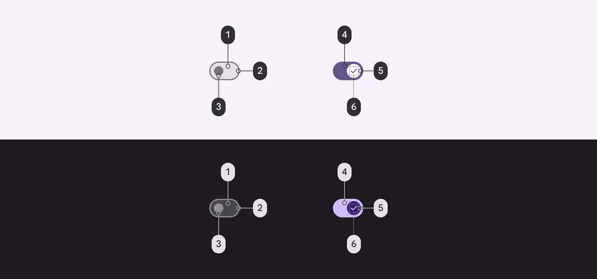
Switch color roles used for light and dark themes:
1. Surface container highest
2. Outline
3. Outline
4. Primary
5. On primary
6. On primary container
### Adjacent text label color
Use the [color role](../../styles/color/roles.md "Color roles are assigned to UI elements based on emphasis, container type, and relationship with other elements. This ensures proper contrast and usage in any color scheme.") **on surface** for adjacent text labels. This remains the same even if interacting with the label or component.
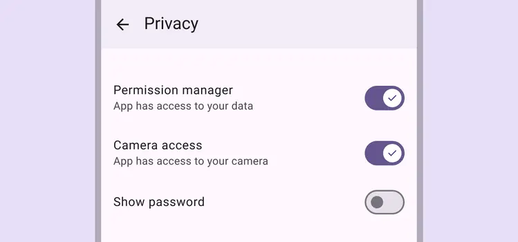
The text label uses **on surface**. Supporting text may use **on surface variant**.
## States
[States](../../foundations/interaction/states/overview.md "States show the interaction status of a component or UI element.") are visual representations used to communicate the status of a component or interactive element. [Learn more about interaction states](../../foundations/interaction/states/overview.md)
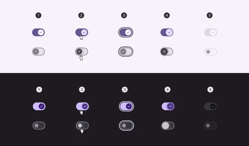
1. Enabled
2. Hovered
3. Focused
4. Pressed
5. Disabled
[State specs are in the token module above](#3708644e-b4d7-4237-bb0a-7afeeae4a9b0)
## Measurements
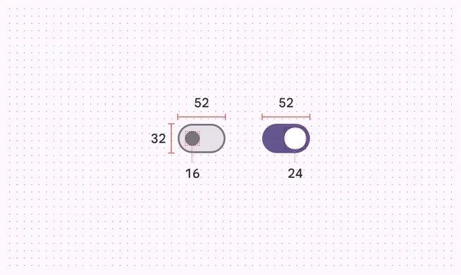
Switches without icons
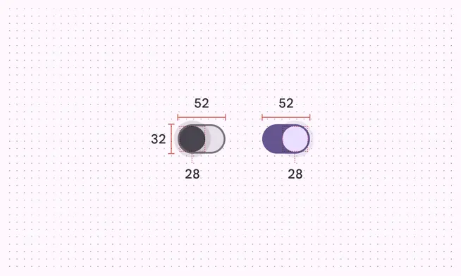
Pressed switches without icons
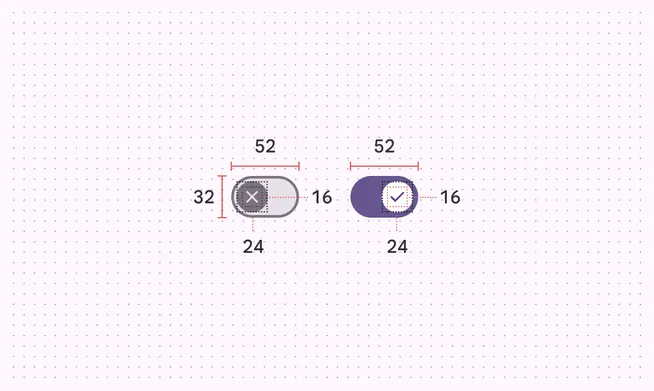
Switches with icons
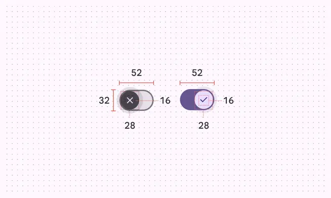
Pressed switches with icons
| Element | Attribute | Value |
| :---------: | :-----------------: | :--------------------------------------------------------------------------------------------------------: |
| Track | Height | 32dp |
| Track | Width | 52dp |
| Track | Outline width | 2dp |
| Track | Shape | [md.sys.shape.corner.full](../../styles/shape/corner-radius-scale.md#56e2bfb5-4bec-49bd-b3a3-bd822c8ab88e) |
| Handle | Height (unselected) | 16dp |
| Handle | Height - with icon | 24dp |
| Handle | Height (selected) | 24dp |
| Handle | Height (pressed) | 28dp |
| Handle | Width (unselected) | 16dp |
| Handle | Width - with icon | 24dp |
| Handle | Width (selected) | 24dp |
| Handle | Width (pressed) | 28dp |
| Handle | Shape | [md.sys.shape.corner.full](../../styles/shape/corner-radius-scale.md#56e2bfb5-4bec-49bd-b3a3-bd822c8ab88e) |
| State layer | Size | 40dp |
| State layer | Shape | [md.sys.shape.corner.full](../../styles/shape/corner-radius-scale.md#56e2bfb5-4bec-49bd-b3a3-bd822c8ab88e) |
| Target | Size | 48dp |
| Icon | Size (selected) | 16dp |
| Icon | Size (unselected) | 16dp |
## Configurations
1. Without icons
2. Icon on selected switch
3. Icon on selected and unselected switch