---
url: /components/segmented-buttons/accessibility.md
description: Segmented buttons help people select options, switch views, or sort elements.
---
# Segmented buttons
Segmented buttons help people select options, switch views, or sort elements.
[Overview](overview.md) · [Specs](specs.md) · [Guidelines](guidelines.md) · **Accessibility**
::: info Note
Segmented buttons are no longer recommended in the Material 3 expressive update. For those who have updated, use the [connected button group](../button-groups/overview.md) instead, which has mostly the same functionality but with an updated visual design.
:::
## Use cases
Users should be able to:
* Navigate to and activate segmented buttons with assistive tech
* Understand what each segment selection will do
### Interaction & style
For keyboard navigation, **Tab** navigates to the button, and arrow keys navigate between the individual segments.
For single-select segments, **Space** or **Enter** will select or unselect the [focused](../../foundations/interaction/states/applying-states.md#bfc1624f-6bcc-4306-b0c1-425e2d8a1bf9 "A focused state communicates when a user has highlighted an element, using an input method such as a keyboard or voice.") segment.
For multi-select segments, **Space** or **Enter** will:
* Select an unselected segment
* Select all of the segments
* Unselect a selected segment
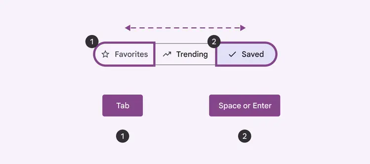
Use **Tab** to navigate through segments, and **Space **or **Enter** to select and unselect
### Color contrast
Segmented buttons are clusters of similar components, so the outline should have at least a 3:1 contrast ratio with the background or surface. This helps distinguish each button.
Both a checkmark icon and a color change are used to distinguish selection. Make sure color isn’t the only way to show selection.
::: tip Do
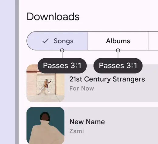
Use an outline with a surface contrast of at least 3:1
:::
::: danger Don't
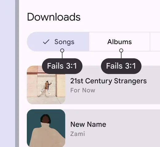
The segmented button shouldn't have a contrast outline less than 3:1
:::
### Initial focus
Focus will start in the first segment. Depending on the direction of the language, it is either the most left or the most right segment.
For single select and multi-select, the first segment will be focused regardless of selection state.
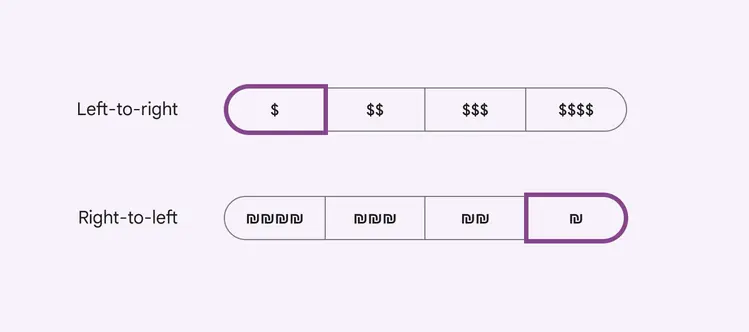
Focus begins on the left for left-to-right languages and on the right for right-to-left languages
### Keyboard navigation
| Keys | Actions |
| :--------------------- | :---------------------------- |
| **Tab** | Navigate between buttons |
| Arrow keys | Navigate inside the component |
| **Space** or **Enter** | Activate a focused button |
### Labeling elements
The [accessibility](../../foundations/overview/principles.md "Accessible design makes products usable for people with all kinds of abilities.") label for a segmented button comes from the visible label text on such as **Relevance** and **Distance**.
If the segmented button displays icons without label text, the accessibility label describes the action that the button is expressing, such as **Inexpensive** for one currency symbol.
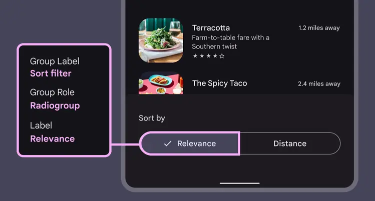
The label for segmented button matches the text label
Single-select segmented buttons behave like [radio buttons](../radio-button/overview.md "Radio buttons let people select one option from a set of options."): only one option can be selected at a time. The label is **Radiogroup**.
Multi-select buttons behave like [checkboxes](../checkbox/overview.md "Checkboxes let users select one or more items from a list, or turn an item on or off."): more than one option can be selected. The label is **Checkbox**.
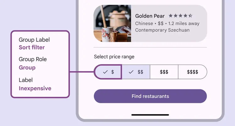
The role for the multi-select segmented button is **Checkbox**