---
url: /components/navigation-drawer/specs.md
description: >-
Navigation drawers let people switch between UI views on larger devices.
Navigation drawers provide access to destinations in your app.
---
# Navigation drawer
Navigation drawers let people switch between UI views on larger devices. Navigation drawers provide access to destinations in your app.
[Overview](overview.md) · **Specs** · [Guidelines](guidelines.md) · [Accessibility](accessibility.md)
::: info Note
The navigation drawer is no longer recommended in the Material 3 Expressive update. For those who have updated, use an [expanded navigation rail](../navigation-rail/overview.md), which has mostly the same functionality of the navigation drawer and adapts better across breakpoints.
:::
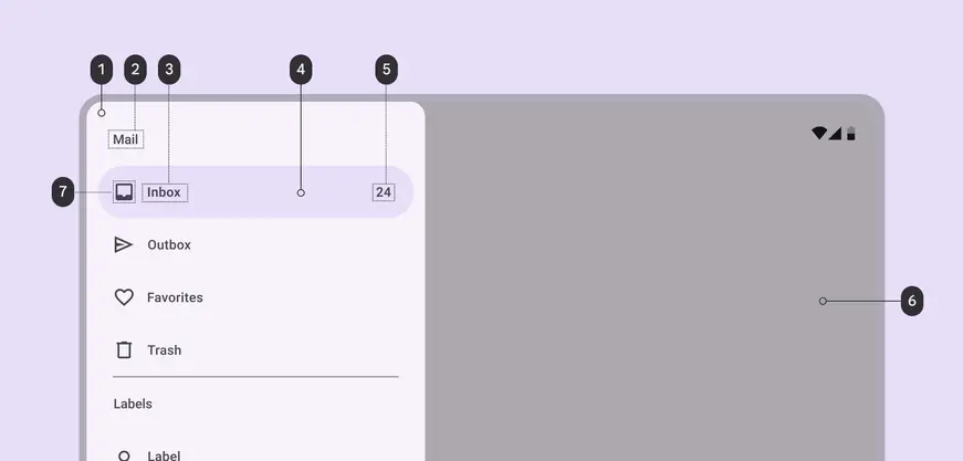
1. Container
2. Headline
3. Label text
4. Active indicator
5. Badge label text
6. Scrim
7. Icon
## Tokens & specs
The navigation drawer has one token set. [Learn about design tokens](../../foundations/design-tokens/overview.md)
::: token-table token-table-376969f91547be8e-43838e48
**Navigation drawer tokens** · 1 token set · 67 tokens · [live token table](https://m3.material.io/components/navigation-drawer/specs) · DSDB `TOKEN_TABLE.376969f91547be8e`
* Default context: Theme: Light · Platform: Android · Audience: 3P · Font: Static · Contrast: Default · iOS dark theme elevation: None · iOS weight setting: Default
* Not configurable here (group default used): Motion scheme: Standard · Language height: Small
* Other contexts: Theme: Dark · Contrast: Medium contrast, High contrast. "Other contexts" lists values that differ from the default when only that one context changes.
* Reference chain: aliases from the token to its source value (`token → alias → … → value`). "—" means the token holds a literal value.
**Navigation drawers (baseline)** · `md.comp.navigation-drawer` · 67 tokens
For the baseline navigation drawer. For expressive, use the expanded nav rail instead \`md.comp.nav-rail.expanded\`.
| Group | Token | Type | Reference chain | Resolved value | Other contexts |
| --- | --- | --- | --- | --- | --- |
| Enabled › Container | `md.comp.navigation-drawer.container.color` (deprecated) | Color | `md.sys.color.surface` → `md.ref.palette.neutral98` | `#FEF7FF` | Dark: `#141218` via `md.ref.palette.neutral6` |
| Enabled › Container | `md.comp.navigation-drawer.modal.container.color` | Color | `md.sys.color.surface-container-low` → `md.ref.palette.neutral96` | `#F7F2FA` | Dark: `#1D1B20` via `md.ref.palette.neutral10` |
| Enabled › Container | `md.comp.navigation-drawer.standard.container.color` | Color | `md.sys.color.surface` → `md.ref.palette.neutral98` | `#FEF7FF` | Dark: `#141218` via `md.ref.palette.neutral6` |
| Enabled › Container | `md.comp.navigation-drawer.container.surface-tint-layer.color` (deprecated) | Color | `md.sys.color.surface-tint` → `md.sys.color.primary` → `md.ref.palette.primary40` | `#6750A4` | Dark: `#D0BCFF` via `md.ref.palette.primary80`
Medium contrast: `#4F378B` via `md.ref.palette.primary30`
High contrast: `#381E72` via `md.ref.palette.primary20` |
| Enabled › Container | `md.comp.navigation-drawer.modal.container.elevation` | Elevation | `md.sys.elevation.level1` | `1dp` | — |
| Enabled › Container | `md.comp.navigation-drawer.standard.container.elevation` | Elevation | `md.sys.elevation.level0` | `0dp` | — |
| Enabled › Container | `md.comp.navigation-drawer.container.height` | Length | — | `100%` | — |
| Enabled › Container | `md.comp.navigation-drawer.container.shape` | Shape | `md.sys.shape.corner.large.end` | `Rounded corners: top-right 16dp, bottom-right 16dp` | — |
| Enabled › Container | `md.comp.navigation-drawer.bottom.container.shape` | Shape | `md.sys.shape.corner.large.top` | `Rounded corners: top-left 16dp, top-right 16dp` | — |
| Enabled › Container | `md.comp.navigation-drawer.container.width` | Length | — | `360dp` | — |
| Enabled › Label text | `md.comp.navigation-drawer.active.label-text.color` | Color | `md.sys.color.on-secondary-container` → `md.ref.palette.secondary30` | `#4A4458` | Dark: `#E8DEF8` via `md.ref.palette.secondary90`
Medium contrast: `#FFFFFF` via `md.ref.palette.secondary100`
High contrast: `#FFFFFF` via `md.ref.palette.secondary100` |
| Enabled › Label text | `md.comp.navigation-drawer.inactive.label-text.color` | Color | `md.sys.color.on-surface-variant` → `md.ref.palette.neutral-variant30` | `#49454F` | Dark: `#CAC4D0` via `md.ref.palette.neutral-variant80`
Medium contrast: `#322F37` via `md.ref.palette.neutral-variant20`
High contrast: `#000000` via `md.ref.palette.neutral-variant0` |
| Enabled › Label text | `md.comp.navigation-drawer.label-text.font` | Font names | `md.sys.typescale.label-large.font` → `md.ref.typeface.plain` | `Roboto` | — |
| Enabled › Label text | `md.comp.navigation-drawer.label-text.line-height` | Line height | `md.sys.typescale.label-large.line-height` | `20pt` | — |
| Enabled › Label text | `md.comp.navigation-drawer.label-text.size` | Font size | `md.sys.typescale.label-large.size` | `14pt` | — |
| Enabled › Label text | `md.comp.navigation-drawer.label-text.tracking` | Font tracking | `md.sys.typescale.label-large.tracking` | `0.1pt` | — |
| Enabled › Label text | `md.comp.navigation-drawer.label-text.weight` | Font weight | `md.sys.typescale.label-large.weight` → `md.ref.typeface.weight-medium` | `500` | — |
| Enabled › Label text | `md.comp.navigation-drawer.active.label-text.weight` | Font weight | `md.sys.typescale.label-large.weight.prominent` → `md.ref.typeface.weight-bold` | `700` | — |
| Enabled › Label text | `md.comp.navigation-drawer.label-text.type` | Typography | composite
font names: `md.comp.navigation-drawer.label-text.font` → `md.sys.typescale.label-large.font` → `md.ref.typeface.plain`
font weight: `md.comp.navigation-drawer.label-text.weight` → `md.sys.typescale.label-large.weight` → `md.ref.typeface.weight-medium`
font size: `md.comp.navigation-drawer.label-text.size` → `md.sys.typescale.label-large.size`
line height: `md.comp.navigation-drawer.label-text.line-height` → `md.sys.typescale.label-large.line-height`
font tracking: `md.comp.navigation-drawer.label-text.tracking` → `md.sys.typescale.label-large.tracking` | `Roboto · weight 500 · size 14pt · line height 20pt · tracking 0.1pt` | — |
| Enabled › Icon | `md.comp.navigation-drawer.active.icon.color` | Color | `md.sys.color.on-secondary-container` → `md.ref.palette.secondary30` | `#4A4458` | Dark: `#E8DEF8` via `md.ref.palette.secondary90`
Medium contrast: `#FFFFFF` via `md.ref.palette.secondary100`
High contrast: `#FFFFFF` via `md.ref.palette.secondary100` |
| Enabled › Icon | `md.comp.navigation-drawer.inactive.icon.color` | Color | `md.sys.color.on-surface-variant` → `md.ref.palette.neutral-variant30` | `#49454F` | Dark: `#CAC4D0` via `md.ref.palette.neutral-variant80`
Medium contrast: `#322F37` via `md.ref.palette.neutral-variant20`
High contrast: `#000000` via `md.ref.palette.neutral-variant0` |
| Enabled › Icon | `md.comp.navigation-drawer.icon.size` | Length | — | `24dp` | — |
| Enabled › Headline | `md.comp.navigation-drawer.headline.color` | Color | `md.sys.color.on-surface-variant` → `md.ref.palette.neutral-variant30` | `#49454F` | Dark: `#CAC4D0` via `md.ref.palette.neutral-variant80`
Medium contrast: `#322F37` via `md.ref.palette.neutral-variant20`
High contrast: `#000000` via `md.ref.palette.neutral-variant0` |
| Enabled › Headline | `md.comp.navigation-drawer.headline.font` | Font names | `md.sys.typescale.title-small.font` → `md.ref.typeface.plain` | `Roboto` | — |
| Enabled › Headline | `md.comp.navigation-drawer.headline.line-height` | Line height | `md.sys.typescale.title-small.line-height` | `20pt` | — |
| Enabled › Headline | `md.comp.navigation-drawer.headline.size` | Font size | `md.sys.typescale.title-small.size` | `14pt` | — |
| Enabled › Headline | `md.comp.navigation-drawer.headline.tracking` | Font tracking | `md.sys.typescale.title-small.tracking` | `0.1pt` | — |
| Enabled › Headline | `md.comp.navigation-drawer.headline.weight` | Font weight | `md.sys.typescale.title-small.weight` → `md.ref.typeface.weight-medium` | `500` | — |
| Enabled › Headline | `md.comp.navigation-drawer.headline.type` | Typography | composite
font names: `md.comp.navigation-drawer.headline.font` → `md.sys.typescale.title-small.font` → `md.ref.typeface.plain`
font weight: `md.comp.navigation-drawer.headline.weight` → `md.sys.typescale.title-small.weight` → `md.ref.typeface.weight-medium`
font size: `md.comp.navigation-drawer.headline.size` → `md.sys.typescale.title-small.size`
line height: `md.comp.navigation-drawer.headline.line-height` → `md.sys.typescale.title-small.line-height`
font tracking: `md.comp.navigation-drawer.headline.tracking` → `md.sys.typescale.title-small.tracking` | `Roboto · weight 500 · size 14pt · line height 20pt · tracking 0.1pt` | — |
| Enabled › Divider | `md.comp.navigation-drawer.divider.color` (deprecated) | Color | `md.sys.color.outline` → `md.ref.palette.neutral-variant50` | `#79747E` | Dark: `#938F99` via `md.ref.palette.neutral-variant60`
Medium contrast: `#49454F` via `md.ref.palette.neutral-variant30`
High contrast: `#322F37` via `md.ref.palette.neutral-variant20` |
| Enabled › Active indicator | `md.comp.navigation-drawer.active-indicator.color` | Color | `md.sys.color.secondary-container` → `md.ref.palette.secondary90` | `#E8DEF8` | Dark: `#4A4458` via `md.ref.palette.secondary30`
Medium contrast: `#625B71` via `md.ref.palette.secondary40`
High contrast: `#4A4458` via `md.ref.palette.secondary30` |
| Enabled › Active indicator | `md.comp.navigation-drawer.active-indicator.height` | Length | — | `56dp` | — |
| Enabled › Active indicator | `md.comp.navigation-drawer.active-indicator.shape` | Shape | `md.sys.shape.corner.full` | `Circular (fully rounded)` | — |
| Enabled › Active indicator | `md.comp.navigation-drawer.active-indicator.width` | Length | — | `336dp` | — |
| Enabled › Large badge label | `md.comp.navigation-drawer.large-badge-label.color` | Color | `md.sys.color.on-surface-variant` → `md.ref.palette.neutral-variant30` | `#49454F` | Dark: `#CAC4D0` via `md.ref.palette.neutral-variant80`
Medium contrast: `#322F37` via `md.ref.palette.neutral-variant20`
High contrast: `#000000` via `md.ref.palette.neutral-variant0` |
| Enabled › Large badge label | `md.comp.navigation-drawer.large-badge-label.font` | Font names | `md.sys.typescale.label-large.font` → `md.ref.typeface.plain` | `Roboto` | — |
| Enabled › Large badge label | `md.comp.navigation-drawer.large-badge-label.line-height` | Line height | `md.sys.typescale.label-large.line-height` | `20pt` | — |
| Enabled › Large badge label | `md.comp.navigation-drawer.large-badge-label.size` | Font size | `md.sys.typescale.label-large.size` | `14pt` | — |
| Enabled › Large badge label | `md.comp.navigation-drawer.large-badge-label.tracking` | Font tracking | `md.sys.typescale.label-large.tracking` | `0.1pt` | — |
| Enabled › Large badge label | `md.comp.navigation-drawer.large-badge-label.weight` | Font weight | `md.sys.typescale.label-large.weight` → `md.ref.typeface.weight-medium` | `500` | — |
| Enabled › Large badge label | `md.comp.navigation-drawer.large-badge-label.type` | Typography | composite
font names: `md.comp.navigation-drawer.large-badge-label.font` → `md.sys.typescale.label-large.font` → `md.ref.typeface.plain`
font weight: `md.comp.navigation-drawer.large-badge-label.weight` → `md.sys.typescale.label-large.weight` → `md.ref.typeface.weight-medium`
font size: `md.comp.navigation-drawer.large-badge-label.size` → `md.sys.typescale.label-large.size`
line height: `md.comp.navigation-drawer.large-badge-label.line-height` → `md.sys.typescale.label-large.line-height`
font tracking: `md.comp.navigation-drawer.large-badge-label.tracking` → `md.sys.typescale.label-large.tracking` | `Roboto · weight 500 · size 14pt · line height 20pt · tracking 0.1pt` | — |
| Enabled › \[Deprecated] Scrim | `md.comp.navigation-drawer.scrim.color` (deprecated) | Color | `md.ref.palette.neutral-variant20` | `#322F37` | — |
| Enabled › \[Deprecated] Scrim | `md.comp.navigation-drawer.scrim.opacity` (deprecated) | Opacity | — | `0.4` | — |
| Hovered › Label text | `md.comp.navigation-drawer.active.hover.label-text.color` | Color | `md.sys.color.on-secondary-container` → `md.ref.palette.secondary30` | `#4A4458` | Dark: `#E8DEF8` via `md.ref.palette.secondary90`
Medium contrast: `#FFFFFF` via `md.ref.palette.secondary100`
High contrast: `#FFFFFF` via `md.ref.palette.secondary100` |
| Hovered › Label text | `md.comp.navigation-drawer.inactive.hover.label-text.color` | Color | `md.sys.color.on-surface` → `md.ref.palette.neutral10` | `#1D1B20` | Dark: `#E6E0E9` via `md.ref.palette.neutral90`
Medium contrast: `#000000` via `md.ref.palette.neutral0`
High contrast: `#000000` via `md.ref.palette.neutral0` |
| Hovered › State layer | `md.comp.navigation-drawer.active.hover.state-layer.color` | Color | `md.sys.color.on-secondary-container` → `md.ref.palette.secondary30` | `#4A4458` | Dark: `#E8DEF8` via `md.ref.palette.secondary90`
Medium contrast: `#FFFFFF` via `md.ref.palette.secondary100`
High contrast: `#FFFFFF` via `md.ref.palette.secondary100` |
| Hovered › State layer | `md.comp.navigation-drawer.inactive.hover.state-layer.color` | Color | `md.sys.color.on-surface` → `md.ref.palette.neutral10` | `#1D1B20` | Dark: `#E6E0E9` via `md.ref.palette.neutral90`
Medium contrast: `#000000` via `md.ref.palette.neutral0`
High contrast: `#000000` via `md.ref.palette.neutral0` |
| Hovered › State layer | `md.comp.navigation-drawer.hover.state-layer.opacity` | Opacity | `md.sys.state.hover.state-layer-opacity` | `0.08` | — |
| Hovered › Icon | `md.comp.navigation-drawer.active.hover.icon.color` | Color | `md.sys.color.on-secondary-container` → `md.ref.palette.secondary30` | `#4A4458` | Dark: `#E8DEF8` via `md.ref.palette.secondary90`
Medium contrast: `#FFFFFF` via `md.ref.palette.secondary100`
High contrast: `#FFFFFF` via `md.ref.palette.secondary100` |
| Hovered › Icon | `md.comp.navigation-drawer.inactive.hover.icon.color` | Color | `md.sys.color.on-surface` → `md.ref.palette.neutral10` | `#1D1B20` | Dark: `#E6E0E9` via `md.ref.palette.neutral90`
Medium contrast: `#000000` via `md.ref.palette.neutral0`
High contrast: `#000000` via `md.ref.palette.neutral0` |
| Focused › Label text | `md.comp.navigation-drawer.active.focus.label-text.color` | Color | `md.sys.color.on-secondary-container` → `md.ref.palette.secondary30` | `#4A4458` | Dark: `#E8DEF8` via `md.ref.palette.secondary90`
Medium contrast: `#FFFFFF` via `md.ref.palette.secondary100`
High contrast: `#FFFFFF` via `md.ref.palette.secondary100` |
| Focused › Label text | `md.comp.navigation-drawer.inactive.focus.label-text.color` | Color | `md.sys.color.on-surface` → `md.ref.palette.neutral10` | `#1D1B20` | Dark: `#E6E0E9` via `md.ref.palette.neutral90`
Medium contrast: `#000000` via `md.ref.palette.neutral0`
High contrast: `#000000` via `md.ref.palette.neutral0` |
| Focused › State layer | `md.comp.navigation-drawer.active.focus.state-layer.color` | Color | `md.sys.color.on-secondary-container` → `md.ref.palette.secondary30` | `#4A4458` | Dark: `#E8DEF8` via `md.ref.palette.secondary90`
Medium contrast: `#FFFFFF` via `md.ref.palette.secondary100`
High contrast: `#FFFFFF` via `md.ref.palette.secondary100` |
| Focused › State layer | `md.comp.navigation-drawer.inactive.focus.state-layer.color` | Color | `md.sys.color.on-surface` → `md.ref.palette.neutral10` | `#1D1B20` | Dark: `#E6E0E9` via `md.ref.palette.neutral90`
Medium contrast: `#000000` via `md.ref.palette.neutral0`
High contrast: `#000000` via `md.ref.palette.neutral0` |
| Focused › State layer | `md.comp.navigation-drawer.focus.state-layer.opacity` | Opacity | `md.sys.state.focus.state-layer-opacity` | `0.1` | — |
| Focused › Icon | `md.comp.navigation-drawer.active.focus.icon.color` | Color | `md.sys.color.on-secondary-container` → `md.ref.palette.secondary30` | `#4A4458` | Dark: `#E8DEF8` via `md.ref.palette.secondary90`
Medium contrast: `#FFFFFF` via `md.ref.palette.secondary100`
High contrast: `#FFFFFF` via `md.ref.palette.secondary100` |
| Focused › Icon | `md.comp.navigation-drawer.inactive.focus.icon.color` | Color | `md.sys.color.on-surface` → `md.ref.palette.neutral10` | `#1D1B20` | Dark: `#E6E0E9` via `md.ref.palette.neutral90`
Medium contrast: `#000000` via `md.ref.palette.neutral0`
High contrast: `#000000` via `md.ref.palette.neutral0` |
| Focused › Focus indicator | `md.comp.navigation-drawer.focus.indicator.color` | Color | `md.sys.color.secondary` → `md.ref.palette.secondary40` | `#625B71` | Dark: `#CCC2DC` via `md.ref.palette.secondary80`
Medium contrast: `#4A4458` via `md.ref.palette.secondary30`
High contrast: `#332D41` via `md.ref.palette.secondary20` |
| Focused › Focus indicator | `md.comp.navigation-drawer.focus.indicator.thickness` | Length | `md.sys.state.focus-indicator.thickness` | `3dp` | — |
| Focused › Focus indicator | `md.comp.navigation-drawer.focus.indicator.outline.offset` | Length | `md.sys.state.focus-indicator.inner-offset` | `-3dp` | — |
| Pressed (ripple) › Label text | `md.comp.navigation-drawer.active.pressed.label-text.color` | Color | `md.sys.color.on-secondary-container` → `md.ref.palette.secondary30` | `#4A4458` | Dark: `#E8DEF8` via `md.ref.palette.secondary90`
Medium contrast: `#FFFFFF` via `md.ref.palette.secondary100`
High contrast: `#FFFFFF` via `md.ref.palette.secondary100` |
| Pressed (ripple) › Label text | `md.comp.navigation-drawer.inactive.pressed.label-text.color` | Color | `md.sys.color.on-surface` → `md.ref.palette.neutral10` | `#1D1B20` | Dark: `#E6E0E9` via `md.ref.palette.neutral90`
Medium contrast: `#000000` via `md.ref.palette.neutral0`
High contrast: `#000000` via `md.ref.palette.neutral0` |
| Pressed (ripple) › State layer | `md.comp.navigation-drawer.active.pressed.state-layer.color` | Color | `md.sys.color.on-secondary-container` → `md.ref.palette.secondary30` | `#4A4458` | Dark: `#E8DEF8` via `md.ref.palette.secondary90`
Medium contrast: `#FFFFFF` via `md.ref.palette.secondary100`
High contrast: `#FFFFFF` via `md.ref.palette.secondary100` |
| Pressed (ripple) › State layer | `md.comp.navigation-drawer.inactive.pressed.state-layer.color` | Color | `md.sys.color.on-secondary-container` → `md.ref.palette.secondary30` | `#4A4458` | Dark: `#E8DEF8` via `md.ref.palette.secondary90`
Medium contrast: `#FFFFFF` via `md.ref.palette.secondary100`
High contrast: `#FFFFFF` via `md.ref.palette.secondary100` |
| Pressed (ripple) › State layer | `md.comp.navigation-drawer.pressed.state-layer.opacity` | Opacity | `md.sys.state.pressed.state-layer-opacity` | `0.1` | — |
| Pressed (ripple) › Icon | `md.comp.navigation-drawer.active.pressed.icon.color` | Color | `md.sys.color.on-secondary-container` → `md.ref.palette.secondary30` | `#4A4458` | Dark: `#E8DEF8` via `md.ref.palette.secondary90`
Medium contrast: `#FFFFFF` via `md.ref.palette.secondary100`
High contrast: `#FFFFFF` via `md.ref.palette.secondary100` |
| Pressed (ripple) › Icon | `md.comp.navigation-drawer.inactive.pressed.icon.color` | Color | `md.sys.color.on-surface` → `md.ref.palette.neutral10` | `#1D1B20` | Dark: `#E6E0E9` via `md.ref.palette.neutral90`
Medium contrast: `#000000` via `md.ref.palette.neutral0`
High contrast: `#000000` via `md.ref.palette.neutral0` |
:::
## Color
Color values are implemented through [design tokens](../../foundations/design-tokens/overview.md "Design tokens are the building blocks of all UI elements. The same tokens are used in designs, tools, and code."). For design, this means working with color values that correspond with tokens. For implementation, a color value will be a token that references a value. [Learn more about design tokens](../../foundations/design-tokens/overview.md)
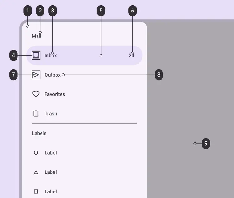
Navigation drawer color roles used for light and dark schemes:
1. Surface container low
2. On surface variant
3. On secondary container
4. On secondary container
5. Secondary container
6. On secondary container
7. On surface variant
8. On surface variant
9. Scrim
For divider color roles, go to [divider specs](../divider/specs.md).
## States
[States](../../foundations/interaction/states/overview.md "States show the interaction status of a component or UI element.") are visual representations used to communicate the status of a component or interactive element. [Learn more about interaction states](../../foundations/interaction/states/overview.md)
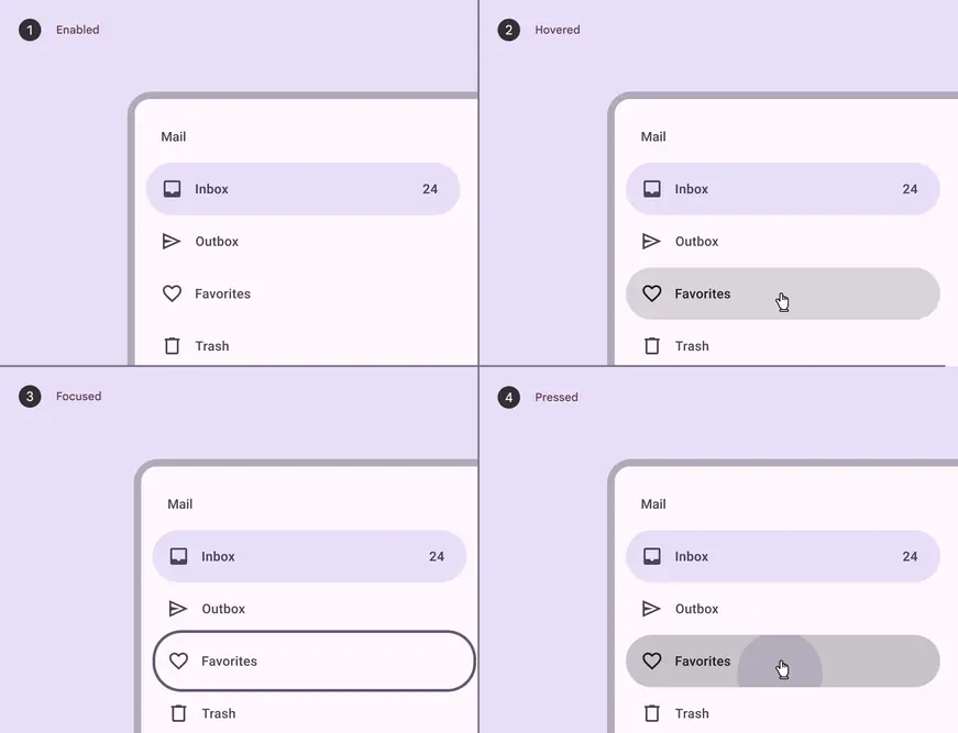
Navigation drawer states:
1. Enabled
2. Hovered
3. Focused
4. Pressed
[State specs are in the tokens module above](#6207b00f-a259-41d2-8146-b6efc6380976)
## Measurements
### Standard navigation drawer
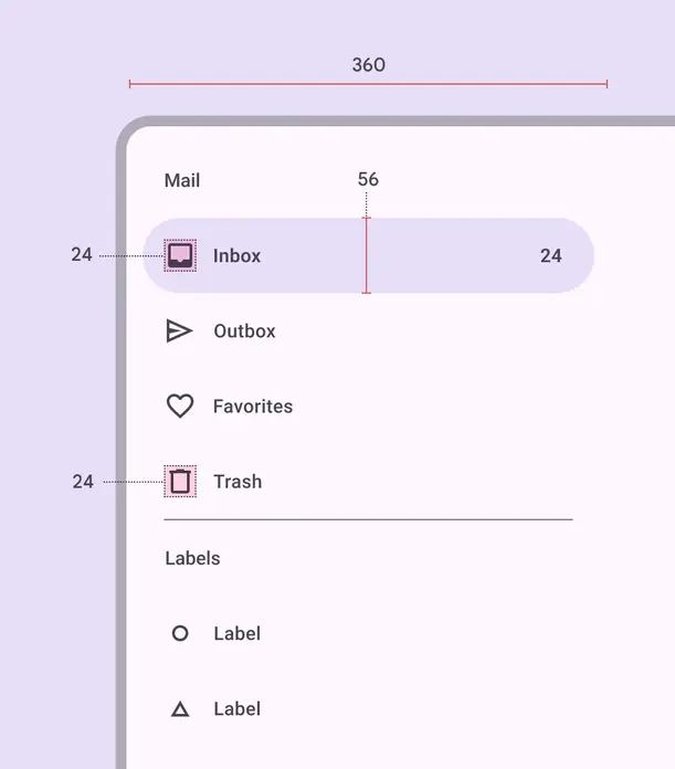
Element size measurements
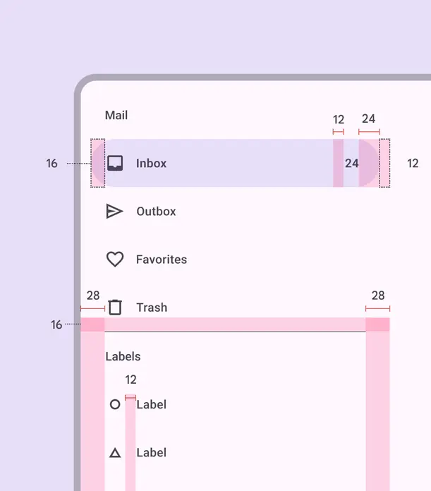
Padding and margins
| Attribute | Value |
| :------------------------: | :----------------------: |
| Container height | 100% |
| Container width | 360dp |
| Container shape | 0,16,16,0dp corner radii |
| Icon size | 24dp |
| Active indicator height | 56dp |
| Active indicator shape | 28dp |
| Active indicator width | 336dp |
| Horizontal label alignment | Start-aligned |
| Left padding | 28dp |
| Right padding | 28dp |
| Active indicator padding | 12dp |
| Padding between elements | 0dp |
### Modal navigation drawer
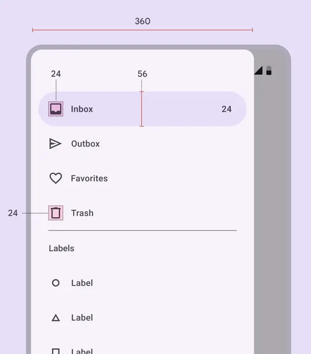
Element size measurements
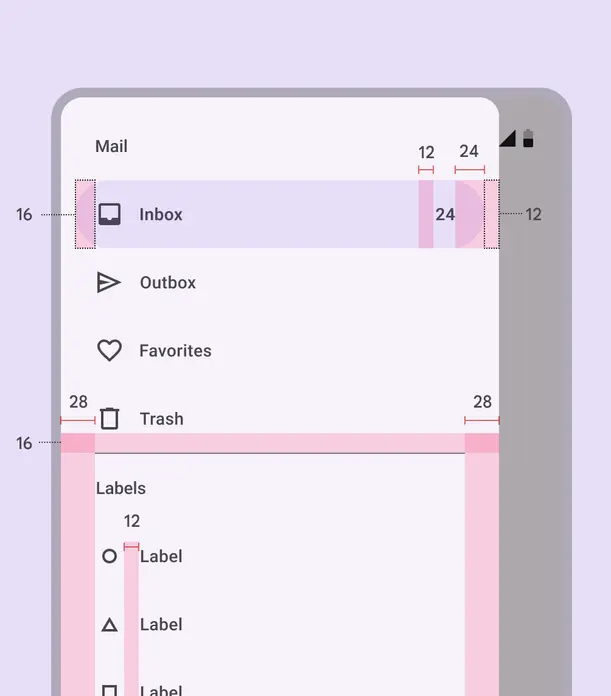
Padding and margins
| Attribute | Value |
| :------------------------: | :-----------: |
| Container height | 100% |
| Container width | 360dp |
| Icon size | 24dp |
| Active indicator height | 56dp |
| Active indicator shape | 28dp |
| Active indicator width | 336dp |
| Horizontal label alignment | Start-aligned |
| Left padding | 28dp |
| Right padding | 28dp |
| Active indicator padding | 12dp |
| Padding between elements | 0dp |