---
url: /components/navigation-bar/guidelines.md
description: >-
Navigation bars let people switch between UI views on smaller devices. They’re
a common navigation component on handheld screens.
---
# Navigation bar
Navigation bars let people switch between UI views on smaller devices. They’re a common navigation component on handheld screens.
[Overview](overview.md) · [Specs](specs.md) · **Guidelines** · [Accessibility](accessibility.md)
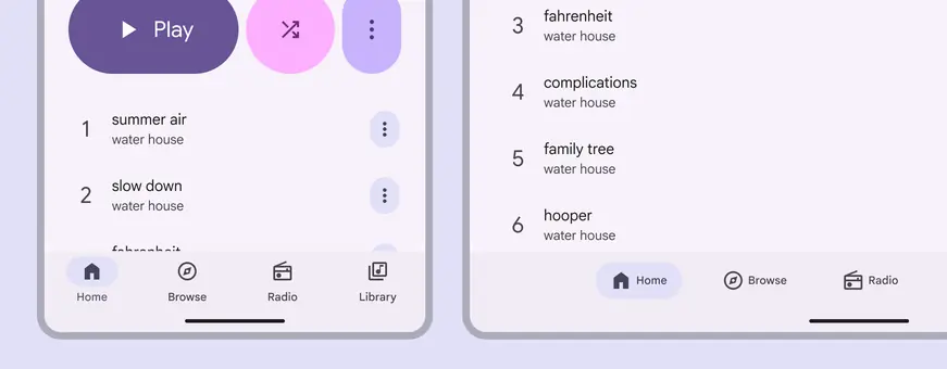
Navigation bars adapt to different breakpoints
## Usage
Navigation bars provide access to three to five destinations. The nav bar is positioned at the bottom of windows for convenient access.
Each destination is represented by an icon and label text. One navigation destination is always active.
When a navigation bar icon is tapped or focused, people are taken to the navigation destination associated with that icon.
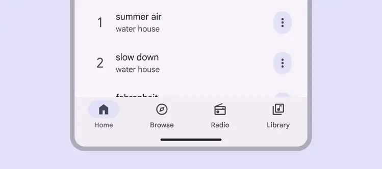
Navigation bars can have three to five destinations
Navigation bars should be used for:
* Three to five main pages in the product
* Mobile or tablet only
Navigation bars shouldn’t be used for accessing single tasks, such as viewing one email.
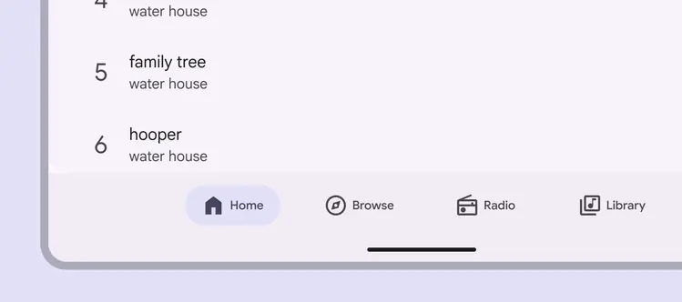
On mobile or tablet, navigation bars should be used for top-level destinations
The navigation items can be **vertical** or **horizontal**.
* Use vertical items in [compact windows](../../foundations/layout/breakpoints/compact.md "Window widths smaller than 600dp, such as a phone in portrait orientation."), like mobile
* Use horizontal items in [medium windows](../../foundations/layout/breakpoints/medium.md "Window widths from 600dp to 839dp, such as a tablet or foldable in portrait orientation."), like tablets
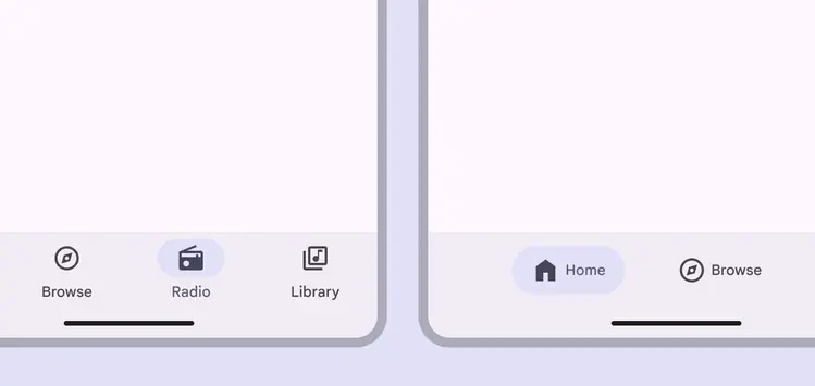
Vertical navigation items work best in compact windows. Horizontal items work best in medium windows.
For products with more than five navigation items, don’t use a navigation bar; the elements may collide and there likely won’t be enough space for translated text.
Instead, consider using [tabs](../tabs/overview.md "Tabs organize content across different screens and views.") to organize similar content within a page, or hide the navigation behind a menu icon using a [modal expanded navigation rail](../navigation-rail/overview.md "Navigation rails let people switch between UI views on mid-sized devices.").
::: danger Don't
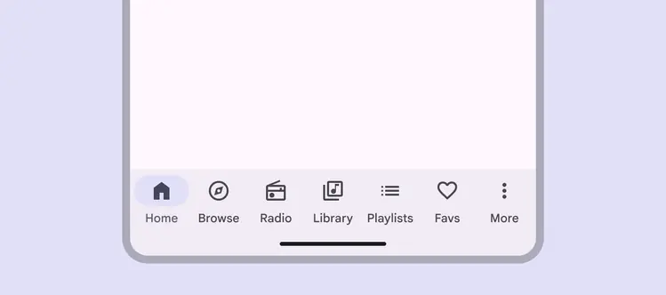
Avoid putting more than five navigation items in a navigation bar
:::
::: danger Don't
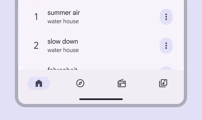
Don’t remove the labels from navigation items
:::
::: danger Don't
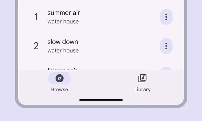
Don’t use a navigation bar for fewer than three destinations. Instead, use tabs.
:::
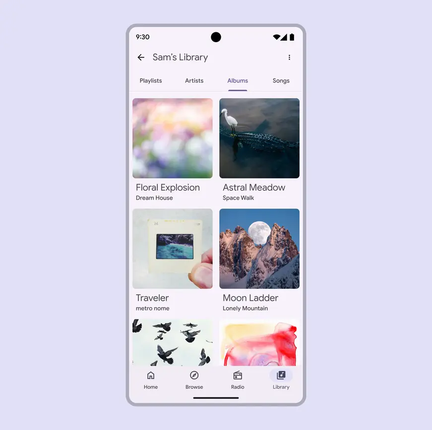
Use navigation for distinct pages and tabs for related content within a page
::: danger Don't

Navigation bar destinations have fixed positions. Don’t scroll them or modify their positions.
:::
## Anatomy
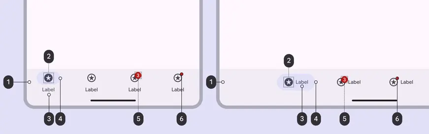
1. Container
2. Icon
3. Label text
4. Active indicator
5. Large badge (optional)
6. Small badge (optional)
### Container
The container should always be placed at the bottom of the product and span the full length of the window. Navigation items are centered within the container.
The container has a color fill to provide separation from other content.
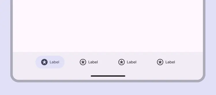
The navigation bar container holds all elements
### Navigation items
Navigation items hold all elements for each destination: the icon, label text, and active indicator. They can be **vertical**, with the text below the icon and indicator, or **horizontal**, with the icon and text beside each other inside the indicator.
Vertical items are best in [compact windows](../../foundations/layout/breakpoints/compact.md "Window widths smaller than 600dp, such as a phone in portrait orientation."), and horizontal items are best in [medium windows](../../foundations/layout/breakpoints/medium.md "Window widths from 600dp to 839dp, such as a tablet or foldable in portrait orientation").
Horizontal items are centered in the nav bar with outer margins.
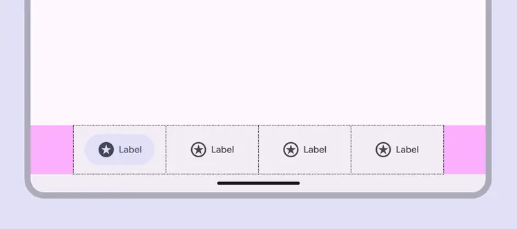
The navigation bar is divided into equal-width segments with padding from the window edge
### Icons
Navigation rail items must use icons that symbolize the content of their page. Browse [popular icon](https://fonts.google.com/icons).
Use a filled icon for the active destination and outlined icons for inactive destinations. If an icon doesn’t have a filled version, apply **semibold** weight to the icon instead.
::: tip Do
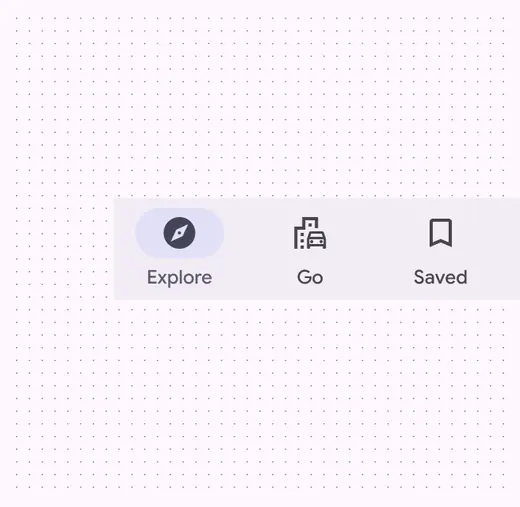
Use filled icons when the navigation item is active
:::
::: warning Caution
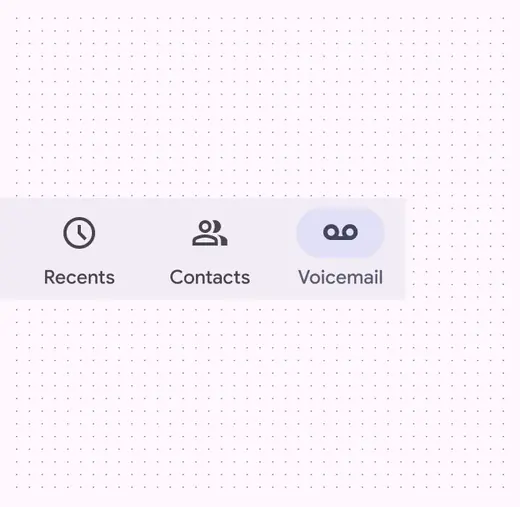
If a filled version of an icon is unavailable, the icon’s weight must increase
:::
Active and inactive icons must have a minimum 3:1 contrast ratio with the container.
::: danger Don't
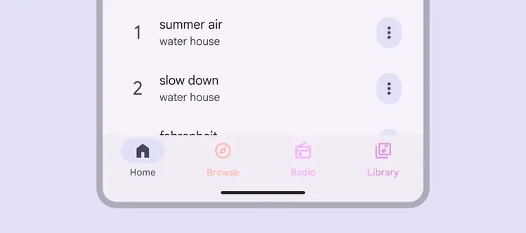
Don’t use multiple or low-contrast colors in a navigation bar, as they make it harder for people to distinguish the active item and navigate to other destinations
:::
### Active indicator
The active indicator shows which page from the nav bar is currently being displayed.
::: tip Do
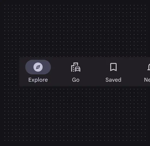
Use the active indicator only for the active destination
:::
::: danger Don't
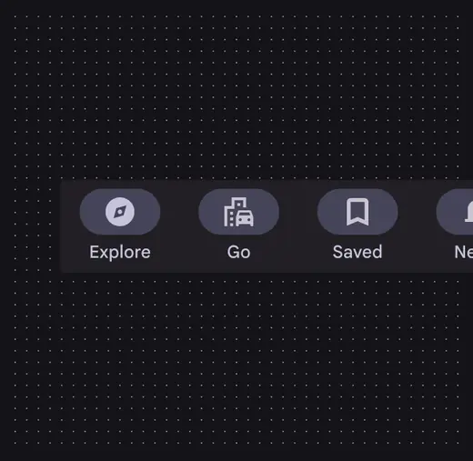
Don’t use the active indicator for more than one destination at a time
:::
### Label text
The label text should be a short, meaningful description of each navigation destination and another way for people to understand an icon’s meaning.
All navigation items require a label text. It should be 1-2 words.
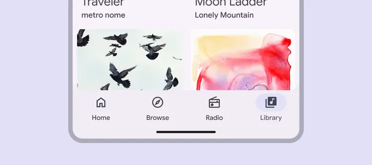
Label text must be brief and clear
::: tip Do
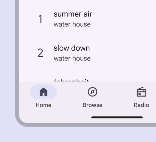
Use brief text labels to identify the purpose of a destination
:::
::: danger Don't
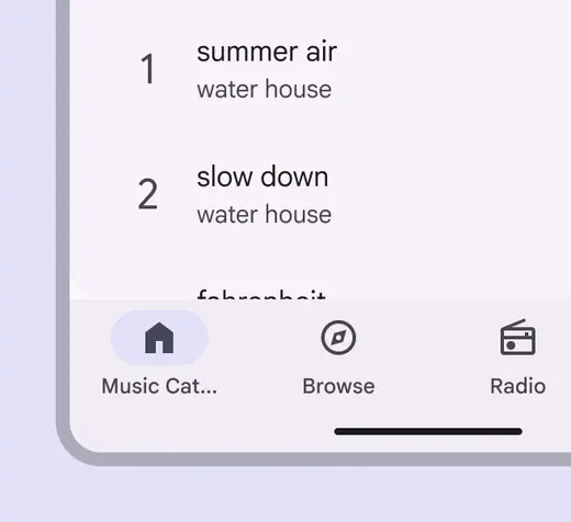
Don’t wrap or truncate text as it can make the label hard to understand
:::
::: danger Don't
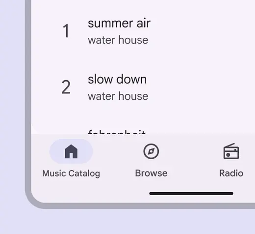
Don’t shrink longer text to fit on a single line
:::
### Badges (optional)
Navigation bars can display badges in the upper right corners of the destination icon.
Badges can contain dynamic information, such as the number of new messages.
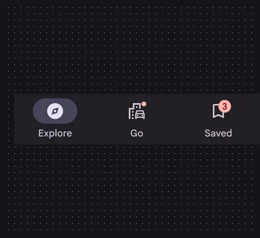
Use a small badge to indicate an update, and a large badge to show the amount of updates
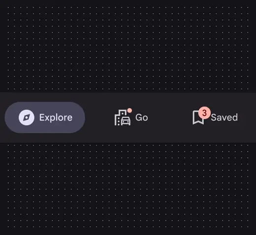
Badges overlap the icon in both vertical and horizontal navigation items
## Placement
The floating action button (FAB) is placed above the navigation bar. Nav bars are always placed at the bottom of the window.
::: tip Do
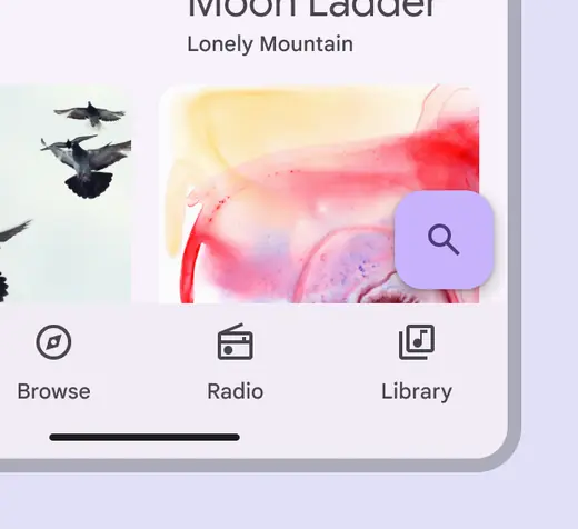
The FAB should be right-aligned above the navigation bar
:::
::: danger Don't
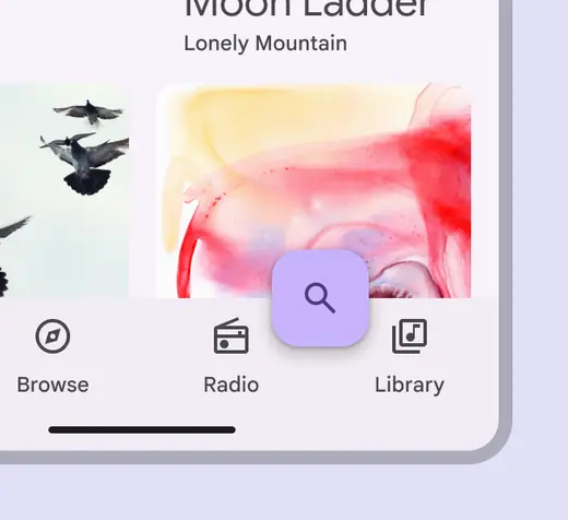
Don’t cover the navigation bar with a FAB
:::
Navigation bars can be temporarily covered by dialogs, bottom sheets, navigation drawers, the on-screen keyboard, or other elements needed to complete a flow. They should not be permanently obstructed on any screen.
The search feature of the screen triggers the on-screen keyboard, temporarily covering the bottom navigation bar until the search flow is completed
## Adaptive design
Adaptive design allows an interface to respond or change based on context, such as the user, device, and usage. More on [adaptive design](../../foundations/layout/layout-overview/adaptive-design.md)
### Resizing
Only use navigation bars for [compact](../../foundations/layout/breakpoints/compact.md "Window widths smaller than 600dp, such as a phone in portrait orientation.") and [medium](../../foundations/layout/breakpoints/medium.md "Window widths from 600dp to 839dp, such as a tablet or foldable in portrait orientation.") breakpoints.
**Compact**: For narrow windows, use a navigation bar or modal navigation rail.
**Medium**: Use a navigation bar or navigation rail. Decide based on whether horizontal or vertical space is more important.
**Expanded and extra-large**: Use a navigation rail instead. Decide based on available window space and the number of navigation destinations.
Navigation bars are best suited for compact and medium breakpoints
The navigation bar container spans 100% of the window width.
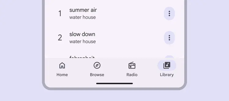
Navigation bars use 100% of the screen width
The navigation bar is used on smaller devices. It’s not intended for desktop.
::: danger Don't
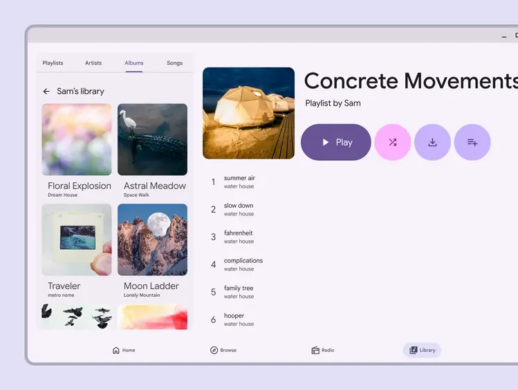
Don’t use navigation bars for desktop layouts. Instead, use a navigation rail or tabs.
:::
### Presentation
In medium breakpoints, use horizontal nav items to better use available space.
Horizontal nav items should remain centered with the same padding at each breakpoint.
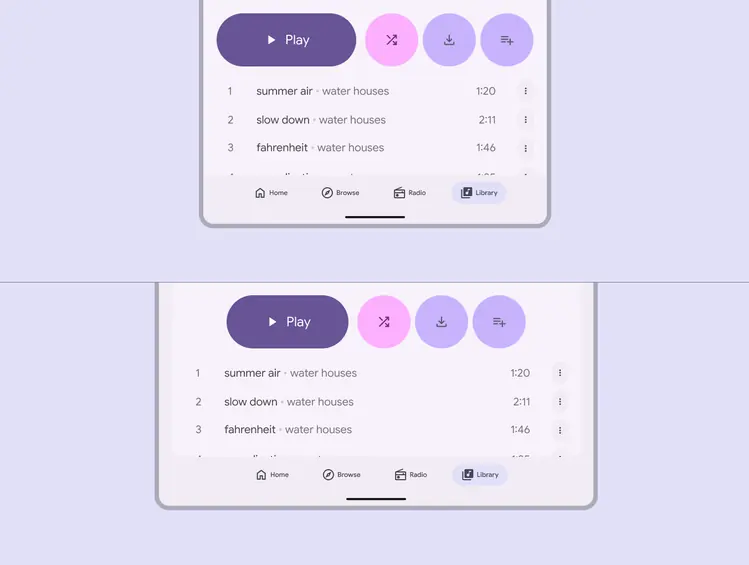
A navigation bar in horizontal orientation keeps the same spacing between destinations
## Behavior
### Navigation
When selecting a navigation bar item not currently selected, the product navigates to that destination’s screen using a [top level](../../styles/motion/transitions/transition-patterns.md#f852afd2-396f-49fd-a265-5f6d96680e16) transition pattern. It can either remember where you left off, or reset to the default view.
1. **Preserve state**: If someone has interacted with this destination, it returns to their scroll position, current tab, and in-line search status.
2. **Reset state**: Any prior user interactions are reset, including scroll position, tab selection, and in-line search.
Choose the behavior that best suits the product and user needs. For example, an app that requires frequent switching between sections should preserve each section’s state.
After selecting an item on the bottom navigation bar, the app navigates to that destination’s screen
Re-selecting the currently active destination should reset the scroll position to the top of the page.
**Don't swipe between destinations**
Swiping across the screen does not navigate between destinations, and is not supported by the navigation bar. Swipe behavior should be reserved for related items, such as cards in a carousel, or actions such as archiving a list item.
Selecting the already selected navigation item scrolls to the top of the screen
### Scrolling
Upon scroll, the navigation bar can appear or disappear.
Don’t hide the navigation bar on scroll when a [screen reader](../../foundations/overview/assistive-technology.md#ec6f3e84-a51c-4dc0-a353-6844f5bde698) is active.
Scrolling downward can hide the navigation bar; scrolling upward reveals it
### Selection
The icon becomes filled and the active indicator expands from the center of the icon when switching between destinations.
The active indicator animation should only apply on one axis to better represent a flat, shared plane.
An active indicator appears when the item is selected.
When a destination is tapped, the destination screens use a [top level](../../styles/motion/transitions/transition-patterns.md#f852afd2-396f-49fd-a265-5f6d96680e16) transition pattern. In addition, the icon becomes filled and the active indicator expands from the center of the icon.
Tapping a destination uses a top level transition pattern