---
url: /components/menus/specs.md
description: >-
Menus display a list of choices on a temporary surface. Menus can open from a
variety of components, including icon buttons and text fields.
---
# Menus
Menus display a list of choices on a temporary surface. Menus can open from a variety of components, including icon buttons and text fields.
[Overview](overview.md) · **Specs** · [Guidelines](guidelines.md) · [Accessibility](accessibility.md)
## Variants
### Vertical menus
Use vertical menus for a more expressive look and feel, including rounded corners, standard and vibrant color styles, more selection states, and submenu motion.
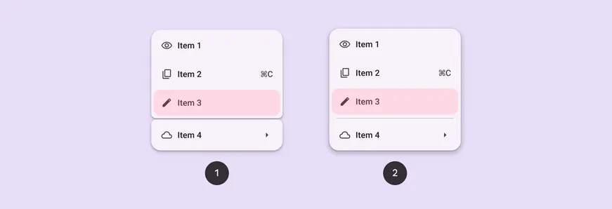
1. Vertical menu with gap
2. Vertical menu with divider
### Baseline variant
In M3 Expressive, [baseline](https://m3.material.io/blog/building-with-m3-expressive "Baseline variants are the original M3 component designs. They may not have the latest features introduced in M3 Expressive, like updated motion, shapes, type, and styles.") menu is still available to use, but doesn’t have the latest shapes, color styles, selection states, and motion. [See baseline menu specs](#a80df2f9-8610-4ce0-b3a3-b9ee749d5c98)

A baseline **menu** has square corners, as compared to a **vertical menu’s** round corners and expressive styling
| **Variant** | **M3** | **M3 Expressive** |
| :-----------------------------------------------------------------------------------------------------------------------------------------------------------------------------------------------------------------------------------------------------: | :-------: | :---------------: |
| Vertical menus | -- | Available |
| Menu ([baseline](https://m3.material.io/blog/building-with-m3-expressive "Baseline variants are the original M3 component designs. They may not have the latest features introduced in M3 Expressive, like updated motion, shapes, type, and styles.")) | Available | Available |
## Configurations
### Vertical menus layout
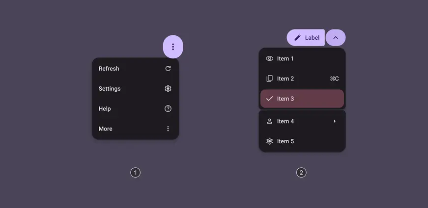
1. Standard
2. Grouped
| **Category
** | **Configuration
** | **M3** | **M3 Expressiv**__e__ |
| :--------------: | :-------------------: | :-------: | --------------------- |
| Color | Standard | Available | Available |
| Color | Vibrant | -- | Available |
| Layout | Standard | Available | Available |
| Layout | Grouped | -- | Available |
## Tokens & specs
Browse the component elements, attributes, tokens, and their values. [Learn about design tokens](../../foundations/design-tokens/overview.md)
::: token-table token-table-385a28e5d3bb3dd0-0cc26be5
**Menus tokens** · 3 token sets · 213 tokens · [live token table](https://m3.material.io/components/menus/specs) · DSDB `TOKEN_TABLE.385a28e5d3bb3dd0`
* Default context: Theme: Light · Platform: Android · Audience: 3P · Font: Static · Contrast: Default · iOS dark theme elevation: None · iOS weight setting: Default
* Not configurable here (group default used): Motion scheme: Standard · Language height: Small
* Other contexts: Theme: Dark · Contrast: Medium contrast, High contrast. "Other contexts" lists values that differ from the default when only that one context changes.
* Reference chain: aliases from the token to its source value (`token → alias → … → value`). "—" means the token holds a literal value.
**Menus - Common** · `md.comp.menus` · 59 tokens
Common tokens for expressive menus. For baseline menus, use "Menu (baseline)" tokens \`md.comp.menu\`.
| Group | Token | Type | Reference chain | Resolved value | Other contexts |
| --- | --- | --- | --- | --- | --- |
| Typography | `md.comp.menus.menu-item.label-text.font` | Font names | `md.sys.typescale.label-large.font` → `md.ref.typeface.plain` | `Roboto` | — |
| Typography | `md.comp.menus.menu-item.label-text.line-height` | Line height | `md.sys.typescale.label-large.line-height` | `20pt` | — |
| Typography | `md.comp.menus.menu-item.label-text.size` | Font size | `md.sys.typescale.label-large.size` | `14pt` | — |
| Typography | `md.comp.menus.menu-item.label-text.tracking` | Font tracking | `md.sys.typescale.label-large.tracking` | `0.1pt` | — |
| Typography | `md.comp.menus.menu-item.label-text.weight` | Font weight | `md.sys.typescale.label-large.weight` → `md.ref.typeface.weight-medium` | `500` | — |
| Typography | `md.comp.menus.menu-item.supporting-text.font` | Font names | `md.sys.typescale.body-small.font` → `md.ref.typeface.plain` | `Roboto` | — |
| Typography | `md.comp.menus.menu-item.supporting-text.line-height` | Line height | `md.sys.typescale.body-small.line-height` | `16pt` | — |
| Typography | `md.comp.menus.menu-item.supporting-text.size` | Font size | `md.sys.typescale.body-small.size` | `12pt` | — |
| Typography | `md.comp.menus.menu-item.supporting-text.tracking` | Font tracking | `md.sys.typescale.body-small.tracking` | `0.4pt` | — |
| Typography | `md.comp.menus.menu-item.supporting-text.weight` | Font weight | `md.sys.typescale.body-small.weight` → `md.ref.typeface.weight-regular` | `400` | — |
| Typography | `md.comp.menus.menu-item.trailing-supporting-text.font` | Font names | `md.sys.typescale.label-large.font` → `md.ref.typeface.plain` | `Roboto` | — |
| Typography | `md.comp.menus.menu-item.trailing-supporting-text.line-height` | Line height | `md.sys.typescale.label-large.line-height` | `20pt` | — |
| Typography | `md.comp.menus.menu-item.trailing-supporting-text.size` | Font size | `md.sys.typescale.label-large.size` | `14pt` | — |
| Typography | `md.comp.menus.menu-item.trailing-supporting-text.tracking` | Font tracking | `md.sys.typescale.label-large.tracking` | `0.1pt` | — |
| Typography | `md.comp.menus.menu-item.trailing-supporting-text.weight` | Font weight | `md.sys.typescale.label-large.weight` → `md.ref.typeface.weight-medium` | `500` | — |
| Shape › Selected | `md.comp.menus.menu-item.selected.shape` | Shape | `md.sys.shape.corner.medium` | `Rounded corners 12dp` | — |
| Shape › Horizontal, Default | `md.comp.menus.horizontal.menu-item.hovered.shape` | Shape | `md.sys.shape.corner.medium` | `Rounded corners 12dp` | — |
| Shape › Horizontal, Default | `md.comp.menus.horizontal.menu-item.focused.shape` | Shape | `md.sys.shape.corner.medium` | `Rounded corners 12dp` | — |
| Shape › Horizontal, Default | `md.comp.menus.horizontal.menu-item.pressed.shape` | Shape | `md.sys.shape.corner.medium` | `Rounded corners 12dp` | — |
| Shape › Horizontal, Default | `md.comp.menus.horizontal.container.shape` | Shape | `md.sys.shape.corner.full` | `Circular (fully rounded)` | — |
| Shape › Horizontal, Selected | `md.comp.menus.horizontal.menu-item.selected.focused.shape` | Shape | `md.sys.shape.corner.full` | `Circular (fully rounded)` | — |
| Shape › Horizontal, Selected | `md.comp.menus.horizontal.menu-item.selected.pressed.shape` | Shape | `md.sys.shape.corner.full` | `Circular (fully rounded)` | — |
| Shape › Horizontal, Selected | `md.comp.menus.horizontal.menu-item.selected.hovered.shape` | Shape | `md.sys.shape.corner.full` | `Circular (fully rounded)` | — |
| Shape › Horizontal icon-only, selected | `md.comp.menus.horizontal.icon-only.menu-item.selected.shape` | Shape | `md.sys.shape.corner.full` | `Circular (fully rounded)` | — |
| Shape › Default | `md.comp.menus.active.container.shape` | Shape | `md.sys.shape.corner.large` | `Rounded corners 16dp` | — |
| Shape › Default | `md.comp.menus.inactive.container.shape` | Shape | `md.sys.shape.corner.small` | `Rounded corners 8dp` | — |
| Shape › Default | `md.comp.menus.group.shape` | Shape | `md.sys.shape.corner.small` | `Rounded corners 8dp` | — |
| Shape › Default | `md.comp.menus.menu-item.shape` | Shape | `md.sys.shape.corner.extra-small` | `Rounded corners 4dp` | — |
| Shape › Default | `md.comp.menus.menu-item.first-child.shape` | Shape | `md.sys.shape.corner.medium` | `Rounded corners 12dp` | — |
| Shape › Default | `md.comp.menus.menu-item.first-child.inner-corner.corner-size` | Shape | `md.sys.shape.corner.extra-small` | `Rounded corners 4dp` | — |
| Shape › Default | `md.comp.menus.menu-item.last-child.shape` | Shape | `md.sys.shape.corner.medium` | `Rounded corners 12dp` | — |
| Shape › Default | `md.comp.menus.menu-item.last-child.inner-corner.corner-size` | Shape | `md.sys.shape.corner.extra-small` | `Rounded corners 4dp` | — |
| Shape › Default | `md.comp.menus.container.shape` | Shape | `md.sys.shape.corner.large` | `Rounded corners 16dp` | — |
| Layout › Horizontal | `md.comp.menus.horizontal.container.top-space` | Length | `md.sys.measurement.space100` | `8dp` | — |
| Layout › Horizontal | `md.comp.menus.horizontal.container.bottom-space` | Length | `md.sys.measurement.space100` | `8dp` | — |
| Layout › Horizontal | `md.comp.menus.horizontal.menu-item.leading-space` | Length | `md.sys.measurement.space150` | `12dp` | — |
| Layout › Horizontal | `md.comp.menus.horizontal.menu-item.trailing-space` | Length | `md.sys.measurement.space150` | `12dp` | — |
| Layout › Horizontal | `md.comp.menus.horizontal.menu-item.between-space` | Length | `md.sys.measurement.space150` | `12dp` | — |
| Layout › Horizontal | `md.comp.menus.horizontal.menu-item.top-space` | Length | `md.sys.measurement.space75` | `6dp` | — |
| Layout › Horizontal | `md.comp.menus.horizontal.menu-item.bottom-space` | Length | `md.sys.measurement.space75` | `6dp` | — |
| Layout › Horizontal icon-only | `md.comp.menus.horizontal.icon-only.menu-item.trailing-space` | Length | `md.sys.measurement.space200` | `16dp` | — |
| Layout › Horizontal icon-only | `md.comp.menus.horizontal.icon-only.menu-item.top-space` | Length | `md.sys.measurement.space200` | `16dp` | — |
| Layout › Horizontal icon-only | `md.comp.menus.horizontal.icon-only.menu-item.bottom-space` | Length | `md.sys.measurement.space200` | `16dp` | — |
| Layout › Horizontal icon-only | `md.comp.menus.horizontal.icon-only.gap` | Length | `md.sys.measurement.space50` | `4dp` | — |
| Layout › Horizontal icon-only | `md.comp.menus.horizontal.icon-only.menu-item.leading-space` | Length | `md.sys.measurement.space200` | `16dp` | — |
| Layout › Default | `md.comp.menus.gap` | Length | `md.sys.measurement.space25` | `2dp` | — |
| Layout › Default | `md.comp.menus.group.padding` | Length | `md.sys.measurement.space25` | `2dp` | — |
| Layout › Default | `md.comp.menus.container.elevation` | Elevation | `md.sys.elevation.level2` | `3dp` | — |
| Layout › Default | `md.comp.menus.menu-item.height` | Length | — | `44dp` | — |
| Layout › Default | `md.comp.menus.menu-item.top-space` | Length | `md.sys.measurement.space100` | `8dp` | — |
| Layout › Default | `md.comp.menus.menu-item.bottom-space` | Length | `md.sys.measurement.space100` | `8dp` | — |
| Layout › Default | `md.comp.menus.menu-item.leading-space` | Length | `md.sys.measurement.space200` | `16dp` | — |
| Layout › Default | `md.comp.menus.menu-item.trailing-space` | Length | `md.sys.measurement.space200` | `16dp` | — |
| Layout › Default | `md.comp.menus.menu-item.between-space` | Length | `md.sys.measurement.space150` | `12dp` | — |
| Layout › Default | `md.comp.menus.menu-item.leading-icon.size` | Length | — | `20dp` | — |
| Layout › Default | `md.comp.menus.menu-item.trailing-icon.size` | Length | — | `20dp` | — |
| Focus ring | `md.comp.menus.menu-item.focus.indicator.thickness` | Length | `md.sys.state.focus-indicator.thickness` | `3dp` | — |
| Focus ring | `md.comp.menus.menu-item.focus.indicator.outline.offset` | Length | `md.sys.state.focus-indicator.inner-offset` | `-3dp` | — |
| Focus ring | `md.comp.menus.menu-item.focus.indicator.color` | Color | `md.sys.color.secondary` → `md.ref.palette.secondary40` | `#625B71` | Dark: `#CCC2DC` via `md.ref.palette.secondary80`
Medium contrast: `#4A4458` via `md.ref.palette.secondary30`
High contrast: `#332D41` via `md.ref.palette.secondary20` |
**Menus - Color - Vibrant** · `md.comp.menus.vibrant` · 70 tokens
Color tokens for the vibrant expressive menu.
| Group | Token | Type | Reference chain | Resolved value | Other contexts |
| --- | --- | --- | --- | --- | --- |
| Enabled | `md.comp.menus.vibrant.menu-item.color` | Color | `md.sys.color.tertiary-container` → `md.ref.palette.tertiary90` | `#FFD8E4` | Dark: `#633B48` via `md.ref.palette.tertiary30`
Medium contrast: `#7D5260` via `md.ref.palette.tertiary40`
High contrast: `#633B48` via `md.ref.palette.tertiary30` |
| Enabled | `md.comp.menus.vibrant.section-label-text.color` | Color | `md.sys.color.on-tertiary-container` → `md.ref.palette.tertiary30` | `#633B48` | Dark: `#FFD8E4` via `md.ref.palette.tertiary90`
Medium contrast: `#FFFFFF` via `md.ref.palette.tertiary100`
High contrast: `#FFFFFF` via `md.ref.palette.tertiary100` |
| Enabled | `md.comp.menus.vibrant.menu-item.label-text.color` | Color | `md.sys.color.on-tertiary-container` → `md.ref.palette.tertiary30` | `#633B48` | Dark: `#FFD8E4` via `md.ref.palette.tertiary90`
Medium contrast: `#FFFFFF` via `md.ref.palette.tertiary100`
High contrast: `#FFFFFF` via `md.ref.palette.tertiary100` |
| Enabled | `md.comp.menus.vibrant.menu-item.supporting-text.color` | Color | `md.sys.color.on-tertiary-container` → `md.ref.palette.tertiary30` | `#633B48` | Dark: `#FFD8E4` via `md.ref.palette.tertiary90`
Medium contrast: `#FFFFFF` via `md.ref.palette.tertiary100`
High contrast: `#FFFFFF` via `md.ref.palette.tertiary100` |
| Enabled | `md.comp.menus.vibrant.menu-item.trailing-supporting-text.color` | Color | `md.sys.color.on-tertiary-container` → `md.ref.palette.tertiary30` | `#633B48` | Dark: `#FFD8E4` via `md.ref.palette.tertiary90`
Medium contrast: `#FFFFFF` via `md.ref.palette.tertiary100`
High contrast: `#FFFFFF` via `md.ref.palette.tertiary100` |
| Enabled | `md.comp.menus.vibrant.menu-item.leading-icon.color` | Color | `md.sys.color.on-tertiary-container` → `md.ref.palette.tertiary30` | `#633B48` | Dark: `#FFD8E4` via `md.ref.palette.tertiary90`
Medium contrast: `#FFFFFF` via `md.ref.palette.tertiary100`
High contrast: `#FFFFFF` via `md.ref.palette.tertiary100` |
| Enabled | `md.comp.menus.vibrant.menu-item.trailing-icon.color` | Color | `md.sys.color.on-tertiary-container` → `md.ref.palette.tertiary30` | `#633B48` | Dark: `#FFD8E4` via `md.ref.palette.tertiary90`
Medium contrast: `#FFFFFF` via `md.ref.palette.tertiary100`
High contrast: `#FFFFFF` via `md.ref.palette.tertiary100` |
| Enabled | `md.comp.menus.vibrant.icon-button.container.color` | Color | `md.sys.color.tertiary-container` → `md.ref.palette.tertiary90` | `#FFD8E4` | Dark: `#633B48` via `md.ref.palette.tertiary30`
Medium contrast: `#7D5260` via `md.ref.palette.tertiary40`
High contrast: `#633B48` via `md.ref.palette.tertiary30` |
| Enabled | `md.comp.menus.vibrant.icon-button.icon.color` | Color | `md.sys.color.on-tertiary-container` → `md.ref.palette.tertiary30` | `#633B48` | Dark: `#FFD8E4` via `md.ref.palette.tertiary90`
Medium contrast: `#FFFFFF` via `md.ref.palette.tertiary100`
High contrast: `#FFFFFF` via `md.ref.palette.tertiary100` |
| Enabled | `md.comp.menus.vibrant.container.color` | Color | `md.sys.color.tertiary-container` → `md.ref.palette.tertiary90` | `#FFD8E4` | Dark: `#633B48` via `md.ref.palette.tertiary30`
Medium contrast: `#7D5260` via `md.ref.palette.tertiary40`
High contrast: `#633B48` via `md.ref.palette.tertiary30` |
| Disabled | `md.comp.menus.vibrant.menu-item.disabled.label-text.opacity` | Opacity | — | `0.38` | — |
| Disabled | `md.comp.menus.vibrant.menu-item.disabled.supporting-text.color` | Color | `md.sys.color.on-tertiary-container` → `md.ref.palette.tertiary30` | `#633B48` | Dark: `#FFD8E4` via `md.ref.palette.tertiary90`
Medium contrast: `#FFFFFF` via `md.ref.palette.tertiary100`
High contrast: `#FFFFFF` via `md.ref.palette.tertiary100` |
| Disabled | `md.comp.menus.vibrant.menu-item.disabled.supporting-text.opacity` | Opacity | — | `0.38` | — |
| Disabled | `md.comp.menus.vibrant.menu-item.disabled.trailing-supporting-text.color` | Color | `md.sys.color.on-tertiary-container` → `md.ref.palette.tertiary30` | `#633B48` | Dark: `#FFD8E4` via `md.ref.palette.tertiary90`
Medium contrast: `#FFFFFF` via `md.ref.palette.tertiary100`
High contrast: `#FFFFFF` via `md.ref.palette.tertiary100` |
| Disabled | `md.comp.menus.vibrant.menu-item.disabled.trailing-supporting-text.opacity` | Opacity | — | `0.38` | — |
| Disabled | `md.comp.menus.vibrant.menu-item.disabled.leading-icon.color` | Color | `md.sys.color.on-tertiary-container` → `md.ref.palette.tertiary30` | `#633B48` | Dark: `#FFD8E4` via `md.ref.palette.tertiary90`
Medium contrast: `#FFFFFF` via `md.ref.palette.tertiary100`
High contrast: `#FFFFFF` via `md.ref.palette.tertiary100` |
| Disabled | `md.comp.menus.vibrant.menu-item.disabled.leading-icon.opacity` | Opacity | — | `0.38` | — |
| Disabled | `md.comp.menus.vibrant.menu-item.disabled.trailing-icon.color` | Color | `md.sys.color.on-tertiary-container` → `md.ref.palette.tertiary30` | `#633B48` | Dark: `#FFD8E4` via `md.ref.palette.tertiary90`
Medium contrast: `#FFFFFF` via `md.ref.palette.tertiary100`
High contrast: `#FFFFFF` via `md.ref.palette.tertiary100` |
| Disabled | `md.comp.menus.vibrant.menu-item.disabled.trailing-icon.opacity` | Opacity | — | `0.38` | — |
| Disabled | `md.comp.menus.vibrant.icon-button.disabled.icon.color` | Color | `md.sys.color.on-tertiary-container` → `md.ref.palette.tertiary30` | `#633B48` | Dark: `#FFD8E4` via `md.ref.palette.tertiary90`
Medium contrast: `#FFFFFF` via `md.ref.palette.tertiary100`
High contrast: `#FFFFFF` via `md.ref.palette.tertiary100` |
| Disabled | `md.comp.menus.vibrant.menu-item.disabled.label-text.color` | Color | `md.sys.color.on-tertiary-container` → `md.ref.palette.tertiary30` | `#633B48` | Dark: `#FFD8E4` via `md.ref.palette.tertiary90`
Medium contrast: `#FFFFFF` via `md.ref.palette.tertiary100`
High contrast: `#FFFFFF` via `md.ref.palette.tertiary100` |
| Hovered | `md.comp.menus.vibrant.menu-item.hovered.state-layer.color` | Color | `md.sys.color.on-tertiary-container` → `md.ref.palette.tertiary30` | `#633B48` | Dark: `#FFD8E4` via `md.ref.palette.tertiary90`
Medium contrast: `#FFFFFF` via `md.ref.palette.tertiary100`
High contrast: `#FFFFFF` via `md.ref.palette.tertiary100` |
| Hovered | `md.comp.menus.vibrant.menu-item.hovered.state-layer.opacity` | Opacity | `md.sys.state.hover.state-layer-opacity` | `0.08` | — |
| Hovered | `md.comp.menus.vibrant.menu-item.hovered.label-text.color` | Color | `md.sys.color.on-tertiary-container` → `md.ref.palette.tertiary30` | `#633B48` | Dark: `#FFD8E4` via `md.ref.palette.tertiary90`
Medium contrast: `#FFFFFF` via `md.ref.palette.tertiary100`
High contrast: `#FFFFFF` via `md.ref.palette.tertiary100` |
| Hovered | `md.comp.menus.vibrant.menu-item.hovered.supporting-text.color` | Color | `md.sys.color.on-tertiary-container` → `md.ref.palette.tertiary30` | `#633B48` | Dark: `#FFD8E4` via `md.ref.palette.tertiary90`
Medium contrast: `#FFFFFF` via `md.ref.palette.tertiary100`
High contrast: `#FFFFFF` via `md.ref.palette.tertiary100` |
| Hovered | `md.comp.menus.vibrant.menu-item.hovered.trailing-supporting-text.color` | Color | `md.sys.color.on-tertiary-container` → `md.ref.palette.tertiary30` | `#633B48` | Dark: `#FFD8E4` via `md.ref.palette.tertiary90`
Medium contrast: `#FFFFFF` via `md.ref.palette.tertiary100`
High contrast: `#FFFFFF` via `md.ref.palette.tertiary100` |
| Hovered | `md.comp.menus.vibrant.menu-item.hovered.leading-icon.color` | Color | `md.sys.color.tertiary` → `md.ref.palette.tertiary40` | `#7D5260` | Dark: `#EFB8C8` via `md.ref.palette.tertiary80`
Medium contrast: `#633B48` via `md.ref.palette.tertiary30`
High contrast: `#492532` via `md.ref.palette.tertiary20` |
| Hovered | `md.comp.menus.vibrant.menu-item.hovered.trailing-icon.color` | Color | `md.sys.color.tertiary` → `md.ref.palette.tertiary40` | `#7D5260` | Dark: `#EFB8C8` via `md.ref.palette.tertiary80`
Medium contrast: `#633B48` via `md.ref.palette.tertiary30`
High contrast: `#492532` via `md.ref.palette.tertiary20` |
| Hovered | `md.comp.menus.vibrant.icon-button.hovered.state-layer.color` | Color | `md.sys.color.on-tertiary-container` → `md.ref.palette.tertiary30` | `#633B48` | Dark: `#FFD8E4` via `md.ref.palette.tertiary90`
Medium contrast: `#FFFFFF` via `md.ref.palette.tertiary100`
High contrast: `#FFFFFF` via `md.ref.palette.tertiary100` |
| Focused | `md.comp.menus.vibrant.menu-item.focused.state-layer.color` | Color | `md.sys.color.on-tertiary-container` → `md.ref.palette.tertiary30` | `#633B48` | Dark: `#FFD8E4` via `md.ref.palette.tertiary90`
Medium contrast: `#FFFFFF` via `md.ref.palette.tertiary100`
High contrast: `#FFFFFF` via `md.ref.palette.tertiary100` |
| Focused | `md.comp.menus.vibrant.menu-item.focused.state-layer.opacity` | Opacity | `md.sys.state.focus.state-layer-opacity` | `0.1` | — |
| Focused | `md.comp.menus.vibrant.menu-item.focused.label-text.color` | Color | `md.sys.color.on-tertiary-container` → `md.ref.palette.tertiary30` | `#633B48` | Dark: `#FFD8E4` via `md.ref.palette.tertiary90`
Medium contrast: `#FFFFFF` via `md.ref.palette.tertiary100`
High contrast: `#FFFFFF` via `md.ref.palette.tertiary100` |
| Focused | `md.comp.menus.vibrant.menu-item.focused.supporting-text.color` | Color | `md.sys.color.on-tertiary-container` → `md.ref.palette.tertiary30` | `#633B48` | Dark: `#FFD8E4` via `md.ref.palette.tertiary90`
Medium contrast: `#FFFFFF` via `md.ref.palette.tertiary100`
High contrast: `#FFFFFF` via `md.ref.palette.tertiary100` |
| Focused | `md.comp.menus.vibrant.menu-item.focused.trailing-supporting-text.color` | Color | `md.sys.color.on-tertiary-container` → `md.ref.palette.tertiary30` | `#633B48` | Dark: `#FFD8E4` via `md.ref.palette.tertiary90`
Medium contrast: `#FFFFFF` via `md.ref.palette.tertiary100`
High contrast: `#FFFFFF` via `md.ref.palette.tertiary100` |
| Focused | `md.comp.menus.vibrant.menu-item.focused.leading-icon.color` | Color | `md.sys.color.tertiary` → `md.ref.palette.tertiary40` | `#7D5260` | Dark: `#EFB8C8` via `md.ref.palette.tertiary80`
Medium contrast: `#633B48` via `md.ref.palette.tertiary30`
High contrast: `#492532` via `md.ref.palette.tertiary20` |
| Focused | `md.comp.menus.vibrant.menu-item.focused.trailing-icon.color` | Color | `md.sys.color.tertiary` → `md.ref.palette.tertiary40` | `#7D5260` | Dark: `#EFB8C8` via `md.ref.palette.tertiary80`
Medium contrast: `#633B48` via `md.ref.palette.tertiary30`
High contrast: `#492532` via `md.ref.palette.tertiary20` |
| Focused | `md.comp.menus.vibrant.icon-button.focused.state-layer.color` | Color | `md.sys.color.on-tertiary-container` → `md.ref.palette.tertiary30` | `#633B48` | Dark: `#FFD8E4` via `md.ref.palette.tertiary90`
Medium contrast: `#FFFFFF` via `md.ref.palette.tertiary100`
High contrast: `#FFFFFF` via `md.ref.palette.tertiary100` |
| Pressed | `md.comp.menus.vibrant.menu-item.pressed.label-text.color` | Color | `md.sys.color.on-tertiary-container` → `md.ref.palette.tertiary30` | `#633B48` | Dark: `#FFD8E4` via `md.ref.palette.tertiary90`
Medium contrast: `#FFFFFF` via `md.ref.palette.tertiary100`
High contrast: `#FFFFFF` via `md.ref.palette.tertiary100` |
| Pressed | `md.comp.menus.vibrant.menu-item.pressed.supporting-text.color` | Color | `md.sys.color.on-tertiary-container` → `md.ref.palette.tertiary30` | `#633B48` | Dark: `#FFD8E4` via `md.ref.palette.tertiary90`
Medium contrast: `#FFFFFF` via `md.ref.palette.tertiary100`
High contrast: `#FFFFFF` via `md.ref.palette.tertiary100` |
| Pressed | `md.comp.menus.vibrant.menu-item.pressed.trailing-supporting-text.color` | Color | `md.sys.color.on-tertiary-container` → `md.ref.palette.tertiary30` | `#633B48` | Dark: `#FFD8E4` via `md.ref.palette.tertiary90`
Medium contrast: `#FFFFFF` via `md.ref.palette.tertiary100`
High contrast: `#FFFFFF` via `md.ref.palette.tertiary100` |
| Pressed | `md.comp.menus.vibrant.menu-item.pressed.leading-icon.color` | Color | `md.sys.color.tertiary` → `md.ref.palette.tertiary40` | `#7D5260` | Dark: `#EFB8C8` via `md.ref.palette.tertiary80`
Medium contrast: `#633B48` via `md.ref.palette.tertiary30`
High contrast: `#492532` via `md.ref.palette.tertiary20` |
| Pressed | `md.comp.menus.vibrant.menu-item.pressed.trailing-icon.color` | Color | `md.sys.color.tertiary` → `md.ref.palette.tertiary40` | `#7D5260` | Dark: `#EFB8C8` via `md.ref.palette.tertiary80`
Medium contrast: `#633B48` via `md.ref.palette.tertiary30`
High contrast: `#492532` via `md.ref.palette.tertiary20` |
| Pressed | `md.comp.menus.vibrant.icon-button.pressed.state-layer.color` | Color | `md.sys.color.on-tertiary-container` → `md.ref.palette.tertiary30` | `#633B48` | Dark: `#FFD8E4` via `md.ref.palette.tertiary90`
Medium contrast: `#FFFFFF` via `md.ref.palette.tertiary100`
High contrast: `#FFFFFF` via `md.ref.palette.tertiary100` |
| Pressed | `md.comp.menus.vibrant.menu-item.pressed.state-layer.color` | Color | `md.sys.color.on-tertiary-container` → `md.ref.palette.tertiary30` | `#633B48` | Dark: `#FFD8E4` via `md.ref.palette.tertiary90`
Medium contrast: `#FFFFFF` via `md.ref.palette.tertiary100`
High contrast: `#FFFFFF` via `md.ref.palette.tertiary100` |
| Pressed | `md.comp.menus.vibrant.menu-item.pressed.state-layer.opacity` | Opacity | `md.sys.state.pressed.state-layer-opacity` | `0.1` | — |
| Enabled, Active | `md.comp.menus.vibrant.menu-item.active.state-layer.opacity` | Opacity | `md.sys.state.hover.state-layer-opacity` | `0.08` | — |
| Enabled, Active | `md.comp.menus.vibrant.menu-item.active.state-layer.color` | Color | `md.sys.color.on-tertiary-container` → `md.ref.palette.tertiary30` | `#633B48` | Dark: `#FFD8E4` via `md.ref.palette.tertiary90`
Medium contrast: `#FFFFFF` via `md.ref.palette.tertiary100`
High contrast: `#FFFFFF` via `md.ref.palette.tertiary100` |
| Enabled, Selected | `md.comp.menus.vibrant.menu-item.selected.supporting-text.color` | Color | `md.sys.color.on-tertiary` → `md.ref.palette.tertiary100` | `#FFFFFF` | Dark: `#492532` via `md.ref.palette.tertiary20` |
| Enabled, Selected | `md.comp.menus.vibrant.menu-item.selected.trailing-supporting-text.color` | Color | `md.sys.color.on-tertiary` → `md.ref.palette.tertiary100` | `#FFFFFF` | Dark: `#492532` via `md.ref.palette.tertiary20` |
| Enabled, Selected | `md.comp.menus.vibrant.menu-item.selected.label-text.color` | Color | `md.sys.color.on-tertiary` → `md.ref.palette.tertiary100` | `#FFFFFF` | Dark: `#492532` via `md.ref.palette.tertiary20` |
| Enabled, Selected | `md.comp.menus.vibrant.menu-item.selected.leading-icon.color` | Color | `md.sys.color.on-tertiary` → `md.ref.palette.tertiary100` | `#FFFFFF` | Dark: `#492532` via `md.ref.palette.tertiary20` |
| Enabled, Selected | `md.comp.menus.vibrant.menu-item.selected.trailing-icon.color` | Color | `md.sys.color.on-tertiary` → `md.ref.palette.tertiary100` | `#FFFFFF` | Dark: `#492532` via `md.ref.palette.tertiary20` |
| Enabled, Selected | `md.comp.menus.vibrant.icon-button.selected.container.color` | Color | `md.sys.color.tertiary` → `md.ref.palette.tertiary40` | `#7D5260` | Dark: `#EFB8C8` via `md.ref.palette.tertiary80`
Medium contrast: `#633B48` via `md.ref.palette.tertiary30`
High contrast: `#492532` via `md.ref.palette.tertiary20` |
| Enabled, Selected | `md.comp.menus.vibrant.icon-button.selected.icon.color` | Color | `md.sys.color.on-tertiary` → `md.ref.palette.tertiary100` | `#FFFFFF` | Dark: `#492532` via `md.ref.palette.tertiary20` |
| Enabled, Selected | `md.comp.menus.vibrant.menu-item.selected.container.color` | Color | `md.sys.color.tertiary` → `md.ref.palette.tertiary40` | `#7D5260` | Dark: `#EFB8C8` via `md.ref.palette.tertiary80`
Medium contrast: `#633B48` via `md.ref.palette.tertiary30`
High contrast: `#492532` via `md.ref.palette.tertiary20` |
| Disabled, Selected | `md.comp.menus.vibrant.menu-item.selected.disabled.supporting-text.opacity` | Opacity | — | `0.38` | — |
| Disabled, Selected | `md.comp.menus.vibrant.menu-item.selected.disabled.trailing-supporting-text.opacity` | Opacity | — | `0.38` | — |
| Disabled, Selected | `md.comp.menus.vibrant.menu-item.selected.disabled.leading-icon.opacity` | Opacity | — | `0.38` | — |
| Disabled, Selected | `md.comp.menus.vibrant.menu-item.selected.disabled.trailing-icon.opacity` | Opacity | — | `0.38` | — |
| Disabled, Selected | `md.comp.menus.vibrant.icon-button.selected.disabled.icon.color` | Color | `md.sys.color.on-tertiary` → `md.ref.palette.tertiary100` | `#FFFFFF` | Dark: `#492532` via `md.ref.palette.tertiary20` |
| Disabled, Selected | `md.comp.menus.vibrant.menu-item.selected.disabled.label-text.opacity` | Opacity | — | `0.38` | — |
| Hovered, Selected | `md.comp.menus.vibrant.menu-item.selected.hovered.state-layer.opacity` | Opacity | `md.sys.state.hover.state-layer-opacity` | `0.08` | — |
| Hovered, Selected | `md.comp.menus.vibrant.menu-item.selected.hovered.label-text.color` | Color | `md.sys.color.on-tertiary` → `md.ref.palette.tertiary100` | `#FFFFFF` | Dark: `#492532` via `md.ref.palette.tertiary20` |
| Hovered, Selected | `md.comp.menus.vibrant.menu-item.selected.hovered.state-layer.color` | Color | `md.sys.color.on-tertiary` → `md.ref.palette.tertiary100` | `#FFFFFF` | Dark: `#492532` via `md.ref.palette.tertiary20` |
| Focused, Selected | `md.comp.menus.vibrant.menu-item.selected.focused.state-layer.opacity` | Opacity | `md.sys.state.focus.state-layer-opacity` | `0.1` | — |
| Focused, Selected | `md.comp.menus.vibrant.menu-item.selected.focused.label-text.color` | Color | `md.sys.color.on-tertiary` → `md.ref.palette.tertiary100` | `#FFFFFF` | Dark: `#492532` via `md.ref.palette.tertiary20` |
| Focused, Selected | `md.comp.menus.vibrant.menu-item.selected.focused.state-layer.color` | Color | `md.sys.color.on-tertiary` → `md.ref.palette.tertiary100` | `#FFFFFF` | Dark: `#492532` via `md.ref.palette.tertiary20` |
| Pressed, Selected | `md.comp.menus.vibrant.menu-item.selected.pressed.state-layer.opacity` | Opacity | `md.sys.state.pressed.state-layer-opacity` | `0.1` | — |
| Pressed, Selected | `md.comp.menus.vibrant.menu-item.selected.pressed.label-text.color` | Color | `md.sys.color.on-tertiary` → `md.ref.palette.tertiary100` | `#FFFFFF` | Dark: `#492532` via `md.ref.palette.tertiary20` |
| Pressed, Selected | `md.comp.menus.vibrant.menu-item.selected.pressed.state-layer.color` | Color | `md.sys.color.on-tertiary` → `md.ref.palette.tertiary100` | `#FFFFFF` | Dark: `#492532` via `md.ref.palette.tertiary20` |
**Menus - Color - Standard** · `md.comp.menus.standard` · 84 tokens
Color tokens for the standard expressive menu.
| Group | Token | Type | Reference chain | Resolved value | Other contexts |
| --- | --- | --- | --- | --- | --- |
| Enabled | `md.comp.menus.standard.section-label-text.color` | Color | `md.sys.color.on-surface-variant` → `md.ref.palette.neutral-variant30` | `#49454F` | Dark: `#CAC4D0` via `md.ref.palette.neutral-variant80`
Medium contrast: `#322F37` via `md.ref.palette.neutral-variant20`
High contrast: `#000000` via `md.ref.palette.neutral-variant0` |
| Enabled | `md.comp.menus.standard.menu-item.container.color` | Color | `md.sys.color.surface-container-low` → `md.ref.palette.neutral96` | `#F7F2FA` | Dark: `#1D1B20` via `md.ref.palette.neutral10` |
| Enabled | `md.comp.menus.standard.menu-item.label-text.color` | Color | `md.sys.color.on-surface` → `md.ref.palette.neutral10` | `#1D1B20` | Dark: `#E6E0E9` via `md.ref.palette.neutral90`
Medium contrast: `#000000` via `md.ref.palette.neutral0`
High contrast: `#000000` via `md.ref.palette.neutral0` |
| Enabled | `md.comp.menus.standard.menu-item.supporting-text.color` | Color | `md.sys.color.on-surface-variant` → `md.ref.palette.neutral-variant30` | `#49454F` | Dark: `#CAC4D0` via `md.ref.palette.neutral-variant80`
Medium contrast: `#322F37` via `md.ref.palette.neutral-variant20`
High contrast: `#000000` via `md.ref.palette.neutral-variant0` |
| Enabled | `md.comp.menus.standard.container.shadow-color` | Color | `md.sys.color.shadow` → `md.ref.palette.neutral0` | `#000000` | — |
| Enabled | `md.comp.menus.standard.menu-item.leading-icon.color` | Color | `md.sys.color.on-surface-variant` → `md.ref.palette.neutral-variant30` | `#49454F` | Dark: `#CAC4D0` via `md.ref.palette.neutral-variant80`
Medium contrast: `#322F37` via `md.ref.palette.neutral-variant20`
High contrast: `#000000` via `md.ref.palette.neutral-variant0` |
| Enabled | `md.comp.menus.standard.menu-item.trailing-icon.color` | Color | `md.sys.color.on-surface-variant` → `md.ref.palette.neutral-variant30` | `#49454F` | Dark: `#CAC4D0` via `md.ref.palette.neutral-variant80`
Medium contrast: `#322F37` via `md.ref.palette.neutral-variant20`
High contrast: `#000000` via `md.ref.palette.neutral-variant0` |
| Enabled | `md.comp.menus.standard.menu-item.trailing-supporting-text.color` | Color | `md.sys.color.on-surface-variant` → `md.ref.palette.neutral-variant30` | `#49454F` | Dark: `#CAC4D0` via `md.ref.palette.neutral-variant80`
Medium contrast: `#322F37` via `md.ref.palette.neutral-variant20`
High contrast: `#000000` via `md.ref.palette.neutral-variant0` |
| Enabled | `md.comp.menus.standard.icon-button.container.color` | Color | `md.sys.color.surface-container-low` → `md.ref.palette.neutral96` | `#F7F2FA` | Dark: `#1D1B20` via `md.ref.palette.neutral10` |
| Enabled | `md.comp.menus.standard.icon-button.icon.color` | Color | `md.sys.color.on-surface-variant` → `md.ref.palette.neutral-variant30` | `#49454F` | Dark: `#CAC4D0` via `md.ref.palette.neutral-variant80`
Medium contrast: `#322F37` via `md.ref.palette.neutral-variant20`
High contrast: `#000000` via `md.ref.palette.neutral-variant0` |
| Enabled | `md.comp.menus.standard.container.color` | Color | `md.sys.color.surface-container-low` → `md.ref.palette.neutral96` | `#F7F2FA` | Dark: `#1D1B20` via `md.ref.palette.neutral10` |
| Disabled | `md.comp.menus.standard.menu-item.disabled.label-text.opacity` | Opacity | — | `0.38` | — |
| Disabled | `md.comp.menus.standard.menu-item.disabled.supporting-text.color` | Color | `md.sys.color.on-surface` → `md.ref.palette.neutral10` | `#1D1B20` | Dark: `#E6E0E9` via `md.ref.palette.neutral90`
Medium contrast: `#000000` via `md.ref.palette.neutral0`
High contrast: `#000000` via `md.ref.palette.neutral0` |
| Disabled | `md.comp.menus.standard.menu-item.disabled.supporting-text.opacity` | Opacity | — | `0.38` | — |
| Disabled | `md.comp.menus.standard.menu-item.disabled.trailing-supporting-text.color` | Color | `md.sys.color.on-surface` → `md.ref.palette.neutral10` | `#1D1B20` | Dark: `#E6E0E9` via `md.ref.palette.neutral90`
Medium contrast: `#000000` via `md.ref.palette.neutral0`
High contrast: `#000000` via `md.ref.palette.neutral0` |
| Disabled | `md.comp.menus.standard.menu-item.disabled.trailing-supporting-text.opacity` | Opacity | — | `0.38` | — |
| Disabled | `md.comp.menus.standard.menu-item.disabled.leading-icon.color` | Color | `md.sys.color.on-surface` → `md.ref.palette.neutral10` | `#1D1B20` | Dark: `#E6E0E9` via `md.ref.palette.neutral90`
Medium contrast: `#000000` via `md.ref.palette.neutral0`
High contrast: `#000000` via `md.ref.palette.neutral0` |
| Disabled | `md.comp.menus.standard.menu-item.disabled.leading-icon.opacity` | Opacity | — | `0.38` | — |
| Disabled | `md.comp.menus.standard.menu-item.disabled.trailing-icon.color` | Color | `md.sys.color.on-surface` → `md.ref.palette.neutral10` | `#1D1B20` | Dark: `#E6E0E9` via `md.ref.palette.neutral90`
Medium contrast: `#000000` via `md.ref.palette.neutral0`
High contrast: `#000000` via `md.ref.palette.neutral0` |
| Disabled | `md.comp.menus.standard.menu-item.disabled.trailing-icon.opacity` | Opacity | — | `0.38` | — |
| Disabled | `md.comp.menus.standard.disabled.icon-button.icon.color` | Color | `md.sys.color.on-surface` → `md.ref.palette.neutral10` | `#1D1B20` | Dark: `#E6E0E9` via `md.ref.palette.neutral90`
Medium contrast: `#000000` via `md.ref.palette.neutral0`
High contrast: `#000000` via `md.ref.palette.neutral0` |
| Disabled | `md.comp.menus.standard.menu-item.disabled.label-text.color` | Color | `md.sys.color.on-surface` → `md.ref.palette.neutral10` | `#1D1B20` | Dark: `#E6E0E9` via `md.ref.palette.neutral90`
Medium contrast: `#000000` via `md.ref.palette.neutral0`
High contrast: `#000000` via `md.ref.palette.neutral0` |
| Hovered | `md.comp.menus.standard.menu-item.hovered.state-layer.opacity` | Opacity | `md.sys.state.hover.state-layer-opacity` | `0.08` | — |
| Hovered | `md.comp.menus.standard.menu-item.hovered.label-text.color` | Color | `md.sys.color.on-surface` → `md.ref.palette.neutral10` | `#1D1B20` | Dark: `#E6E0E9` via `md.ref.palette.neutral90`
Medium contrast: `#000000` via `md.ref.palette.neutral0`
High contrast: `#000000` via `md.ref.palette.neutral0` |
| Hovered | `md.comp.menus.standard.menu-item.hovered.leading-icon.color` | Color | `md.sys.color.on-surface-variant` → `md.ref.palette.neutral-variant30` | `#49454F` | Dark: `#CAC4D0` via `md.ref.palette.neutral-variant80`
Medium contrast: `#322F37` via `md.ref.palette.neutral-variant20`
High contrast: `#000000` via `md.ref.palette.neutral-variant0` |
| Hovered | `md.comp.menus.standard.menu-item.hovered.trailing-icon.color` | Color | `md.sys.color.on-surface-variant` → `md.ref.palette.neutral-variant30` | `#49454F` | Dark: `#CAC4D0` via `md.ref.palette.neutral-variant80`
Medium contrast: `#322F37` via `md.ref.palette.neutral-variant20`
High contrast: `#000000` via `md.ref.palette.neutral-variant0` |
| Hovered | `md.comp.menus.standard.icon-button.hovered.state-layer.color` | Color | `md.sys.color.on-surface` → `md.ref.palette.neutral10` | `#1D1B20` | Dark: `#E6E0E9` via `md.ref.palette.neutral90`
Medium contrast: `#000000` via `md.ref.palette.neutral0`
High contrast: `#000000` via `md.ref.palette.neutral0` |
| Hovered | `md.comp.menus.standard.menu-item.hovered.state-layer.color` | Color | `md.sys.color.on-surface` → `md.ref.palette.neutral10` | `#1D1B20` | Dark: `#E6E0E9` via `md.ref.palette.neutral90`
Medium contrast: `#000000` via `md.ref.palette.neutral0`
High contrast: `#000000` via `md.ref.palette.neutral0` |
| Focused | `md.comp.menus.standard.menu-item.focused.state-layer.opacity` | Opacity | `md.sys.state.focus.state-layer-opacity` | `0.1` | — |
| Focused | `md.comp.menus.standard.menu-item.focused.label-text.color` | Color | `md.sys.color.on-surface` → `md.ref.palette.neutral10` | `#1D1B20` | Dark: `#E6E0E9` via `md.ref.palette.neutral90`
Medium contrast: `#000000` via `md.ref.palette.neutral0`
High contrast: `#000000` via `md.ref.palette.neutral0` |
| Focused | `md.comp.menus.standard.menu-item.focused.leading-icon.color` | Color | `md.sys.color.on-surface-variant` → `md.ref.palette.neutral-variant30` | `#49454F` | Dark: `#CAC4D0` via `md.ref.palette.neutral-variant80`
Medium contrast: `#322F37` via `md.ref.palette.neutral-variant20`
High contrast: `#000000` via `md.ref.palette.neutral-variant0` |
| Focused | `md.comp.menus.standard.menu-item.focused.trailing-icon.color` | Color | `md.sys.color.on-surface-variant` → `md.ref.palette.neutral-variant30` | `#49454F` | Dark: `#CAC4D0` via `md.ref.palette.neutral-variant80`
Medium contrast: `#322F37` via `md.ref.palette.neutral-variant20`
High contrast: `#000000` via `md.ref.palette.neutral-variant0` |
| Focused | `md.comp.menus.standard.icon-button.focused.state-layer.color` | Color | `md.sys.color.on-surface` → `md.ref.palette.neutral10` | `#1D1B20` | Dark: `#E6E0E9` via `md.ref.palette.neutral90`
Medium contrast: `#000000` via `md.ref.palette.neutral0`
High contrast: `#000000` via `md.ref.palette.neutral0` |
| Focused | `md.comp.menus.standard.menu-item.focused.state-layer.color` | Color | `md.sys.color.on-surface` → `md.ref.palette.neutral10` | `#1D1B20` | Dark: `#E6E0E9` via `md.ref.palette.neutral90`
Medium contrast: `#000000` via `md.ref.palette.neutral0`
High contrast: `#000000` via `md.ref.palette.neutral0` |
| Pressed | `md.comp.menus.standard.menu-item.pressed.state-layer.opacity` | Opacity | `md.sys.state.pressed.state-layer-opacity` | `0.1` | — |
| Pressed | `md.comp.menus.standard.menu-item.pressed.label-text.color` | Color | `md.sys.color.on-surface` → `md.ref.palette.neutral10` | `#1D1B20` | Dark: `#E6E0E9` via `md.ref.palette.neutral90`
Medium contrast: `#000000` via `md.ref.palette.neutral0`
High contrast: `#000000` via `md.ref.palette.neutral0` |
| Pressed | `md.comp.menus.standard.menu-item.pressed.leading-icon.color` | Color | `md.sys.color.on-surface-variant` → `md.ref.palette.neutral-variant30` | `#49454F` | Dark: `#CAC4D0` via `md.ref.palette.neutral-variant80`
Medium contrast: `#322F37` via `md.ref.palette.neutral-variant20`
High contrast: `#000000` via `md.ref.palette.neutral-variant0` |
| Pressed | `md.comp.menus.standard.menu-item.pressed.trailing-icon.color` | Color | `md.sys.color.on-surface-variant` → `md.ref.palette.neutral-variant30` | `#49454F` | Dark: `#CAC4D0` via `md.ref.palette.neutral-variant80`
Medium contrast: `#322F37` via `md.ref.palette.neutral-variant20`
High contrast: `#000000` via `md.ref.palette.neutral-variant0` |
| Pressed | `md.comp.menus.standard.icon-button.pressed.state-layer.color` | Color | `md.sys.color.on-surface` → `md.ref.palette.neutral10` | `#1D1B20` | Dark: `#E6E0E9` via `md.ref.palette.neutral90`
Medium contrast: `#000000` via `md.ref.palette.neutral0`
High contrast: `#000000` via `md.ref.palette.neutral0` |
| Pressed | `md.comp.menus.standard.menu-item.pressed.state-layer.color` | Color | `md.sys.color.on-surface` → `md.ref.palette.neutral10` | `#1D1B20` | Dark: `#E6E0E9` via `md.ref.palette.neutral90`
Medium contrast: `#000000` via `md.ref.palette.neutral0`
High contrast: `#000000` via `md.ref.palette.neutral0` |
| Enabled, Active | `md.comp.menus.standard.menu-item.active.state-layer.opacity` | Opacity | `md.sys.state.hover.state-layer-opacity` | `0.08` | — |
| Enabled, Active | `md.comp.menus.standard.menu-item.active.state-layer.color` | Color | `md.sys.color.on-surface` → `md.ref.palette.neutral10` | `#1D1B20` | Dark: `#E6E0E9` via `md.ref.palette.neutral90`
Medium contrast: `#000000` via `md.ref.palette.neutral0`
High contrast: `#000000` via `md.ref.palette.neutral0` |
| Enabled, Selected | `md.comp.menus.standard.menu-item.selected.label-text.color` | Color | `md.sys.color.on-tertiary-container` → `md.ref.palette.tertiary30` | `#633B48` | Dark: `#FFD8E4` via `md.ref.palette.tertiary90`
Medium contrast: `#FFFFFF` via `md.ref.palette.tertiary100`
High contrast: `#FFFFFF` via `md.ref.palette.tertiary100` |
| Enabled, Selected | `md.comp.menus.standard.menu-item.selected.supporting-text.color` | Color | `md.sys.color.on-tertiary-container` → `md.ref.palette.tertiary30` | `#633B48` | Dark: `#FFD8E4` via `md.ref.palette.tertiary90`
Medium contrast: `#FFFFFF` via `md.ref.palette.tertiary100`
High contrast: `#FFFFFF` via `md.ref.palette.tertiary100` |
| Enabled, Selected | `md.comp.menus.standard.menu-item.selected.leading-icon.color` | Color | `md.sys.color.on-tertiary-container` → `md.ref.palette.tertiary30` | `#633B48` | Dark: `#FFD8E4` via `md.ref.palette.tertiary90`
Medium contrast: `#FFFFFF` via `md.ref.palette.tertiary100`
High contrast: `#FFFFFF` via `md.ref.palette.tertiary100` |
| Enabled, Selected | `md.comp.menus.standard.menu-item.selected.trailing-icon.color` | Color | `md.sys.color.on-tertiary-container` → `md.ref.palette.tertiary30` | `#633B48` | Dark: `#FFD8E4` via `md.ref.palette.tertiary90`
Medium contrast: `#FFFFFF` via `md.ref.palette.tertiary100`
High contrast: `#FFFFFF` via `md.ref.palette.tertiary100` |
| Enabled, Selected | `md.comp.menus.standard.menu-item.selected.trailing-supporting-text.color` | Color | `md.sys.color.on-tertiary-container` → `md.ref.palette.tertiary30` | `#633B48` | Dark: `#FFD8E4` via `md.ref.palette.tertiary90`
Medium contrast: `#FFFFFF` via `md.ref.palette.tertiary100`
High contrast: `#FFFFFF` via `md.ref.palette.tertiary100` |
| Enabled, Selected | `md.comp.menus.standard.icon-button.selected.container.color` | Color | `md.sys.color.tertiary-container` → `md.ref.palette.tertiary90` | `#FFD8E4` | Dark: `#633B48` via `md.ref.palette.tertiary30`
Medium contrast: `#7D5260` via `md.ref.palette.tertiary40`
High contrast: `#633B48` via `md.ref.palette.tertiary30` |
| Enabled, Selected | `md.comp.menus.standard.icon-button.selected.icon.color` | Color | `md.sys.color.on-tertiary-container` → `md.ref.palette.tertiary30` | `#633B48` | Dark: `#FFD8E4` via `md.ref.palette.tertiary90`
Medium contrast: `#FFFFFF` via `md.ref.palette.tertiary100`
High contrast: `#FFFFFF` via `md.ref.palette.tertiary100` |
| Enabled, Selected | `md.comp.menus.standard.menu-item.selected.container.color` | Color | `md.sys.color.tertiary-container` → `md.ref.palette.tertiary90` | `#FFD8E4` | Dark: `#633B48` via `md.ref.palette.tertiary30`
Medium contrast: `#7D5260` via `md.ref.palette.tertiary40`
High contrast: `#633B48` via `md.ref.palette.tertiary30` |
| Disabled, Selected | `md.comp.menus.standard.menu-item.selected.disabled.container.opacity` | Opacity | — | `0.38` | — |
| Disabled, Selected | `md.comp.menus.standard.menu-item.selected.disabled.label-text.color` | Color | `md.sys.color.on-tertiary-container` → `md.ref.palette.tertiary30` | `#633B48` | Dark: `#FFD8E4` via `md.ref.palette.tertiary90`
Medium contrast: `#FFFFFF` via `md.ref.palette.tertiary100`
High contrast: `#FFFFFF` via `md.ref.palette.tertiary100` |
| Disabled, Selected | `md.comp.menus.standard.menu-item.selected.disabled.label-text.opacity` | Opacity | — | `0.38` | — |
| Disabled, Selected | `md.comp.menus.standard.menu-item.selected.disabled.leading-icon.color` | Color | `md.sys.color.on-tertiary-container` → `md.ref.palette.tertiary30` | `#633B48` | Dark: `#FFD8E4` via `md.ref.palette.tertiary90`
Medium contrast: `#FFFFFF` via `md.ref.palette.tertiary100`
High contrast: `#FFFFFF` via `md.ref.palette.tertiary100` |
| Disabled, Selected | `md.comp.menus.standard.menu-item.selected.disabled.leading-icon.opacity` | Opacity | — | `0.38` | — |
| Disabled, Selected | `md.comp.menus.standard.menu-item.selected.disabled.trailing-icon.color` | Color | `md.sys.color.on-tertiary-container` → `md.ref.palette.tertiary30` | `#633B48` | Dark: `#FFD8E4` via `md.ref.palette.tertiary90`
Medium contrast: `#FFFFFF` via `md.ref.palette.tertiary100`
High contrast: `#FFFFFF` via `md.ref.palette.tertiary100` |
| Disabled, Selected | `md.comp.menus.standard.menu-item.selected.disabled.trailing-icon.opacity` | Opacity | — | `0.38` | — |
| Disabled, Selected | `md.comp.menus.standard.menu-item.selected.disabled.trailing-supporting-text.color` | Color | `md.sys.color.on-tertiary-container` → `md.ref.palette.tertiary30` | `#633B48` | Dark: `#FFD8E4` via `md.ref.palette.tertiary90`
Medium contrast: `#FFFFFF` via `md.ref.palette.tertiary100`
High contrast: `#FFFFFF` via `md.ref.palette.tertiary100` |
| Disabled, Selected | `md.comp.menus.standard.icon-button.disabled.icon.color` | Color | `md.sys.color.on-tertiary-container` → `md.ref.palette.tertiary30` | `#633B48` | Dark: `#FFD8E4` via `md.ref.palette.tertiary90`
Medium contrast: `#FFFFFF` via `md.ref.palette.tertiary100`
High contrast: `#FFFFFF` via `md.ref.palette.tertiary100` |
| Disabled, Selected | `md.comp.menus.standard.menu-item.selected.disabled.container.color` | Color | `md.sys.color.tertiary-container` → `md.ref.palette.tertiary90` | `#FFD8E4` | Dark: `#633B48` via `md.ref.palette.tertiary30`
Medium contrast: `#7D5260` via `md.ref.palette.tertiary40`
High contrast: `#633B48` via `md.ref.palette.tertiary30` |
| Hovered, Selected | `md.comp.menus.standard.menu-item.selected.hovered.state-layer.opacity` | Opacity | `md.sys.state.hover.state-layer-opacity` | `0.08` | — |
| Hovered, Selected | `md.comp.menus.standard.menu-item.selected.hovered.label-text.color` | Color | `md.sys.color.on-tertiary-container` → `md.ref.palette.tertiary30` | `#633B48` | Dark: `#FFD8E4` via `md.ref.palette.tertiary90`
Medium contrast: `#FFFFFF` via `md.ref.palette.tertiary100`
High contrast: `#FFFFFF` via `md.ref.palette.tertiary100` |
| Hovered, Selected | `md.comp.menus.standard.menu-item.selected.hovered.supporting-text.color` | Color | `md.sys.color.on-tertiary-container` → `md.ref.palette.tertiary30` | `#633B48` | Dark: `#FFD8E4` via `md.ref.palette.tertiary90`
Medium contrast: `#FFFFFF` via `md.ref.palette.tertiary100`
High contrast: `#FFFFFF` via `md.ref.palette.tertiary100` |
| Hovered, Selected | `md.comp.menus.standard.menu-item.selected.hovered.trailing-supporting-text.color` | Color | `md.sys.color.on-tertiary-container` → `md.ref.palette.tertiary30` | `#633B48` | Dark: `#FFD8E4` via `md.ref.palette.tertiary90`
Medium contrast: `#FFFFFF` via `md.ref.palette.tertiary100`
High contrast: `#FFFFFF` via `md.ref.palette.tertiary100` |
| Hovered, Selected | `md.comp.menus.standard.menu-item.selected.hovered.leading-icon.color` | Color | `md.sys.color.on-tertiary-container` → `md.ref.palette.tertiary30` | `#633B48` | Dark: `#FFD8E4` via `md.ref.palette.tertiary90`
Medium contrast: `#FFFFFF` via `md.ref.palette.tertiary100`
High contrast: `#FFFFFF` via `md.ref.palette.tertiary100` |
| Hovered, Selected | `md.comp.menus.standard.menu-item.selected.hovered.trailing-icon.color` | Color | `md.sys.color.on-tertiary-container` → `md.ref.palette.tertiary30` | `#633B48` | Dark: `#FFD8E4` via `md.ref.palette.tertiary90`
Medium contrast: `#FFFFFF` via `md.ref.palette.tertiary100`
High contrast: `#FFFFFF` via `md.ref.palette.tertiary100` |
| Hovered, Selected | `md.comp.menus.standard.icon-button.selected.hovered.state-layer.color` | Color | `md.sys.color.on-tertiary-container` → `md.ref.palette.tertiary30` | `#633B48` | Dark: `#FFD8E4` via `md.ref.palette.tertiary90`
Medium contrast: `#FFFFFF` via `md.ref.palette.tertiary100`
High contrast: `#FFFFFF` via `md.ref.palette.tertiary100` |
| Hovered, Selected | `md.comp.menus.standard.menu-item.selected.hovered.state-layer.color` | Color | `md.sys.color.on-tertiary-container` → `md.ref.palette.tertiary30` | `#633B48` | Dark: `#FFD8E4` via `md.ref.palette.tertiary90`
Medium contrast: `#FFFFFF` via `md.ref.palette.tertiary100`
High contrast: `#FFFFFF` via `md.ref.palette.tertiary100` |
| Focused, Selected | `md.comp.menus.standard.menu-item.selected.focused.state-layer.opacity` | Opacity | `md.sys.state.focus.state-layer-opacity` | `0.1` | — |
| Focused, Selected | `md.comp.menus.standard.menu-item.selected.focused.label-text.color` | Color | `md.sys.color.on-tertiary-container` → `md.ref.palette.tertiary30` | `#633B48` | Dark: `#FFD8E4` via `md.ref.palette.tertiary90`
Medium contrast: `#FFFFFF` via `md.ref.palette.tertiary100`
High contrast: `#FFFFFF` via `md.ref.palette.tertiary100` |
| Focused, Selected | `md.comp.menus.standard.menu-item.selected.focused.supporting-text.color` | Color | `md.sys.color.on-tertiary-container` → `md.ref.palette.tertiary30` | `#633B48` | Dark: `#FFD8E4` via `md.ref.palette.tertiary90`
Medium contrast: `#FFFFFF` via `md.ref.palette.tertiary100`
High contrast: `#FFFFFF` via `md.ref.palette.tertiary100` |
| Focused, Selected | `md.comp.menus.standard.menu-item.selected.focused.trailing-supporting-text.color` | Color | `md.sys.color.on-tertiary-container` → `md.ref.palette.tertiary30` | `#633B48` | Dark: `#FFD8E4` via `md.ref.palette.tertiary90`
Medium contrast: `#FFFFFF` via `md.ref.palette.tertiary100`
High contrast: `#FFFFFF` via `md.ref.palette.tertiary100` |
| Focused, Selected | `md.comp.menus.standard.menu-item.selected.focused.leading-icon.color` | Color | `md.sys.color.on-tertiary-container` → `md.ref.palette.tertiary30` | `#633B48` | Dark: `#FFD8E4` via `md.ref.palette.tertiary90`
Medium contrast: `#FFFFFF` via `md.ref.palette.tertiary100`
High contrast: `#FFFFFF` via `md.ref.palette.tertiary100` |
| Focused, Selected | `md.comp.menus.standard.menu-item.selected.focused.trailing-icon.color` | Color | `md.sys.color.on-tertiary-container` → `md.ref.palette.tertiary30` | `#633B48` | Dark: `#FFD8E4` via `md.ref.palette.tertiary90`
Medium contrast: `#FFFFFF` via `md.ref.palette.tertiary100`
High contrast: `#FFFFFF` via `md.ref.palette.tertiary100` |
| Focused, Selected | `md.comp.menus.standard.icon-button.selected.focused.state-layer.color` | Color | `md.sys.color.on-tertiary-container` → `md.ref.palette.tertiary30` | `#633B48` | Dark: `#FFD8E4` via `md.ref.palette.tertiary90`
Medium contrast: `#FFFFFF` via `md.ref.palette.tertiary100`
High contrast: `#FFFFFF` via `md.ref.palette.tertiary100` |
| Focused, Selected | `md.comp.menus.standard.menu-item.selected.focused.state-layer.color` | Color | `md.sys.color.on-tertiary-container` → `md.ref.palette.tertiary30` | `#633B48` | Dark: `#FFD8E4` via `md.ref.palette.tertiary90`
Medium contrast: `#FFFFFF` via `md.ref.palette.tertiary100`
High contrast: `#FFFFFF` via `md.ref.palette.tertiary100` |
| Pressed, Selected | `md.comp.menus.standard.menu-item.selected.pressed.state-layer.opacity` | Opacity | `md.sys.state.pressed.state-layer-opacity` | `0.1` | — |
| Pressed, Selected | `md.comp.menus.standard.menu-item.selected.pressed.label-text.color` | Color | `md.sys.color.on-tertiary-container` → `md.ref.palette.tertiary30` | `#633B48` | Dark: `#FFD8E4` via `md.ref.palette.tertiary90`
Medium contrast: `#FFFFFF` via `md.ref.palette.tertiary100`
High contrast: `#FFFFFF` via `md.ref.palette.tertiary100` |
| Pressed, Selected | `md.comp.menus.standard.menu-item.selected.pressed.supporting-text.color` | Color | `md.sys.color.on-tertiary-container` → `md.ref.palette.tertiary30` | `#633B48` | Dark: `#FFD8E4` via `md.ref.palette.tertiary90`
Medium contrast: `#FFFFFF` via `md.ref.palette.tertiary100`
High contrast: `#FFFFFF` via `md.ref.palette.tertiary100` |
| Pressed, Selected | `md.comp.menus.standard.menu-item.selected.pressed.trailing-supporting-text.color` | Color | `md.sys.color.on-tertiary-container` → `md.ref.palette.tertiary30` | `#633B48` | Dark: `#FFD8E4` via `md.ref.palette.tertiary90`
Medium contrast: `#FFFFFF` via `md.ref.palette.tertiary100`
High contrast: `#FFFFFF` via `md.ref.palette.tertiary100` |
| Pressed, Selected | `md.comp.menus.standard.menu-item.selected.pressed.leading-icon.color` | Color | `md.sys.color.on-tertiary-container` → `md.ref.palette.tertiary30` | `#633B48` | Dark: `#FFD8E4` via `md.ref.palette.tertiary90`
Medium contrast: `#FFFFFF` via `md.ref.palette.tertiary100`
High contrast: `#FFFFFF` via `md.ref.palette.tertiary100` |
| Pressed, Selected | `md.comp.menus.standard.menu-item.selected.pressed.trailing-icon.color` | Color | `md.sys.color.on-tertiary-container` → `md.ref.palette.tertiary30` | `#633B48` | Dark: `#FFD8E4` via `md.ref.palette.tertiary90`
Medium contrast: `#FFFFFF` via `md.ref.palette.tertiary100`
High contrast: `#FFFFFF` via `md.ref.palette.tertiary100` |
| Pressed, Selected | `md.comp.menus.standard.icon-button.selected.pressed.state-layer.color` | Color | `md.sys.color.on-tertiary-container` → `md.ref.palette.tertiary30` | `#633B48` | Dark: `#FFD8E4` via `md.ref.palette.tertiary90`
Medium contrast: `#FFFFFF` via `md.ref.palette.tertiary100`
High contrast: `#FFFFFF` via `md.ref.palette.tertiary100` |
| Pressed, Selected | `md.comp.menus.standard.menu-item.selected.pressed.state-layer.color` | Color | `md.sys.color.on-tertiary-container` → `md.ref.palette.tertiary30` | `#633B48` | Dark: `#FFD8E4` via `md.ref.palette.tertiary90`
Medium contrast: `#FFFFFF` via `md.ref.palette.tertiary100`
High contrast: `#FFFFFF` via `md.ref.palette.tertiary100` |
:::
## Anatomy
### Vertical menus
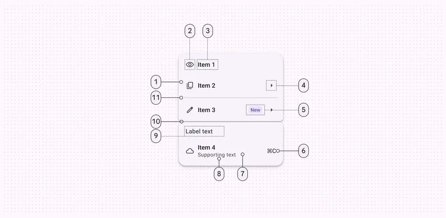
1. Menu item
2. Leading icon (optional)
3. Menu item text
4. Trailing icon (optional)
5. Badge (optional)
6. Trailing text (optional)
7. Container
8. Supporting text (optional)
9. Label text (optional)
10. Gap (optional)
11. Divider (optional)
## Color
Color values are implemented through [design tokens](../../foundations/design-tokens/overview.md "Design tokens are the building blocks of all UI elements. The same tokens are used in designs, tools, and code."). For designers, this means working with color values that correspond with tokens. In implementation, a color value will be a token that references a value. [Learn more about design tokens](../../foundations/design-tokens/overview.md)
Menus have two color mappings:
* Standard: Surface-based
* Vibrant: Tertiary-based
These mappings provide options for lower or higher visual emphasis. Vibrant menus are more prominent so should be used sparingly.
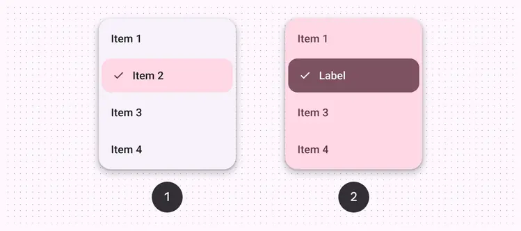
1. Standard color scheme
2. Vibrant color scheme
### Standard colors
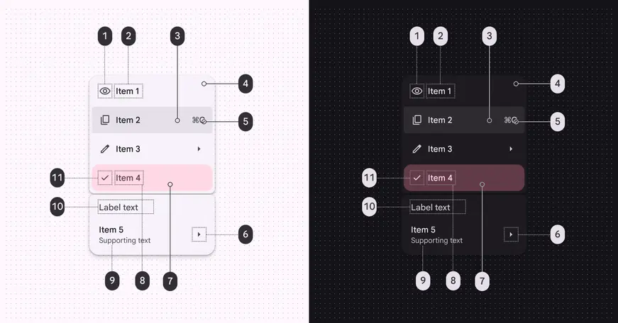
Vertical menus color roles used for light and dark themes:
1. On surface variant
2. On surface
3. On surface (state layer)
4. Surface container low
5. On surface variant
6. On surface variant
7. Tertiary container (selected)
8. On tertiary container (selected)
9. On surface variant
10. On surface variant
11. On tertiary container (selected)
### Vibrant colors
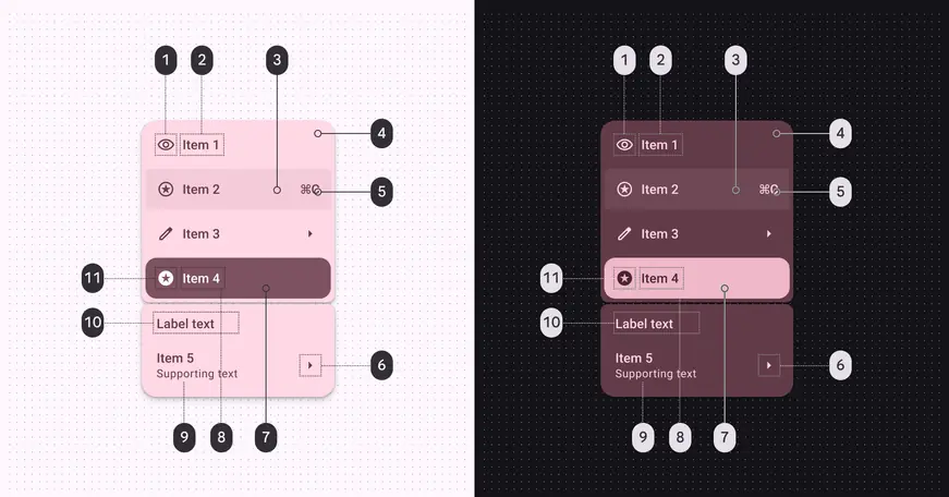
Vertical menus color roles used for light and dark themes:
1. On tertiary container
2. On tertiary container
3. On tertiary container (state layer)
4. Tertiary container
5. On tertiary container
6. On tertiary container
7. Tertiary (selected)
8. On tertiary (selected)
9. On tertiary container
10. On tertiary container
11. On tertiary (selected)
## States
[States](../../foundations/interaction/states/overview.md "States show the interaction status of a component or UI element.") are visual representations used to communicate the status of a component or an interactive element. [More on interaction states](../../foundations/interaction/states/overview.md)
Shape morphing in vertical menus creates an expressive active state. As focus moves between submenus, the corner shape changes to highlight the active menu. [More on menu focus](guidelines.md#7cc1d01b-a454-48c7-8306-e60347ffd17f)
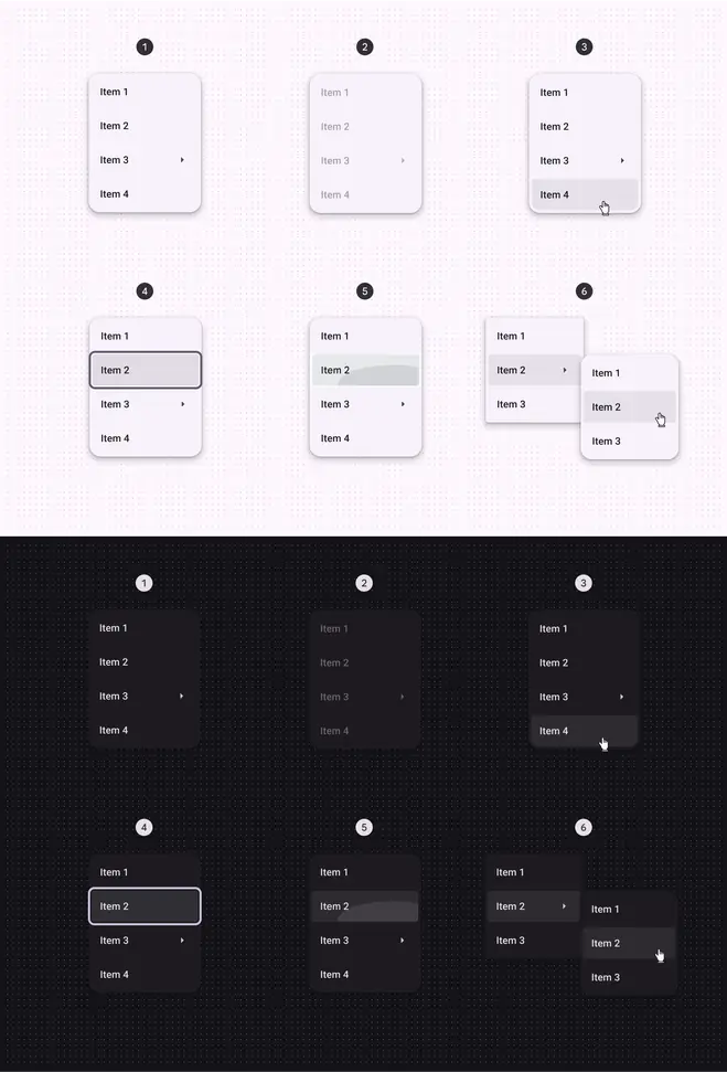
1. Enabled
2. Disabled
3. Hovered
4. Focused
5. Pressed
6. Active (main menu reveals submenu)
## Measurements
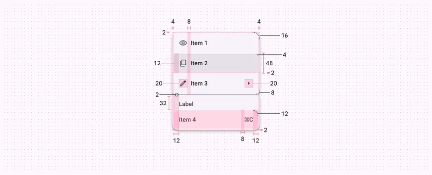
Vertical menu padding and size measurements
## Menu (baseline)
The [baseline](https://m3.material.io/blog/building-with-m3-expressive "Baseline variants are the original M3 component designs. They may not have the latest features introduced in M3 Expressive, like updated motion, shapes, type, and styles.") menu variant is available and continues to work in existing products. However, M3 expressive vertical menus are recommended for new designs.
### Baseline tokens & specs
Browse the component elements, attributes, tokens, and their values. [Learn about design tokens](../../foundations/design-tokens/overview.md)
::: token-table token-table-385a28e5d3bb3dd0-50e7068d
**Menus tokens** · 1 token set · 49 tokens · [live token table](https://m3.material.io/components/menus/specs) · DSDB `TOKEN_TABLE.385a28e5d3bb3dd0`
* Default context: Theme: Light · Platform: Android · Audience: 3P · Font: Static · Contrast: Default · iOS dark theme elevation: None · iOS weight setting: Default
* Not configurable here (group default used): Motion scheme: Standard · Language height: Small
* Other contexts: Theme: Dark · Contrast: Medium contrast, High contrast. "Other contexts" lists values that differ from the default when only that one context changes.
* Reference chain: aliases from the token to its source value (`token → alias → … → value`). "—" means the token holds a literal value.
**Menu (baseline)** · `md.comp.menu` · 49 tokens
Tokens for baseline GM3 menus. For expressive menus, use \`md.comp.menus\` instead.
| Group | Token | Type | Reference chain | Resolved value | Other contexts |
| --- | --- | --- | --- | --- | --- |
| Disabled › Leading icon | `md.comp.menu.list-item.with-leading-icon.disabled.leading-icon.color` (deprecated) | Color | `md.sys.color.on-surface` → `md.ref.palette.neutral10` | `#1D1B20` | Dark: `#E6E0E9` via `md.ref.palette.neutral90`
Medium contrast: `#000000` via `md.ref.palette.neutral0`
High contrast: `#000000` via `md.ref.palette.neutral0` |
| Disabled › Leading icon | `md.comp.menu.list-item.with-leading-icon.disabled.leading-icon.opacity` (deprecated) | Opacity | — | `0.38` | — |
| Disabled › Trailing icon | `md.comp.menu.list-item.with-trailing-icon.disabled.trailing-icon.color` (deprecated) | Color | `md.sys.color.on-surface` → `md.ref.palette.neutral10` | `#1D1B20` | Dark: `#E6E0E9` via `md.ref.palette.neutral90`
Medium contrast: `#000000` via `md.ref.palette.neutral0`
High contrast: `#000000` via `md.ref.palette.neutral0` |
| Disabled › Trailing icon | `md.comp.menu.list-item.with-trailing-icon.disabled.trailing-icon.opacity` (deprecated) | Opacity | — | `0.38` | — |
| Disabled › Label text | `md.comp.menu.list-item.disabled.label-text.color` (deprecated) | Color | `md.sys.color.on-surface` → `md.ref.palette.neutral10` | `#1D1B20` | Dark: `#E6E0E9` via `md.ref.palette.neutral90`
Medium contrast: `#000000` via `md.ref.palette.neutral0`
High contrast: `#000000` via `md.ref.palette.neutral0` |
| Disabled › Label text | `md.comp.menu.list-item.disabled.label-text.opacity` (deprecated) | Opacity | — | `0.38` | — |
| Hover › Leading icon | `md.comp.menu.list-item.with-leading-icon.hover.icon.color` (deprecated) | Color | `md.sys.color.on-surface-variant` → `md.ref.palette.neutral-variant30` | `#49454F` | Dark: `#CAC4D0` via `md.ref.palette.neutral-variant80`
Medium contrast: `#322F37` via `md.ref.palette.neutral-variant20`
High contrast: `#000000` via `md.ref.palette.neutral-variant0` |
| Hover › Trailing icon | `md.comp.menu.list-item.with-trailing-icon.hover.icon.color` (deprecated) | Color | `md.sys.color.on-surface-variant` → `md.ref.palette.neutral-variant30` | `#49454F` | Dark: `#CAC4D0` via `md.ref.palette.neutral-variant80`
Medium contrast: `#322F37` via `md.ref.palette.neutral-variant20`
High contrast: `#000000` via `md.ref.palette.neutral-variant0` |
| Hover › State layer | `md.comp.menu.list-item.hover.state-layer.color` (deprecated) | Color | `md.sys.color.on-surface` → `md.ref.palette.neutral10` | `#1D1B20` | Dark: `#E6E0E9` via `md.ref.palette.neutral90`
Medium contrast: `#000000` via `md.ref.palette.neutral0`
High contrast: `#000000` via `md.ref.palette.neutral0` |
| Hover › State layer | `md.comp.menu.list-item.hover.state-layer.opacity` (deprecated) | Opacity | `md.sys.state.hover.state-layer-opacity` | `0.08` | — |
| Hover › Label text | `md.comp.menu.list-item.hover.label-text.color` (deprecated) | Color | `md.sys.color.on-surface` → `md.ref.palette.neutral10` | `#1D1B20` | Dark: `#E6E0E9` via `md.ref.palette.neutral90`
Medium contrast: `#000000` via `md.ref.palette.neutral0`
High contrast: `#000000` via `md.ref.palette.neutral0` |
| Focus › Leading icon | `md.comp.menu.list-item.with-leading-icon.focus.icon.color` (deprecated) | Color | `md.sys.color.on-surface-variant` → `md.ref.palette.neutral-variant30` | `#49454F` | Dark: `#CAC4D0` via `md.ref.palette.neutral-variant80`
Medium contrast: `#322F37` via `md.ref.palette.neutral-variant20`
High contrast: `#000000` via `md.ref.palette.neutral-variant0` |
| Focus › Trailing icon | `md.comp.menu.list-item.with-trailing-icon.focus.icon.color` (deprecated) | Color | `md.sys.color.on-surface-variant` → `md.ref.palette.neutral-variant30` | `#49454F` | Dark: `#CAC4D0` via `md.ref.palette.neutral-variant80`
Medium contrast: `#322F37` via `md.ref.palette.neutral-variant20`
High contrast: `#000000` via `md.ref.palette.neutral-variant0` |
| Focus › Label text | `md.comp.menu.list-item.focus.label-text.color` (deprecated) | Color | `md.sys.color.on-surface` → `md.ref.palette.neutral10` | `#1D1B20` | Dark: `#E6E0E9` via `md.ref.palette.neutral90`
Medium contrast: `#000000` via `md.ref.palette.neutral0`
High contrast: `#000000` via `md.ref.palette.neutral0` |
| Focus › State layer | `md.comp.menu.list-item.focus.state-layer.color` (deprecated) | Color | `md.sys.color.on-surface` → `md.ref.palette.neutral10` | `#1D1B20` | Dark: `#E6E0E9` via `md.ref.palette.neutral90`
Medium contrast: `#000000` via `md.ref.palette.neutral0`
High contrast: `#000000` via `md.ref.palette.neutral0` |
| Focus › State layer | `md.comp.menu.list-item.focus.state-layer.opacity` (deprecated) | Opacity | `md.sys.state.focus.state-layer-opacity` | `0.1` | — |
| Pressed › Leading icon | `md.comp.menu.list-item.with-leading-icon.pressed.icon.color` (deprecated) | Color | `md.sys.color.on-surface-variant` → `md.ref.palette.neutral-variant30` | `#49454F` | Dark: `#CAC4D0` via `md.ref.palette.neutral-variant80`
Medium contrast: `#322F37` via `md.ref.palette.neutral-variant20`
High contrast: `#000000` via `md.ref.palette.neutral-variant0` |
| Pressed › Label text | `md.comp.menu.list-item.pressed.label-text.color` (deprecated) | Color | `md.sys.color.on-surface` → `md.ref.palette.neutral10` | `#1D1B20` | Dark: `#E6E0E9` via `md.ref.palette.neutral90`
Medium contrast: `#000000` via `md.ref.palette.neutral0`
High contrast: `#000000` via `md.ref.palette.neutral0` |
| Pressed › Trailing icon | `md.comp.menu.list-item.with-trailing-icon.pressed.icon.color` (deprecated) | Color | `md.sys.color.on-surface-variant` → `md.ref.palette.neutral-variant30` | `#49454F` | Dark: `#CAC4D0` via `md.ref.palette.neutral-variant80`
Medium contrast: `#322F37` via `md.ref.palette.neutral-variant20`
High contrast: `#000000` via `md.ref.palette.neutral-variant0` |
| Pressed › State layer | `md.comp.menu.list-item.pressed.state-layer.color` (deprecated) | Color | `md.sys.color.on-surface` → `md.ref.palette.neutral10` | `#1D1B20` | Dark: `#E6E0E9` via `md.ref.palette.neutral90`
Medium contrast: `#000000` via `md.ref.palette.neutral0`
High contrast: `#000000` via `md.ref.palette.neutral0` |
| Pressed › State layer | `md.comp.menu.list-item.pressed.state-layer.opacity` (deprecated) | Opacity | `md.sys.state.pressed.state-layer-opacity` | `0.1` | — |
| Focus indicator | `md.comp.menu.focus.indicator.color` (deprecated) | Color | `md.sys.color.secondary` → `md.ref.palette.secondary40` | `#625B71` | Dark: `#CCC2DC` via `md.ref.palette.secondary80`
Medium contrast: `#4A4458` via `md.ref.palette.secondary30`
High contrast: `#332D41` via `md.ref.palette.secondary20` |
| Focus indicator | `md.comp.menu.focus.indicator.thickness` (deprecated) | Length | `md.sys.state.focus-indicator.thickness` | `3dp` | — |
| Focus indicator | `md.comp.menu.focus.indicator.outline.offset` (deprecated) | Length | `md.sys.state.focus-indicator.inner-offset` | `-3dp` | — |
| Enabled | `md.comp.menu.container.shape` | Shape | `md.sys.shape.corner.extra-small` | `Rounded corners 4dp` | — |
| Enabled | `md.comp.menu.container.shadow-color` | Color | `md.sys.color.shadow` → `md.ref.palette.neutral0` | `#000000` | — |
| Enabled | `md.comp.menu.container.elevation` | Elevation | `md.sys.elevation.level2` | `3dp` | — |
| Enabled | `md.comp.menu.container.color` | Color | `md.sys.color.surface-container` → `md.ref.palette.neutral94` | `#F3EDF7` | Dark: `#211F26` via `md.ref.palette.neutral12` |
| Enabled › Container | `md.comp.menu.container.surface-tint-layer.color` (deprecated) | Color | `md.sys.color.surface-tint` → `md.sys.color.primary` → `md.ref.palette.primary40` | `#6750A4` | Dark: `#D0BCFF` via `md.ref.palette.primary80`
Medium contrast: `#4F378B` via `md.ref.palette.primary30`
High contrast: `#381E72` via `md.ref.palette.primary20` |
| Enabled › Container | `md.comp.menu.list-item.container.height` (deprecated) | Length | — | `48dp` | — |
| Enabled › Container | `md.comp.menu.list-item.selected.container.color` (deprecated) | Color | `md.sys.color.secondary-container` → `md.ref.palette.secondary90` | `#E8DEF8` | Dark: `#4A4458` via `md.ref.palette.secondary30`
Medium contrast: `#625B71` via `md.ref.palette.secondary40`
High contrast: `#4A4458` via `md.ref.palette.secondary30` |
| Enabled › Container | `md.comp.menu.list-item.selected.label-text.color` (deprecated) | Color | `md.sys.color.on-secondary-container` → `md.ref.palette.secondary30` | `#4A4458` | Dark: `#E8DEF8` via `md.ref.palette.secondary90`
Medium contrast: `#FFFFFF` via `md.ref.palette.secondary100`
High contrast: `#FFFFFF` via `md.ref.palette.secondary100` |
| Enabled › Container | `md.comp.menu.list-item.selected.with-leading-icon.leading-icon.color` (deprecated) | Color | `md.sys.color.on-secondary-container` → `md.ref.palette.secondary30` | `#4A4458` | Dark: `#E8DEF8` via `md.ref.palette.secondary90`
Medium contrast: `#FFFFFF` via `md.ref.palette.secondary100`
High contrast: `#FFFFFF` via `md.ref.palette.secondary100` |
| Enabled › Container | `md.comp.menu.list-item.selected.with-leading-icon.trailing-icon.color` (deprecated) | Color | `md.sys.color.on-secondary-container` → `md.ref.palette.secondary30` | `#4A4458` | Dark: `#E8DEF8` via `md.ref.palette.secondary90`
Medium contrast: `#FFFFFF` via `md.ref.palette.secondary100`
High contrast: `#FFFFFF` via `md.ref.palette.secondary100` |
| Enabled › Label text | `md.comp.menu.list-item.label-text.color` (deprecated) | Color | `md.sys.color.on-surface` → `md.ref.palette.neutral10` | `#1D1B20` | Dark: `#E6E0E9` via `md.ref.palette.neutral90`
Medium contrast: `#000000` via `md.ref.palette.neutral0`
High contrast: `#000000` via `md.ref.palette.neutral0` |
| Enabled › Label text | `md.comp.menu.list-item.label-text.font` (deprecated) | Font names | `md.sys.typescale.label-large.font` → `md.ref.typeface.plain` | `Roboto` | — |
| Enabled › Label text | `md.comp.menu.list-item.label-text.line-height` (deprecated) | Line height | `md.sys.typescale.label-large.line-height` | `20pt` | — |
| Enabled › Label text | `md.comp.menu.list-item.label-text.size` (deprecated) | Font size | `md.sys.typescale.label-large.size` | `14pt` | — |
| Enabled › Label text | `md.comp.menu.list-item.label-text.tracking` (deprecated) | Font tracking | `md.sys.typescale.label-large.tracking` | `0.1pt` | — |
| Enabled › Label text | `md.comp.menu.list-item.label-text.weight` (deprecated) | Font weight | `md.sys.typescale.label-large.weight` → `md.ref.typeface.weight-medium` | `500` | — |
| Enabled › Label text | `md.comp.menu.list-item.label-text.type` (deprecated) | Typography | composite
font names: `md.comp.menu.list-item.label-text.font` → `md.sys.typescale.label-large.font` → `md.ref.typeface.plain`
font weight: `md.comp.menu.list-item.label-text.weight` → `md.sys.typescale.label-large.weight` → `md.ref.typeface.weight-medium`
font size: `md.comp.menu.list-item.label-text.size` → `md.sys.typescale.label-large.size`
line height: `md.comp.menu.list-item.label-text.line-height` → `md.sys.typescale.label-large.line-height`
font tracking: `md.comp.menu.list-item.label-text.tracking` → `md.sys.typescale.label-large.tracking` | `Roboto · weight 500 · size 14pt · line height 20pt · tracking 0.1pt` | — |
| Enabled › Icon | `md.comp.menu.cascading-menu-indicator.icon.color` (deprecated) | Color | `md.sys.color.on-surface-variant` → `md.ref.palette.neutral-variant30` | `#49454F` | Dark: `#CAC4D0` via `md.ref.palette.neutral-variant80`
Medium contrast: `#322F37` via `md.ref.palette.neutral-variant20`
High contrast: `#000000` via `md.ref.palette.neutral-variant0` |
| Enabled › Icon | `md.comp.menu.cascading-menu-indicator.icon.size` (deprecated) | Length | — | `24dp` | — |
| Enabled › Leading icon | `md.comp.menu.list-item.with-leading-icon.leading-icon.size` (deprecated) | Length | — | `24dp` | — |
| Enabled › Leading icon | `md.comp.menu.list-item.with-leading-icon.leading-icon.color` (deprecated) | Color | `md.sys.color.on-surface-variant` → `md.ref.palette.neutral-variant30` | `#49454F` | Dark: `#CAC4D0` via `md.ref.palette.neutral-variant80`
Medium contrast: `#322F37` via `md.ref.palette.neutral-variant20`
High contrast: `#000000` via `md.ref.palette.neutral-variant0` |
| Enabled › Trailing icon | `md.comp.menu.list-item.with-trailing-icon.trailing-icon.size` (deprecated) | Length | — | `24dp` | — |
| Enabled › Trailing icon | `md.comp.menu.list-item.with-trailing-icon.trailing-icon.color` (deprecated) | Color | `md.sys.color.on-surface-variant` → `md.ref.palette.neutral-variant30` | `#49454F` | Dark: `#CAC4D0` via `md.ref.palette.neutral-variant80`
Medium contrast: `#322F37` via `md.ref.palette.neutral-variant20`
High contrast: `#000000` via `md.ref.palette.neutral-variant0` |
| Enabled › Divider | `md.comp.menu.divider.color` (deprecated) | Color | `md.sys.color.surface-variant` → `md.ref.palette.neutral-variant90` | `#E7E0EC` | Dark: `#49454F` via `md.ref.palette.neutral-variant30` |
| Enabled › Divider | `md.comp.menu.divider.height` (deprecated) | Length | — | `1dp` | — |
:::
### Anatomy
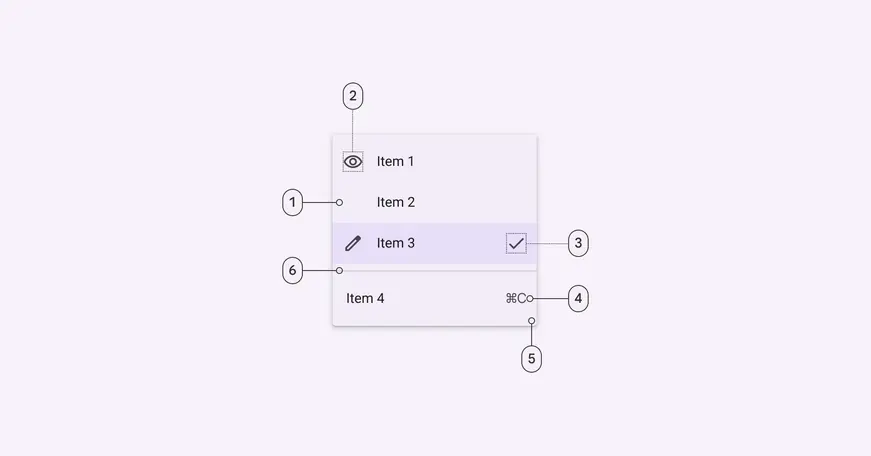
1. List item
2. List item leading icon
3. List item trailing icon
4. Container
5. List item trailing text
6. Divider
### Color
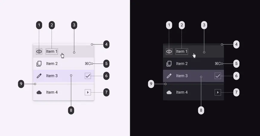
Baseline menu color roles used for light and dark themes:
1. On surface variant
2. On surface
3. On surface - opacity: 0.08
4. Surface container
5. On surface variant
6. On surface variant
7. On surface variant
8. Surface container highest
9. Outline variant
### States
#### Default menu items
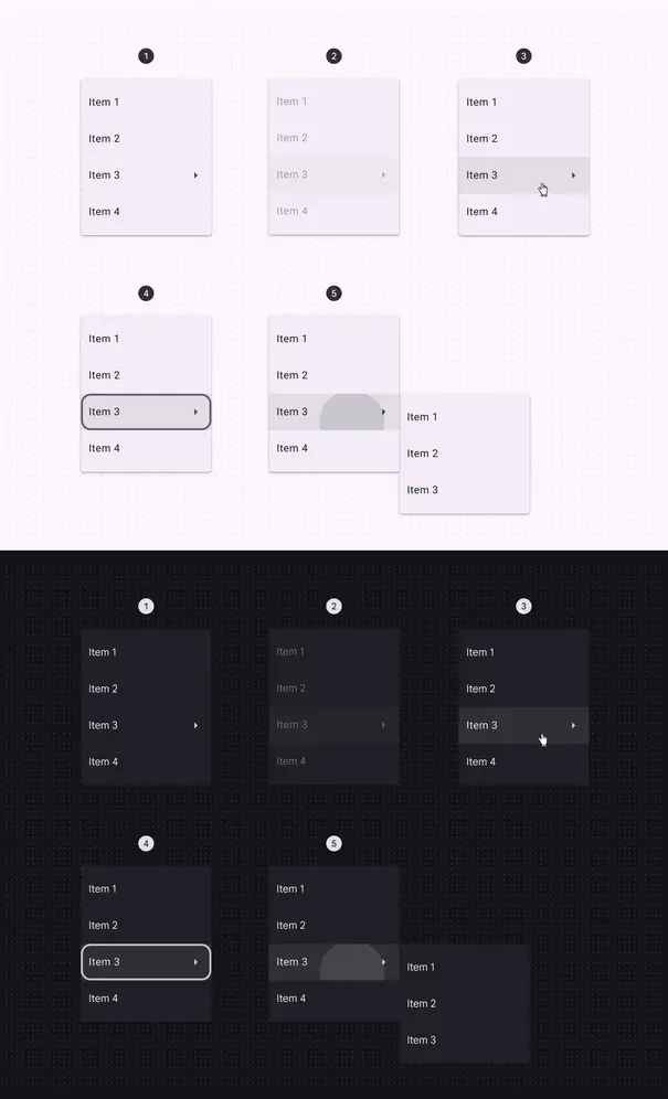
1. Enabled
2. Disabled
3. Hovered
4. Focused
5. Pressed
#### Selected menu items
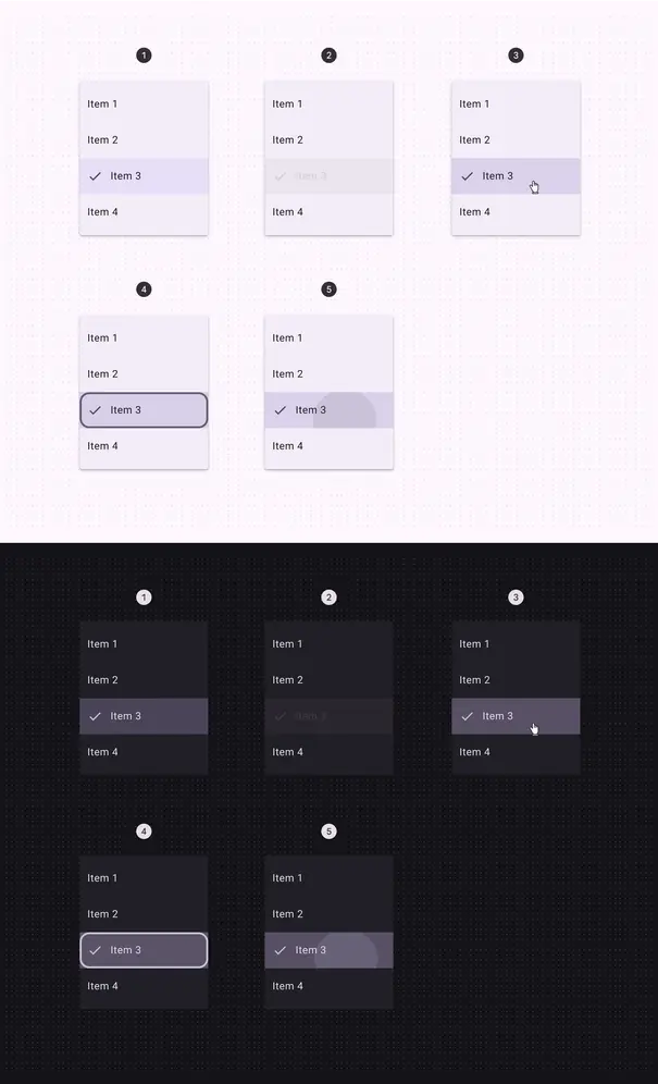
1. Enabled
2. Disabled
3. Hovered
4. Focused
5. Pressed
[State specs are in the token module above](#c811d2fa-469a-4e4e-9d9f-0f535c5c9b4c)
### Measurements
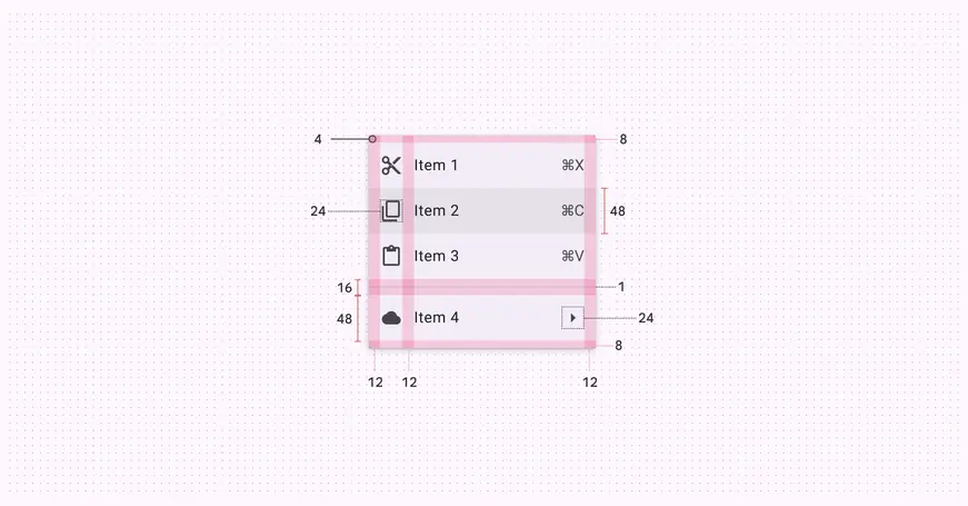
Baseline menu padding and size measurements
| Attribute | Value |
| :-----------------------------------------: | :------------------: |
| Container width | 112dp min, 280dp max |
| Corner radius | 4dp |
| Vertical label text alignment | Center-aligned |
| Horizontal label text alignment | Start-aligned |
| Left/right padding | 12dp |
| Left/right padding with-icon | 12dp |
| List item height | 48dp |
| Padding between elements within a list item | 12dp |
| Divider top/bottom padding | 8dp |
| Divider height | 1dp |
| Divider width | Dynamic |
| Leading/trailing icon size | 24dp |
### Configurations
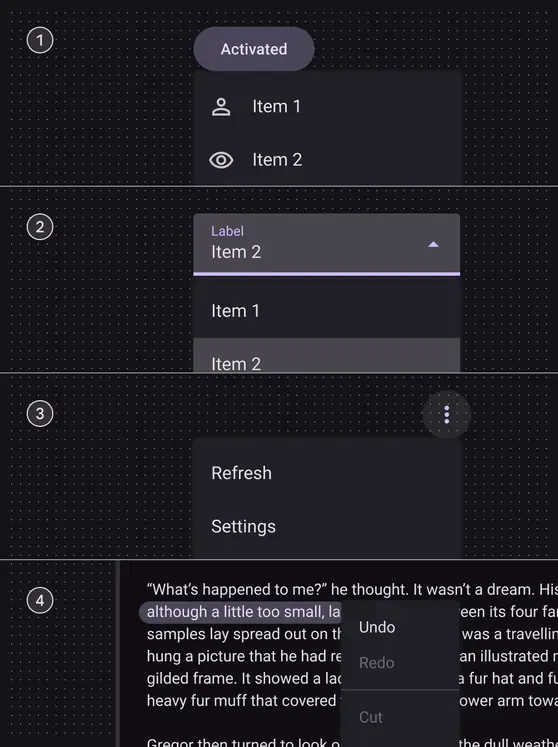
A baseline menu appears when a person interacts with a button, action, or other control.
A few examples:
1. [Button](../buttons/overview.md "Buttons let people take action and make choices with one tap.")
2. [Text field](../text-fields/overview.md "Text fields let users enter text into a UI.")
3. [Icon button](../icon-buttons/overview.md "Icon buttons help people take minor actions with one tap.")
4. Selected text