---
url: /components/fab-menu/specs.md
description: >-
The floating action button (FAB) menu opens from a FAB to display multiple
related actions
---
# FAB menu
The floating action button (FAB) menu opens from a FAB to display multiple related actions
[Overview](overview.md) · **Specs** · [Guidelines](guidelines.md) · [Accessibility](accessibility.md)
## Variants

There’s one variant of FAB menu
| Variant | M3 | M3 Expressive |
| -------- | :-: | :-----------: |
| FAB menu | -- | Available |
## Configurations
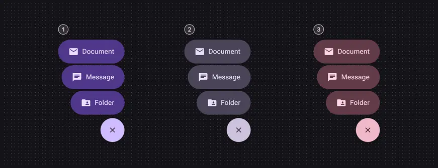
Three color sets:
1. Primary
2. Secondary
3. Tertiary
| Category | Configuration | M3 | M3 Expressive |
| -------- | ---------------------------------------- | :-: | :-----------: |
| Color | Primary set, secondary set, tertiary set | -- | Available |
## Tokens & specs
Use the table's menu to switch token sets. The FAB menu has a common token set and six color sets, three for each element (close button and menu item). [Learn about design tokens](../../foundations/design-tokens/overview.md)
::: token-table token-table-1a076cec8bc202c2-ee63ce38
**FAB menu tokens** · 7 token sets · 117 tokens · [live token table](https://m3.material.io/components/fab-menu/specs) · DSDB `TOKEN_TABLE.1a076cec8bc202c2`
* Default context: Theme: Light · Platform: Android · Audience: 3P · Contrast: Default · iOS dark theme elevation: None · iOS weight setting: Default
* Not configurable here (group default used): Motion scheme: Standard · Font: Static · Language height: Small
* Other contexts: Theme: Dark · Contrast: Medium contrast, High contrast. "Other contexts" lists values that differ from the default when only that one context changes.
* Reference chain: aliases from the token to its source value (`token → alias → … → value`). "—" means the token holds a literal value.
**FAB menu - Common** · `md.comp.fab-menu` · 15 tokens
Common tokens for all FAB menus.
| Group | Token | Type | Reference chain | Resolved value | Other contexts |
| --- | --- | --- | --- | --- | --- |
| Close button | `md.comp.fab-menu.close-button.container.width` | Length | — | `56dp` | — |
| Close button | `md.comp.fab-menu.close-button.icon.size` | Length | — | `20dp` | — |
| Close button | `md.comp.fab-menu.close-button.container.elevation` | Elevation | `md.sys.elevation.level3` | `6dp` | — |
| Close button | `md.comp.fab-menu.close-button.container.shape` | Shape | `md.sys.shape.corner.full` | `Circular (fully rounded)` | — |
| Close button | `md.comp.fab-menu.close-button.between-space` | Length | `md.sys.measurement.space100` | `8dp` | — |
| Close button | `md.comp.fab-menu.close-button.container.height` | Length | — | `56dp` | — |
| List item | `md.comp.fab-menu.menu-item.label-text` | Typography | `md.sys.typescale.title-medium` → composite
font names: `md.sys.typescale.title-medium.font` → `md.ref.typeface.plain`
font weight: `md.sys.typescale.title-medium.weight` → `md.ref.typeface.weight-medium`
font size: `md.sys.typescale.title-medium.size`
line height: `md.sys.typescale.title-medium.line-height`
font tracking: `md.sys.typescale.title-medium.tracking` | `Roboto · weight 500 · size 16pt · line height 24pt · tracking 0.15pt` | — |
| List item | `md.comp.fab-menu.menu-item.icon.size` | Length | — | `24dp` | — |
| List item | `md.comp.fab-menu.menu-item.container.elevation` | Elevation | `md.sys.elevation.level0` | `0dp` | — |
| List item | `md.comp.fab-menu.menu-item.container.shape` | Shape | `md.sys.shape.corner.full` | `Circular (fully rounded)` | — |
| List item | `md.comp.fab-menu.menu-item.leading-space` | Length | `md.sys.measurement.space300` | `24dp` | — |
| List item | `md.comp.fab-menu.menu-item.icon-label-space` | Length | `md.sys.measurement.space100` | `8dp` | — |
| List item | `md.comp.fab-menu.menu-item.trailing-space` | Length | `md.sys.measurement.space300` | `24dp` | — |
| List item | `md.comp.fab-menu.menu-item.between-space` | Length | `md.sys.measurement.space50` | `4dp` | — |
| List item | `md.comp.fab-menu.menu-item.container.height` | Length | — | `56dp` | — |
**FAB menu close button - Color - Primary** · `md.comp.fab-menu.primary.close-button` · 15 tokens
Primary color tokens for the close button in the FAB menu.
| Group | Token | Type | Reference chain | Resolved value | Other contexts |
| --- | --- | --- | --- | --- | --- |
| Enabled | `md.comp.fab-menu.primary.close-button.container.shadow-color` | Color | `md.sys.color.shadow` → `md.ref.palette.neutral0` | `#000000` | — |
| Enabled | `md.comp.fab-menu.primary.close-button.icon.color` | Color | `md.sys.color.on-primary` → `md.ref.palette.primary100` | `#FFFFFF` | Dark: `#381E72` via `md.ref.palette.primary20` |
| Enabled | `md.comp.fab-menu.primary.close-button.container.color` | Color | `md.sys.color.primary` → `md.ref.palette.primary40` | `#6750A4` | Dark: `#D0BCFF` via `md.ref.palette.primary80`
Medium contrast: `#4F378B` via `md.ref.palette.primary30`
High contrast: `#381E72` via `md.ref.palette.primary20` |
| Hovered | `md.comp.fab-menu.primary.close-button.hovered.state-layer.color` | Color | `md.sys.color.on-primary` → `md.ref.palette.primary100` | `#FFFFFF` | Dark: `#381E72` via `md.ref.palette.primary20` |
| Hovered | `md.comp.fab-menu.primary.close-button.hovered.state-layer.opacity` | Opacity | `md.sys.state.hover.state-layer-opacity` | `0.08` | — |
| Hovered | `md.comp.fab-menu.primary.close-button.hovered.icon.color` | Color | `md.sys.color.on-primary` → `md.ref.palette.primary100` | `#FFFFFF` | Dark: `#381E72` via `md.ref.palette.primary20` |
| Hovered | `md.comp.fab-menu.primary.close-button.hovered.container.elevation` | Elevation | `md.sys.elevation.level4` | `8dp` | — |
| Focused | `md.comp.fab-menu.primary.close-button.focused.state-layer.color` | Color | `md.sys.color.on-primary` → `md.ref.palette.primary100` | `#FFFFFF` | Dark: `#381E72` via `md.ref.palette.primary20` |
| Focused | `md.comp.fab-menu.primary.close-button.focused.state-layer.opacity` | Opacity | `md.sys.state.focus.state-layer-opacity` | `0.1` | — |
| Focused | `md.comp.fab-menu.primary.close-button.focused.icon.color` | Color | `md.sys.color.on-primary` → `md.ref.palette.primary100` | `#FFFFFF` | Dark: `#381E72` via `md.ref.palette.primary20` |
| Focused | `md.comp.fab-menu.primary.close-button.focused.container.elevation` | Elevation | `md.sys.elevation.level3` | `6dp` | — |
| Pressed | `md.comp.fab-menu.primary.close-button.pressed.state-layer.color` | Color | `md.sys.color.on-primary` → `md.ref.palette.primary100` | `#FFFFFF` | Dark: `#381E72` via `md.ref.palette.primary20` |
| Pressed | `md.comp.fab-menu.primary.close-button.pressed.state-layer.opacity` | Opacity | `md.sys.state.pressed.state-layer-opacity` | `0.1` | — |
| Pressed | `md.comp.fab-menu.primary.close-button.pressed.icon.color` | Color | `md.sys.color.on-primary` → `md.ref.palette.primary100` | `#FFFFFF` | Dark: `#381E72` via `md.ref.palette.primary20` |
| Pressed | `md.comp.fab-menu.primary.close-button.pressed.container.elevation` | Elevation | `md.sys.elevation.level3` | `6dp` | — |
**FAB menu close button - Color - Secondary** · `md.comp.fab-menu.secondary.close-button` · 15 tokens
Secondary color tokens for the close button in the FAB menu.
| Group | Token | Type | Reference chain | Resolved value | Other contexts |
| --- | --- | --- | --- | --- | --- |
| Enabled | `md.comp.fab-menu.secondary.close-button.container.shadow-color` | Color | `md.sys.color.shadow` → `md.ref.palette.neutral0` | `#000000` | — |
| Enabled | `md.comp.fab-menu.secondary.close-button.icon.color` | Color | `md.sys.color.on-secondary` → `md.ref.palette.secondary100` | `#FFFFFF` | Dark: `#332D41` via `md.ref.palette.secondary20` |
| Enabled | `md.comp.fab-menu.secondary.close-button.container.color` | Color | `md.sys.color.secondary` → `md.ref.palette.secondary40` | `#625B71` | Dark: `#CCC2DC` via `md.ref.palette.secondary80`
Medium contrast: `#4A4458` via `md.ref.palette.secondary30`
High contrast: `#332D41` via `md.ref.palette.secondary20` |
| Hovered | `md.comp.fab-menu.secondary.close-button.hovered.state-layer.color` | Color | `md.sys.color.on-secondary` → `md.ref.palette.secondary100` | `#FFFFFF` | Dark: `#332D41` via `md.ref.palette.secondary20` |
| Hovered | `md.comp.fab-menu.secondary.close-button.hovered.state-layer.opacity` | Opacity | `md.sys.state.hover.state-layer-opacity` | `0.08` | — |
| Hovered | `md.comp.fab-menu.secondary.close-button.hovered.icon.color` | Color | `md.sys.color.on-secondary` → `md.ref.palette.secondary100` | `#FFFFFF` | Dark: `#332D41` via `md.ref.palette.secondary20` |
| Hovered | `md.comp.fab-menu.secondary.close-button.hovered.container.elevation` | Elevation | `md.sys.elevation.level4` | `8dp` | — |
| Focused | `md.comp.fab-menu.secondary.close-button.focused.state-layer.color` | Color | `md.sys.color.on-secondary` → `md.ref.palette.secondary100` | `#FFFFFF` | Dark: `#332D41` via `md.ref.palette.secondary20` |
| Focused | `md.comp.fab-menu.secondary.close-button.focused.state-layer.opacity` | Opacity | `md.sys.state.focus.state-layer-opacity` | `0.1` | — |
| Focused | `md.comp.fab-menu.secondary.close-button.focused.icon.color` | Color | `md.sys.color.on-secondary` → `md.ref.palette.secondary100` | `#FFFFFF` | Dark: `#332D41` via `md.ref.palette.secondary20` |
| Focused | `md.comp.fab-menu.secondary.close-button.focused.container.elevation` | Elevation | `md.sys.elevation.level3` | `6dp` | — |
| Pressed | `md.comp.fab-menu.secondary.close-button.pressed.state-layer.color` | Color | `md.sys.color.on-secondary` → `md.ref.palette.secondary100` | `#FFFFFF` | Dark: `#332D41` via `md.ref.palette.secondary20` |
| Pressed | `md.comp.fab-menu.secondary.close-button.pressed.state-layer.opacity` | Opacity | `md.sys.state.pressed.state-layer-opacity` | `0.1` | — |
| Pressed | `md.comp.fab-menu.secondary.close-button.pressed.icon.color` | Color | `md.sys.color.on-secondary` → `md.ref.palette.secondary100` | `#FFFFFF` | Dark: `#332D41` via `md.ref.palette.secondary20` |
| Pressed | `md.comp.fab-menu.secondary.close-button.pressed.container.elevation` | Elevation | `md.sys.elevation.level3` | `6dp` | — |
**FAB menu close button - Color - Tertiary** · `md.comp.fab-menu.tertiary.close-button` · 15 tokens
Tertiary color tokens for the close button in the FAB menu.
| Group | Token | Type | Reference chain | Resolved value | Other contexts |
| --- | --- | --- | --- | --- | --- |
| Enabled | `md.comp.fab-menu.tertiary.close-button.container.shadow-color` | Color | `md.sys.color.shadow` → `md.ref.palette.neutral0` | `#000000` | — |
| Enabled | `md.comp.fab-menu.tertiary.close-button.icon.color` | Color | `md.sys.color.on-tertiary` → `md.ref.palette.tertiary100` | `#FFFFFF` | Dark: `#492532` via `md.ref.palette.tertiary20` |
| Enabled | `md.comp.fab-menu.tertiary.close-button.container.color` | Color | `md.sys.color.tertiary` → `md.ref.palette.tertiary40` | `#7D5260` | Dark: `#EFB8C8` via `md.ref.palette.tertiary80`
Medium contrast: `#633B48` via `md.ref.palette.tertiary30`
High contrast: `#492532` via `md.ref.palette.tertiary20` |
| Hovered | `md.comp.fab-menu.tertiary.close-button.hovered.state-layer.color` | Color | `md.sys.color.on-tertiary` → `md.ref.palette.tertiary100` | `#FFFFFF` | Dark: `#492532` via `md.ref.palette.tertiary20` |
| Hovered | `md.comp.fab-menu.tertiary.close-button.hovered.state-layer.opacity` | Opacity | `md.sys.state.hover.state-layer-opacity` | `0.08` | — |
| Hovered | `md.comp.fab-menu.tertiary.close-button.hovered.icon.color` | Color | `md.sys.color.on-tertiary` → `md.ref.palette.tertiary100` | `#FFFFFF` | Dark: `#492532` via `md.ref.palette.tertiary20` |
| Hovered | `md.comp.fab-menu.tertiary.close-button.hovered.container.elevation` | Elevation | `md.sys.elevation.level4` | `8dp` | — |
| Focused | `md.comp.fab-menu.tertiary.close-button.focused.state-layer.color` | Color | `md.sys.color.on-tertiary` → `md.ref.palette.tertiary100` | `#FFFFFF` | Dark: `#492532` via `md.ref.palette.tertiary20` |
| Focused | `md.comp.fab-menu.tertiary.close-button.focused.state-layer.opacity` | Opacity | `md.sys.state.focus.state-layer-opacity` | `0.1` | — |
| Focused | `md.comp.fab-menu.tertiary.close-button.focused.icon.color` | Color | `md.sys.color.on-tertiary` → `md.ref.palette.tertiary100` | `#FFFFFF` | Dark: `#492532` via `md.ref.palette.tertiary20` |
| Focused | `md.comp.fab-menu.tertiary.close-button.focused.container.elevation` | Elevation | `md.sys.elevation.level3` | `6dp` | — |
| Pressed | `md.comp.fab-menu.tertiary.close-button.pressed.state-layer.color` | Color | `md.sys.color.on-tertiary` → `md.ref.palette.tertiary100` | `#FFFFFF` | Dark: `#492532` via `md.ref.palette.tertiary20` |
| Pressed | `md.comp.fab-menu.tertiary.close-button.pressed.state-layer.opacity` | Opacity | `md.sys.state.pressed.state-layer-opacity` | `0.1` | — |
| Pressed | `md.comp.fab-menu.tertiary.close-button.pressed.icon.color` | Color | `md.sys.color.on-tertiary` → `md.ref.palette.tertiary100` | `#FFFFFF` | Dark: `#492532` via `md.ref.palette.tertiary20` |
| Pressed | `md.comp.fab-menu.tertiary.close-button.pressed.container.elevation` | Elevation | `md.sys.elevation.level3` | `6dp` | — |
**FAB menu list items - Color - Primary** · `md.comp.fab-menu.primary-container` · 19 tokens
Primary container color tokens for the items in the FAB menu.
| Group | Token | Type | Reference chain | Resolved value | Other contexts |
| --- | --- | --- | --- | --- | --- |
| Enabled | `md.comp.fab-menu.primary-container.list-item.container.shadow-color` | Color | `md.sys.color.shadow` → `md.ref.palette.neutral0` | `#000000` | — |
| Enabled | `md.comp.fab-menu.primary-container.list-item.icon.color` | Color | `md.sys.color.on-primary-container` → `md.ref.palette.primary30` | `#4F378B` | Dark: `#EADDFF` via `md.ref.palette.primary90`
Medium contrast: `#FFFFFF` via `md.ref.palette.primary100`
High contrast: `#FFFFFF` via `md.ref.palette.primary100` |
| Enabled | `md.comp.fab-menu.primary-container.list-item.label-text.color` | Color | `md.sys.color.on-primary-container` → `md.ref.palette.primary30` | `#4F378B` | Dark: `#EADDFF` via `md.ref.palette.primary90`
Medium contrast: `#FFFFFF` via `md.ref.palette.primary100`
High contrast: `#FFFFFF` via `md.ref.palette.primary100` |
| Enabled | `md.comp.fab-menu.primary-container.list-item.container.color` | Color | `md.sys.color.primary-container` → `md.ref.palette.primary90` | `#EADDFF` | Dark: `#4F378B` via `md.ref.palette.primary30`
Medium contrast: `#6750A4` via `md.ref.palette.primary40`
High contrast: `#4F378B` via `md.ref.palette.primary30` |
| Hovered | `md.comp.fab-menu.primary-container.list-item.hovered.state-layer.color` | Color | `md.sys.color.on-primary-container` → `md.ref.palette.primary30` | `#4F378B` | Dark: `#EADDFF` via `md.ref.palette.primary90`
Medium contrast: `#FFFFFF` via `md.ref.palette.primary100`
High contrast: `#FFFFFF` via `md.ref.palette.primary100` |
| Hovered | `md.comp.fab-menu.primary-container.list-item.hovered.state-layer.opacity` | Opacity | `md.sys.state.hover.state-layer-opacity` | `0.08` | — |
| Hovered | `md.comp.fab-menu.primary-container.list-item.hovered.icon.color` | Color | `md.sys.color.on-primary-container` → `md.ref.palette.primary30` | `#4F378B` | Dark: `#EADDFF` via `md.ref.palette.primary90`
Medium contrast: `#FFFFFF` via `md.ref.palette.primary100`
High contrast: `#FFFFFF` via `md.ref.palette.primary100` |
| Hovered | `md.comp.fab-menu.primary-container.list-item.hovered.label-text.color` | Color | `md.sys.color.on-primary-container` → `md.ref.palette.primary30` | `#4F378B` | Dark: `#EADDFF` via `md.ref.palette.primary90`
Medium contrast: `#FFFFFF` via `md.ref.palette.primary100`
High contrast: `#FFFFFF` via `md.ref.palette.primary100` |
| Hovered | `md.comp.fab-menu.primary-container.list-item.hovered.container.elevation` | Elevation | `md.sys.elevation.level4` | `8dp` | — |
| Focused | `md.comp.fab-menu.primary-container.list-item.focused.state-layer.color` | Color | `md.sys.color.on-primary-container` → `md.ref.palette.primary30` | `#4F378B` | Dark: `#EADDFF` via `md.ref.palette.primary90`
Medium contrast: `#FFFFFF` via `md.ref.palette.primary100`
High contrast: `#FFFFFF` via `md.ref.palette.primary100` |
| Focused | `md.comp.fab-menu.primary-container.list-item.focused.state-layer.opacity` | Opacity | `md.sys.state.focus.state-layer-opacity` | `0.1` | — |
| Focused | `md.comp.fab-menu.primary-container.list-item.focused.icon.color` | Color | `md.sys.color.on-primary-container` → `md.ref.palette.primary30` | `#4F378B` | Dark: `#EADDFF` via `md.ref.palette.primary90`
Medium contrast: `#FFFFFF` via `md.ref.palette.primary100`
High contrast: `#FFFFFF` via `md.ref.palette.primary100` |
| Focused | `md.comp.fab-menu.primary-container.list-item.focused.label-text.color` | Color | `md.sys.color.on-primary-container` → `md.ref.palette.primary30` | `#4F378B` | Dark: `#EADDFF` via `md.ref.palette.primary90`
Medium contrast: `#FFFFFF` via `md.ref.palette.primary100`
High contrast: `#FFFFFF` via `md.ref.palette.primary100` |
| Focused | `md.comp.fab-menu.primary-container.list-item.focused.container.elevation` | Elevation | `md.sys.elevation.level3` | `6dp` | — |
| Pressed | `md.comp.fab-menu.primary-container.list-item.pressed.state-layer.color` | Color | `md.sys.color.on-primary-container` → `md.ref.palette.primary30` | `#4F378B` | Dark: `#EADDFF` via `md.ref.palette.primary90`
Medium contrast: `#FFFFFF` via `md.ref.palette.primary100`
High contrast: `#FFFFFF` via `md.ref.palette.primary100` |
| Pressed | `md.comp.fab-menu.primary-container.list-item.pressed.state-layer.opacity` | Opacity | `md.sys.state.pressed.state-layer-opacity` | `0.1` | — |
| Pressed | `md.comp.fab-menu.primary-container.list-item.pressed.icon.color` | Color | `md.sys.color.on-primary-container` → `md.ref.palette.primary30` | `#4F378B` | Dark: `#EADDFF` via `md.ref.palette.primary90`
Medium contrast: `#FFFFFF` via `md.ref.palette.primary100`
High contrast: `#FFFFFF` via `md.ref.palette.primary100` |
| Pressed | `md.comp.fab-menu.primary-container.list-item.pressed.label-text.color` | Color | `md.sys.color.on-primary-container` → `md.ref.palette.primary30` | `#4F378B` | Dark: `#EADDFF` via `md.ref.palette.primary90`
Medium contrast: `#FFFFFF` via `md.ref.palette.primary100`
High contrast: `#FFFFFF` via `md.ref.palette.primary100` |
| Pressed | `md.comp.fab-menu.primary-container.list-item.pressed.container.elevation` | Elevation | `md.sys.elevation.level3` | `6dp` | — |
**FAB menu list items - Color - Secondary** · `md.comp.fab-menu.secondary-container` · 19 tokens
Secondary container color tokens for the items in the FAB menu.
| Group | Token | Type | Reference chain | Resolved value | Other contexts |
| --- | --- | --- | --- | --- | --- |
| Enabled | `md.comp.fab-menu.secondary-container.list-item.container.shadow-color` | Color | `md.sys.color.shadow` → `md.ref.palette.neutral0` | `#000000` | — |
| Enabled | `md.comp.fab-menu.secondary-container.list-item.icon.color` | Color | `md.sys.color.on-secondary-container` → `md.ref.palette.secondary30` | `#4A4458` | Dark: `#E8DEF8` via `md.ref.palette.secondary90`
Medium contrast: `#FFFFFF` via `md.ref.palette.secondary100`
High contrast: `#FFFFFF` via `md.ref.palette.secondary100` |
| Enabled | `md.comp.fab-menu.secondary-container.list-item.label-text.color` | Color | `md.sys.color.on-secondary-container` → `md.ref.palette.secondary30` | `#4A4458` | Dark: `#E8DEF8` via `md.ref.palette.secondary90`
Medium contrast: `#FFFFFF` via `md.ref.palette.secondary100`
High contrast: `#FFFFFF` via `md.ref.palette.secondary100` |
| Enabled | `md.comp.fab-menu.secondary-container.list-item.container.color` | Color | `md.sys.color.secondary-container` → `md.ref.palette.secondary90` | `#E8DEF8` | Dark: `#4A4458` via `md.ref.palette.secondary30`
Medium contrast: `#625B71` via `md.ref.palette.secondary40`
High contrast: `#4A4458` via `md.ref.palette.secondary30` |
| Hovered | `md.comp.fab-menu.secondary-container.list-item.hovered.state-layer.color` | Color | `md.sys.color.on-secondary-container` → `md.ref.palette.secondary30` | `#4A4458` | Dark: `#E8DEF8` via `md.ref.palette.secondary90`
Medium contrast: `#FFFFFF` via `md.ref.palette.secondary100`
High contrast: `#FFFFFF` via `md.ref.palette.secondary100` |
| Hovered | `md.comp.fab-menu.secondary-container.list-item.hovered.state-layer.opacity` | Opacity | `md.sys.state.hover.state-layer-opacity` | `0.08` | — |
| Hovered | `md.comp.fab-menu.secondary-container.list-item.hovered.icon.color` | Color | `md.sys.color.on-secondary-container` → `md.ref.palette.secondary30` | `#4A4458` | Dark: `#E8DEF8` via `md.ref.palette.secondary90`
Medium contrast: `#FFFFFF` via `md.ref.palette.secondary100`
High contrast: `#FFFFFF` via `md.ref.palette.secondary100` |
| Hovered | `md.comp.fab-menu.secondary-container.list-item.hovered.label-text.color` | Color | `md.sys.color.on-secondary-container` → `md.ref.palette.secondary30` | `#4A4458` | Dark: `#E8DEF8` via `md.ref.palette.secondary90`
Medium contrast: `#FFFFFF` via `md.ref.palette.secondary100`
High contrast: `#FFFFFF` via `md.ref.palette.secondary100` |
| Hovered | `md.comp.fab-menu.secondary-container.list-item.hovered.container.elevation` | Elevation | `md.sys.elevation.level4` | `8dp` | — |
| Focused | `md.comp.fab-menu.secondary-container.list-item.focused.state-layer.color` | Color | `md.sys.color.on-secondary-container` → `md.ref.palette.secondary30` | `#4A4458` | Dark: `#E8DEF8` via `md.ref.palette.secondary90`
Medium contrast: `#FFFFFF` via `md.ref.palette.secondary100`
High contrast: `#FFFFFF` via `md.ref.palette.secondary100` |
| Focused | `md.comp.fab-menu.secondary-container.list-item.focused.state-layer.opacity` | Opacity | `md.sys.state.focus.state-layer-opacity` | `0.1` | — |
| Focused | `md.comp.fab-menu.secondary-container.list-item.focused.icon.color` | Color | `md.sys.color.on-secondary-container` → `md.ref.palette.secondary30` | `#4A4458` | Dark: `#E8DEF8` via `md.ref.palette.secondary90`
Medium contrast: `#FFFFFF` via `md.ref.palette.secondary100`
High contrast: `#FFFFFF` via `md.ref.palette.secondary100` |
| Focused | `md.comp.fab-menu.secondary-container.list-item.focused.label-text.color` | Color | `md.sys.color.on-secondary-container` → `md.ref.palette.secondary30` | `#4A4458` | Dark: `#E8DEF8` via `md.ref.palette.secondary90`
Medium contrast: `#FFFFFF` via `md.ref.palette.secondary100`
High contrast: `#FFFFFF` via `md.ref.palette.secondary100` |
| Focused | `md.comp.fab-menu.secondary-container.list-item.focused.container.elevation` | Elevation | `md.sys.elevation.level3` | `6dp` | — |
| Pressed | `md.comp.fab-menu.secondary-container.list-item.pressed.state-layer.color` | Color | `md.sys.color.on-secondary-container` → `md.ref.palette.secondary30` | `#4A4458` | Dark: `#E8DEF8` via `md.ref.palette.secondary90`
Medium contrast: `#FFFFFF` via `md.ref.palette.secondary100`
High contrast: `#FFFFFF` via `md.ref.palette.secondary100` |
| Pressed | `md.comp.fab-menu.secondary-container.list-item.pressed.state-layer.opacity` | Opacity | `md.sys.state.pressed.state-layer-opacity` | `0.1` | — |
| Pressed | `md.comp.fab-menu.secondary-container.list-item.pressed.icon.color` | Color | `md.sys.color.on-secondary-container` → `md.ref.palette.secondary30` | `#4A4458` | Dark: `#E8DEF8` via `md.ref.palette.secondary90`
Medium contrast: `#FFFFFF` via `md.ref.palette.secondary100`
High contrast: `#FFFFFF` via `md.ref.palette.secondary100` |
| Pressed | `md.comp.fab-menu.secondary-container.list-item.pressed.label-text.color` | Color | `md.sys.color.on-secondary-container` → `md.ref.palette.secondary30` | `#4A4458` | Dark: `#E8DEF8` via `md.ref.palette.secondary90`
Medium contrast: `#FFFFFF` via `md.ref.palette.secondary100`
High contrast: `#FFFFFF` via `md.ref.palette.secondary100` |
| Pressed | `md.comp.fab-menu.secondary-container.list-item.pressed.container.elevation` | Elevation | `md.sys.elevation.level3` | `6dp` | — |
**FAB menu list items - Color - Tertiary** · `md.comp.fab-menu.tertiary-container` · 19 tokens
Tertiary container color tokens for the items in the FAB menu.
| Group | Token | Type | Reference chain | Resolved value | Other contexts |
| --- | --- | --- | --- | --- | --- |
| Enabled | `md.comp.fab-menu.tertiary-container.list-item.container.shadow-color` | Color | `md.sys.color.shadow` → `md.ref.palette.neutral0` | `#000000` | — |
| Enabled | `md.comp.fab-menu.tertiary-container.list-item.icon.color` | Color | `md.sys.color.on-tertiary-container` → `md.ref.palette.tertiary30` | `#633B48` | Dark: `#FFD8E4` via `md.ref.palette.tertiary90`
Medium contrast: `#FFFFFF` via `md.ref.palette.tertiary100`
High contrast: `#FFFFFF` via `md.ref.palette.tertiary100` |
| Enabled | `md.comp.fab-menu.tertiary-container.list-item.label-text.color` | Color | `md.sys.color.on-tertiary-container` → `md.ref.palette.tertiary30` | `#633B48` | Dark: `#FFD8E4` via `md.ref.palette.tertiary90`
Medium contrast: `#FFFFFF` via `md.ref.palette.tertiary100`
High contrast: `#FFFFFF` via `md.ref.palette.tertiary100` |
| Enabled | `md.comp.fab-menu.tertiary-container.list-item.container.color` | Color | `md.sys.color.tertiary-container` → `md.ref.palette.tertiary90` | `#FFD8E4` | Dark: `#633B48` via `md.ref.palette.tertiary30`
Medium contrast: `#7D5260` via `md.ref.palette.tertiary40`
High contrast: `#633B48` via `md.ref.palette.tertiary30` |
| Hovered | `md.comp.fab-menu.tertiary-container.list-item.hovered.state-layer.color` | Color | `md.sys.color.on-tertiary-container` → `md.ref.palette.tertiary30` | `#633B48` | Dark: `#FFD8E4` via `md.ref.palette.tertiary90`
Medium contrast: `#FFFFFF` via `md.ref.palette.tertiary100`
High contrast: `#FFFFFF` via `md.ref.palette.tertiary100` |
| Hovered | `md.comp.fab-menu.tertiary-container.list-item.hovered.state-layer.opacity` | Opacity | `md.sys.state.hover.state-layer-opacity` | `0.08` | — |
| Hovered | `md.comp.fab-menu.tertiary-container.list-item.hovered.icon.color` | Color | `md.sys.color.on-tertiary-container` → `md.ref.palette.tertiary30` | `#633B48` | Dark: `#FFD8E4` via `md.ref.palette.tertiary90`
Medium contrast: `#FFFFFF` via `md.ref.palette.tertiary100`
High contrast: `#FFFFFF` via `md.ref.palette.tertiary100` |
| Hovered | `md.comp.fab-menu.tertiary-container.list-item.hovered.label-text.color` | Color | `md.sys.color.on-tertiary-container` → `md.ref.palette.tertiary30` | `#633B48` | Dark: `#FFD8E4` via `md.ref.palette.tertiary90`
Medium contrast: `#FFFFFF` via `md.ref.palette.tertiary100`
High contrast: `#FFFFFF` via `md.ref.palette.tertiary100` |
| Hovered | `md.comp.fab-menu.tertiary-container.list-item.hovered.container.elevation` | Elevation | `md.sys.elevation.level4` | `8dp` | — |
| Focused | `md.comp.fab-menu.tertiary-container.list-item.focused.state-layer.color` | Color | `md.sys.color.on-tertiary-container` → `md.ref.palette.tertiary30` | `#633B48` | Dark: `#FFD8E4` via `md.ref.palette.tertiary90`
Medium contrast: `#FFFFFF` via `md.ref.palette.tertiary100`
High contrast: `#FFFFFF` via `md.ref.palette.tertiary100` |
| Focused | `md.comp.fab-menu.tertiary-container.list-item.focused.state-layer.opacity` | Opacity | `md.sys.state.focus.state-layer-opacity` | `0.1` | — |
| Focused | `md.comp.fab-menu.tertiary-container.list-item.focused.icon.color` | Color | `md.sys.color.on-tertiary-container` → `md.ref.palette.tertiary30` | `#633B48` | Dark: `#FFD8E4` via `md.ref.palette.tertiary90`
Medium contrast: `#FFFFFF` via `md.ref.palette.tertiary100`
High contrast: `#FFFFFF` via `md.ref.palette.tertiary100` |
| Focused | `md.comp.fab-menu.tertiary-container.list-item.focused.label-text.color` | Color | `md.sys.color.on-tertiary-container` → `md.ref.palette.tertiary30` | `#633B48` | Dark: `#FFD8E4` via `md.ref.palette.tertiary90`
Medium contrast: `#FFFFFF` via `md.ref.palette.tertiary100`
High contrast: `#FFFFFF` via `md.ref.palette.tertiary100` |
| Focused | `md.comp.fab-menu.tertiary-container.list-item.focused.container.elevation` | Elevation | `md.sys.elevation.level3` | `6dp` | — |
| Pressed | `md.comp.fab-menu.tertiary-container.list-item.pressed.state-layer.color` | Color | `md.sys.color.on-tertiary-container` → `md.ref.palette.tertiary30` | `#633B48` | Dark: `#FFD8E4` via `md.ref.palette.tertiary90`
Medium contrast: `#FFFFFF` via `md.ref.palette.tertiary100`
High contrast: `#FFFFFF` via `md.ref.palette.tertiary100` |
| Pressed | `md.comp.fab-menu.tertiary-container.list-item.pressed.state-layer.opacity` | Opacity | `md.sys.state.pressed.state-layer-opacity` | `0.1` | — |
| Pressed | `md.comp.fab-menu.tertiary-container.list-item.pressed.icon.color` | Color | `md.sys.color.on-tertiary-container` → `md.ref.palette.tertiary30` | `#633B48` | Dark: `#FFD8E4` via `md.ref.palette.tertiary90`
Medium contrast: `#FFFFFF` via `md.ref.palette.tertiary100`
High contrast: `#FFFFFF` via `md.ref.palette.tertiary100` |
| Pressed | `md.comp.fab-menu.tertiary-container.list-item.pressed.label-text.color` | Color | `md.sys.color.on-tertiary-container` → `md.ref.palette.tertiary30` | `#633B48` | Dark: `#FFD8E4` via `md.ref.palette.tertiary90`
Medium contrast: `#FFFFFF` via `md.ref.palette.tertiary100`
High contrast: `#FFFFFF` via `md.ref.palette.tertiary100` |
| Pressed | `md.comp.fab-menu.tertiary-container.list-item.pressed.container.elevation` | Elevation | `md.sys.elevation.level3` | `6dp` | — |
:::
## Anatomy

1. Close button
2. Menu item
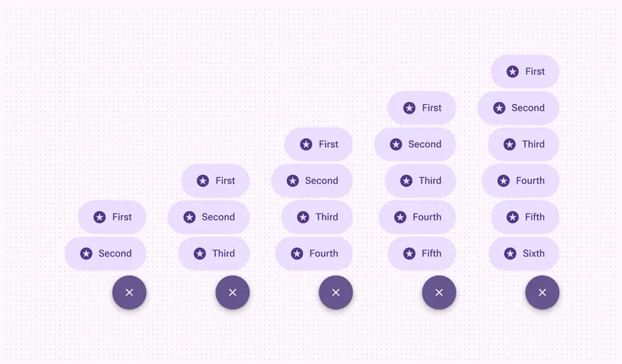
The FAB menu can have up to six items
## Color
Color values are implemented through design tokens. For designers, this means working with color values that correspond with tokens. In implementation, a color value will be a token that references a value. [Learn more about design tokens](../../foundations/design-tokens/overview.md)
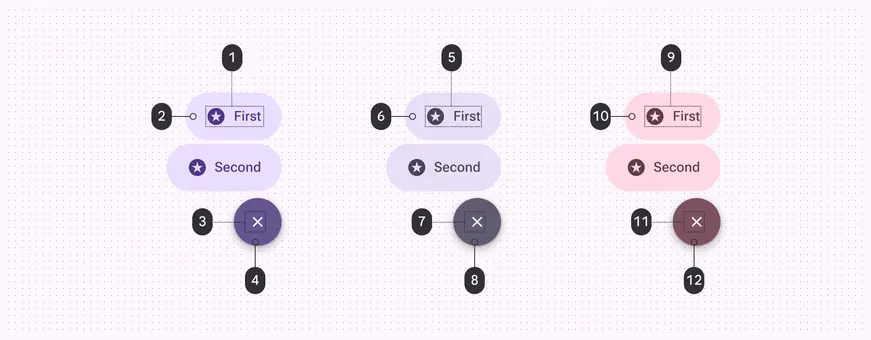
1. On primary container
2. Primary container
3. On primary
4. Primary
5. On secondary container
6. Secondary container
7. On secondary
8. Secondary
9. On tertiary container
10. Tertiary container
11. On tertiary
12. Tertiary
## States
States are visual representations used to communicate the status of a component or interactive element. [Learn more about interaction states](../../foundations/interaction/states/overview.md)
### Close button
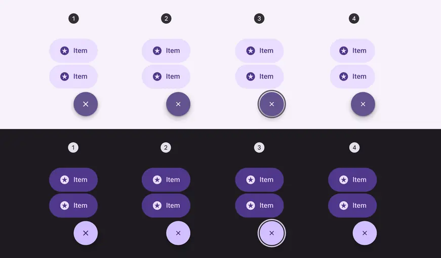
Close button states in light and dark themes:
1. Enabled
2. Hovered
3. Focused
4. Pressed
### Menu item
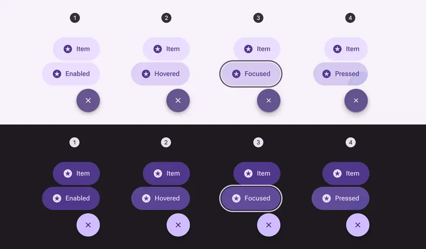
Menu item states in light and dark themes:
1. Enabled
2. Hovered
3. Focused
4. Pressed
## Measurements
FAB menu items share the same measurements as the medium [button](../buttons/overview.md "Buttons let people take action and make choices with one tap.") specs.
The close button should always be 56dp.
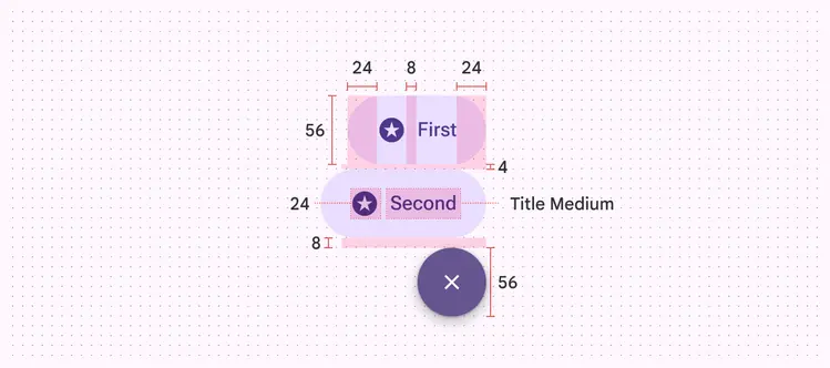
FAB menu size measurements
The FAB menu animates from the top trailing edge of the FAB to ensure a smooth animation.
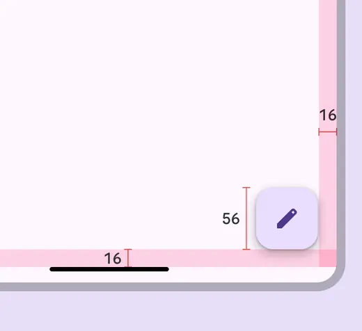
The FAB should always have 16dp margins
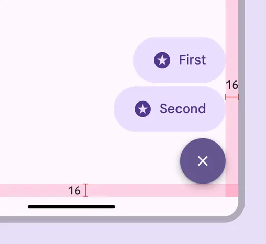
The close button and FAB share the top trailing corner as an anchor and appear in the same place
Larger FABs will place the FAB menu slightly higher, with larger margins underneath.
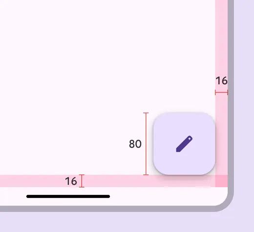
The medium FAB placement has 16dp margins
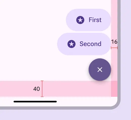
The close button is placed higher to align with the top of the medium FAB
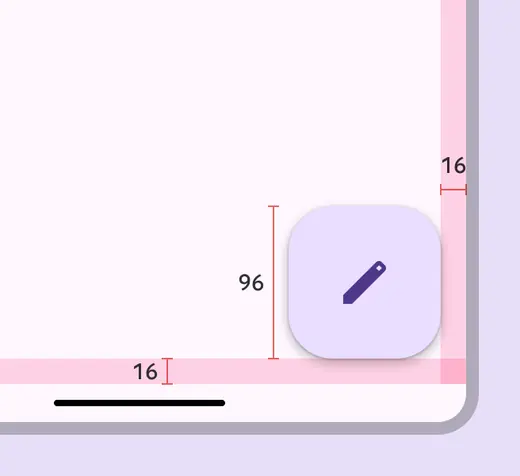
The large FAB placement has 16dp margins
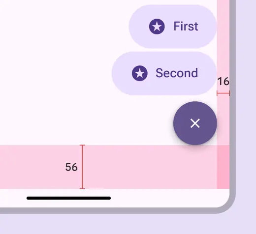
The close button is placed higher to align with the top of the large FAB
On web, the FAB menu opens from the FAB, and inherits its states and specs from the baseline [menu](../menus/overview.md "Menus display a list of choices on a temporary surface.") component.
The gap between the FAB and menu can vary, but 4dp is recommended.
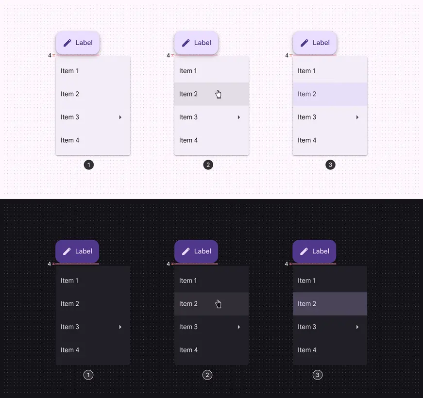
Spacing and interaction on FAB menu for web:
1. Enabled
2. Hovered
3. Selected