---
url: /components/divider/specs.md
description: A divider is a thin line that groups content in lists and containers.
---
# Divider
A divider is a thin line that groups content in lists and containers.
[Overview](overview.md) · **Specs** · [Guidelines](guidelines.md) · [Accessibility](accessibility.md)

1. Divider
## Tokens and specs
Browse the component elements, attributes, tokens, and their values.
::: token-table token-table-77f7657eb270e53d-012021a6
**Divider tokens** · 1 token set · 2 tokens · [live token table](https://m3.material.io/components/divider/specs) · DSDB `TOKEN_TABLE.77f7657eb270e53d`
* Default context: Theme: Light · Platform: Android · Audience: 3P · Contrast: Default · iOS dark theme elevation: None · iOS weight setting: Default
* Not configurable here (group default used): Motion scheme: Standard · Font: Static · Language height: Small
* Other contexts: Theme: Dark · Contrast: Medium contrast, High contrast. "Other contexts" lists values that differ from the default when only that one context changes.
* Reference chain: aliases from the token to its source value (`token → alias → … → value`). "—" means the token holds a literal value.
**Divider** · `md.comp.divider` · 2 tokens
For dividers.
| Group | Token | Type | Reference chain | Resolved value | Other contexts |
| --- | --- | --- | --- | --- | --- |
| Enabled › Container | `md.comp.divider.thickness` | Length | — | `1dp` | — |
| Enabled › Container | `md.comp.divider.color` | Color | `md.sys.color.outline-variant` → `md.ref.palette.neutral-variant80` | `#CAC4D0` | Dark: `#49454F` via `md.ref.palette.neutral-variant30`
Medium contrast: `#79747E` via `md.ref.palette.neutral-variant50`
High contrast: `#49454F` via `md.ref.palette.neutral-variant30` |
:::
## Color
Color values are implemented through design tokens. For design, this means working with color values that correspond with tokens. For implementation, a color value will be a token that references a value. [Learn more about design tokens](../../foundations/design-tokens/overview.md)
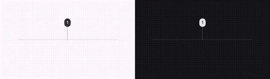
Divider color roles used for light and dark schemes:
1. Outline variant
## Measurements

Measurements
| Attribute | Value |
| :-------------------------------------: | :---: |
| Divider full-width | 100% |
| Divider inset left margin | 16dp |
| Divider inset right margin | 0dp |
| Divider middle-inset left margin | 16dp |
| Divider middle-inset right margin | 16dp |
| Space between divider & supporting-text | 4dp |
| Divider right margin | 8dp |
| Divider bottom margin | 8dp |