---
url: /components/carousel/specs.md
description: >-
Carousels show a collection of items that can be scrolled on and off the
screen. Contain visual items like images or video, along with optional label
text.
---
# Carousel
Carousels show a collection of items that can be scrolled on and off the screen. Contain visual items like images or video, along with optional label text.
[Overview](overview.md) · **Specs** · [Guidelines](guidelines.md) · [Accessibility](accessibility.md)
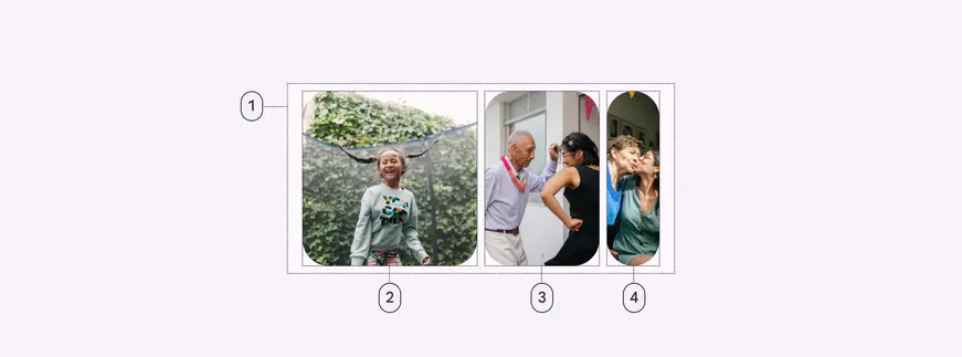
1. Container
2. Large carousel item
3. Medium carousel item
4. Small carousel item
## Tokens & specs
Browse the component elements, attributes, tokens, and their values.
::: token-table token-table-43a124d2adc8a2ef-ac9cdbf9
**Carousel tokens** · 1 token set · 27 tokens · [live token table](https://m3.material.io/components/carousel/specs) · DSDB `TOKEN_TABLE.43a124d2adc8a2ef`
* Default context: Theme: Light · Platform: Android · Audience: 3P · Contrast: Default · iOS dark theme elevation: None · iOS weight setting: Default
* Not configurable here (group default used): Motion scheme: Standard · Font: Static · Language height: Small
* Other contexts: Theme: Dark · Contrast: Medium contrast, High contrast. "Other contexts" lists values that differ from the default when only that one context changes.
* Reference chain: aliases from the token to its source value (`token → alias → … → value`). "—" means the token holds a literal value.
**Carousel item** · `md.comp.carousel-item` · 27 tokens
For carousel items.
| Group | Token | Type | Reference chain | Resolved value | Other contexts |
| --- | --- | --- | --- | --- | --- |
| Enabled › Container | `md.comp.carousel-item.container.color` | Color | `md.sys.color.surface` → `md.ref.palette.neutral98` | `#FEF7FF` | Dark: `#141218` via `md.ref.palette.neutral6` |
| Enabled › Container | `md.comp.carousel-item.container.elevation` | Elevation | `md.sys.elevation.level0` | `0dp` | — |
| Enabled › Container | `md.comp.carousel-item.container.shadow-color` | Color | `md.sys.color.shadow` → `md.ref.palette.neutral0` | `#000000` | — |
| Enabled › Container | `md.comp.carousel-item.container.surface-tint-layer.color` (deprecated) | Color | `md.sys.color.surface-tint` → `md.sys.color.primary` → `md.ref.palette.primary40` | `#6750A4` | Dark: `#D0BCFF` via `md.ref.palette.primary80`
Medium contrast: `#4F378B` via `md.ref.palette.primary30`
High contrast: `#381E72` via `md.ref.palette.primary20` |
| Enabled › Container | `md.comp.carousel-item.container.shape` | Shape | `md.sys.shape.corner.extra-large` | `Rounded corners 28dp` | — |
| Enabled › Outline | `md.comp.carousel-item.with-outline.outline.color` | Color | `md.sys.color.outline` → `md.ref.palette.neutral-variant50` | `#79747E` | Dark: `#938F99` via `md.ref.palette.neutral-variant60`
Medium contrast: `#49454F` via `md.ref.palette.neutral-variant30`
High contrast: `#322F37` via `md.ref.palette.neutral-variant20` |
| Enabled › Outline | `md.comp.carousel-item.with-outline.outline.width` | Elevation | — | `1dp` | — |
| Hover › Container | `md.comp.carousel-item.hover.container.elevation` | Elevation | `md.sys.elevation.level1` | `1dp` | — |
| Hover › State layer | `md.comp.carousel-item.hover.state-layer.color` | Color | `md.sys.color.on-surface` → `md.ref.palette.neutral10` | `#1D1B20` | Dark: `#E6E0E9` via `md.ref.palette.neutral90`
Medium contrast: `#000000` via `md.ref.palette.neutral0`
High contrast: `#000000` via `md.ref.palette.neutral0` |
| Hover › State layer | `md.comp.carousel-item.hover.state-layer.opacity` | Opacity | `md.sys.state.hover.state-layer-opacity` | `0.08` | — |
| Hover › Outline | `md.comp.carousel-item.with-outline.hover.outline.color` | Color | `md.sys.color.outline` → `md.ref.palette.neutral-variant50` | `#79747E` | Dark: `#938F99` via `md.ref.palette.neutral-variant60`
Medium contrast: `#49454F` via `md.ref.palette.neutral-variant30`
High contrast: `#322F37` via `md.ref.palette.neutral-variant20` |
| Focus › Container | `md.comp.carousel-item.focus.container.elevation` | Elevation | `md.sys.elevation.level0` | `0dp` | — |
| Focus › State layer | `md.comp.carousel-item.focus.state-layer.color` | Color | `md.sys.color.on-surface` → `md.ref.palette.neutral10` | `#1D1B20` | Dark: `#E6E0E9` via `md.ref.palette.neutral90`
Medium contrast: `#000000` via `md.ref.palette.neutral0`
High contrast: `#000000` via `md.ref.palette.neutral0` |
| Focus › State layer | `md.comp.carousel-item.focus.state-layer.opacity` | Opacity | `md.sys.state.focus.state-layer-opacity` | `0.1` | — |
| Focus › Focus indicator | `md.comp.carousel-item.focus.indicator.color` | Color | `md.sys.color.secondary` → `md.ref.palette.secondary40` | `#625B71` | Dark: `#CCC2DC` via `md.ref.palette.secondary80`
Medium contrast: `#4A4458` via `md.ref.palette.secondary30`
High contrast: `#332D41` via `md.ref.palette.secondary20` |
| Focus › Focus indicator | `md.comp.carousel-item.focus.indicator.thickness` | Length | `md.sys.state.focus-indicator.thickness` | `3dp` | — |
| Focus › Focus indicator | `md.comp.carousel-item.focus.indicator.outline.offset` | Length | `md.sys.state.focus-indicator.outer-offset` | `2dp` | — |
| Focus › Outline | `md.comp.carousel-item.with-outline.focus.outline.color` | Color | `md.sys.color.on-surface` → `md.ref.palette.neutral10` | `#1D1B20` | Dark: `#E6E0E9` via `md.ref.palette.neutral90`
Medium contrast: `#000000` via `md.ref.palette.neutral0`
High contrast: `#000000` via `md.ref.palette.neutral0` |
| Pressed (ripple) › Container | `md.comp.carousel-item.pressed.container.elevation` | Elevation | `md.sys.elevation.level0` | `0dp` | — |
| Pressed (ripple) › State layer | `md.comp.carousel-item.pressed.state-layer.color` | Color | `md.sys.color.on-surface` → `md.ref.palette.neutral10` | `#1D1B20` | Dark: `#E6E0E9` via `md.ref.palette.neutral90`
Medium contrast: `#000000` via `md.ref.palette.neutral0`
High contrast: `#000000` via `md.ref.palette.neutral0` |
| Pressed (ripple) › State layer | `md.comp.carousel-item.pressed.state-layer.opacity` | Opacity | `md.sys.state.pressed.state-layer-opacity` | `0.1` | — |
| Pressed (ripple) › Outline | `md.comp.carousel-item.with-outline.pressed.outline.color` | Color | `md.sys.color.outline` → `md.ref.palette.neutral-variant50` | `#79747E` | Dark: `#938F99` via `md.ref.palette.neutral-variant60`
Medium contrast: `#49454F` via `md.ref.palette.neutral-variant30`
High contrast: `#322F37` via `md.ref.palette.neutral-variant20` |
| Disabled › Container | `md.comp.carousel-item.disabled.container.elevation` | Elevation | `md.sys.elevation.level0` | `0dp` | — |
| Disabled › Container | `md.comp.carousel-item.disabled.container.opacity` | Opacity | — | `0.38` | — |
| Disabled › Container | `md.comp.carousel-item.disabled.container.color` | Color | `md.sys.color.surface` → `md.ref.palette.neutral98` | `#FEF7FF` | Dark: `#141218` via `md.ref.palette.neutral6` |
| Disabled › Outline | `md.comp.carousel-item.with-outline.disabled.outline.color` | Color | `md.sys.color.outline` → `md.ref.palette.neutral-variant50` | `#79747E` | Dark: `#938F99` via `md.ref.palette.neutral-variant60`
Medium contrast: `#49454F` via `md.ref.palette.neutral-variant30`
High contrast: `#322F37` via `md.ref.palette.neutral-variant20` |
| Disabled › Outline | `md.comp.carousel-item.with-outline.disabled.outline.opacity` | Opacity | — | `0.12` | — |
:::
## Color
Color values are implemented through [design tokens](../../foundations/design-tokens/overview.md "Design tokens are the building blocks of all UI elements. The same tokens are used in designs, tools, and code."). For design, this means working with color values that correspond with tokens. For implementation, a color value will be a token that references a value. [Learn more about design tokens](../../foundations/design-tokens/overview.md)
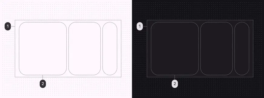
Carousel color roles used for light and dark schemes:
1. Container
2. Surface
## States
[States](../../foundations/interaction/states/overview.md "States show the interaction status of a component or UI element.") are visual representations used to communicate the status of a component or interactive element. [Learn more about interaction states](../../foundations/interaction/states/overview.md)
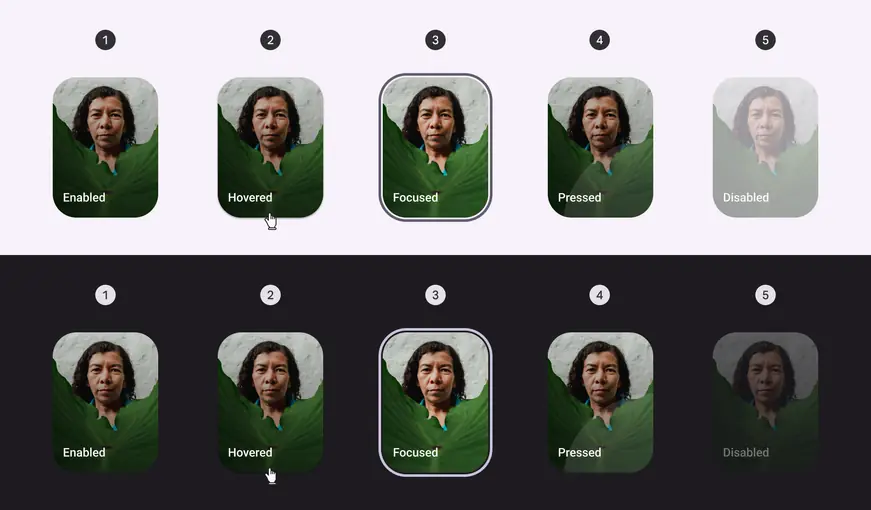
1. Enabled
2. Hovered
3. Focused
4. Pressed
5. Disabled
## Carousel item dynamic widths
All kinds of carousel items dynamically adapt to the width of the container.
Large items have a customizable maximum width that's used to optimally fit carousel items into the available space.
Small carousel items have a minimum width of 40dp and a maximum width of 56dp.
Items change size as they move through the carousel layout.
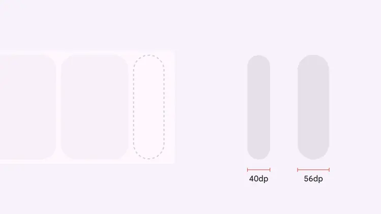
Small carousel items have a minimum and maximum width
## Multi-browse
The multi-browse layout shows at least one large, medium, and small carousel item.
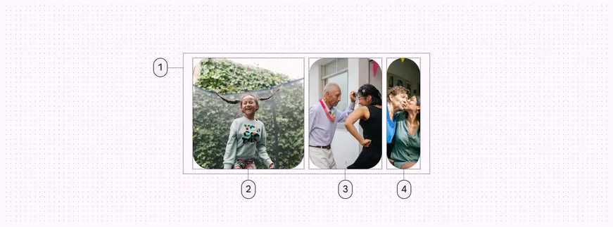
1. Container
2. Large carousel item
3. Medium carousel item
4. Small carousel item
### Measurements
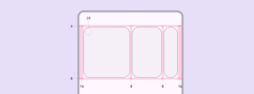
Multi-browse carousels have padding on both sides of the container
| Attribute | Value |
| :----------------------: | :------------------: |
| Alignment | Vertically centered |
| Leading/trailing padding | 16dp |
| Top/bottom padding | 8dp |
| Padding between elements | 8dp |
| Large item width | Dynamic, or user-set |
| Medium item width | Dynamic |
| Small item width | 40–56dp, dynamic |
| Item corner radius | 28dp |
## Uncontained
The uncontained layout shows items that scroll to the edge of the container.
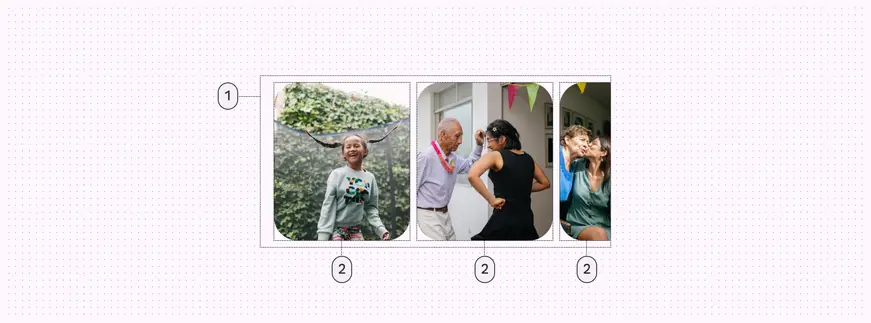
1. Container
2. Large carousel item
### Measurements
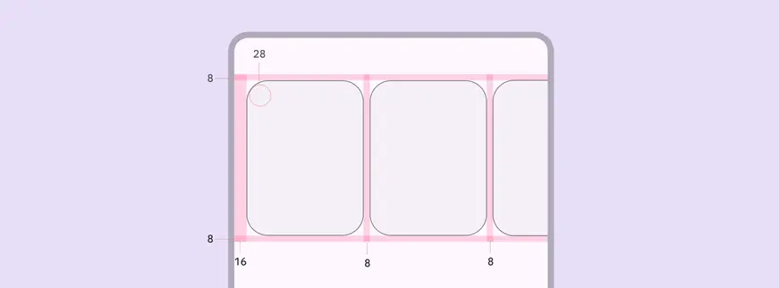
Uncontained carousel items bleed over the padding on each side when scrolling
| Attribute | Value |
| :----------------------: | :-----------------: |
| Alignment | Vertically centered |
| Leading padding | 16dp |
| Top/bottom padding | 8dp |
| Padding between elements | 8dp |
| Item corner radius | 28dp |
## Uncontained mutli-aspect ratio
The uncontained multi-aspect ratio layout shows carousel items of various widths.
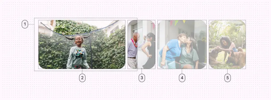
1. Container
2. Carousel item (16:9)
3. Carousel item (9:16)
4. Carousel item (1:1)
5. Carousel item (3:4)
### Measurements
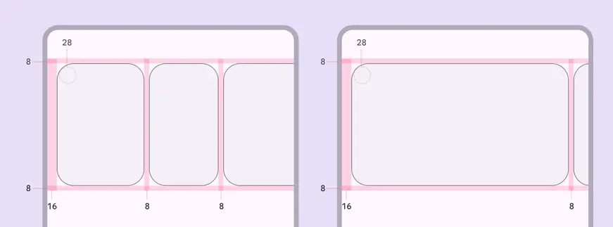
Uncontained multi-aspect ratio carousels only have leading padding, with 8dp of padding between items.
| Attribute | Value |
| :----------------------: | :-----------------: |
| Alignment | Vertically centered |
| Leading padding | 16dp |
| Top/bottom padding | 8dp |
| Padding between elements | 8dp |
| Item corner radius | 28dp |
## Hero
The hero layout shows at least one large item and one small item.
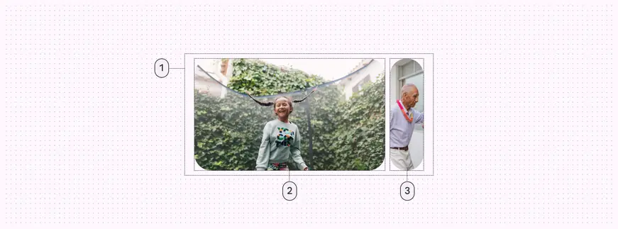
1. Container
2. Large carousel item
3. Small carousel item
### Measurements
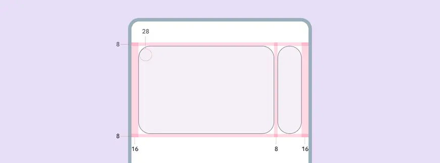
Hero carousels have padding on both sides of the container
| Attribute | Value |
| :----------------------: | :-----------------: |
| Alignment | Vertically centered |
| Leading/Trailing padding | 16dp |
| Top/bottom padding | 8dp |
| Padding between elements | 8dp |
| Large item width | Dynamic |
| Small item width | 40-56dp, dynamic |
| Item corner radius | 28dp |
## Center-aligned hero
The center-aligned hero layout shows at least one large item and two small items.
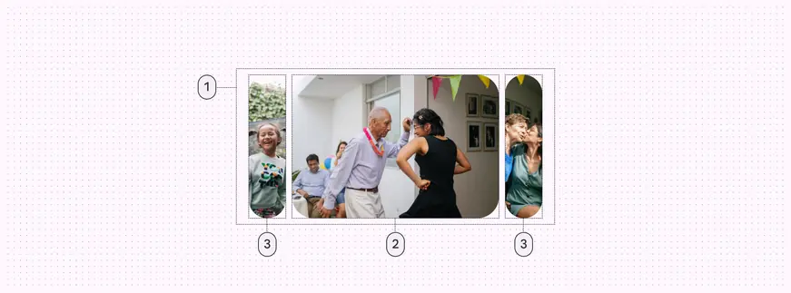
1. Container
2. Large carousel item
3. Small carousel item
### Measurements
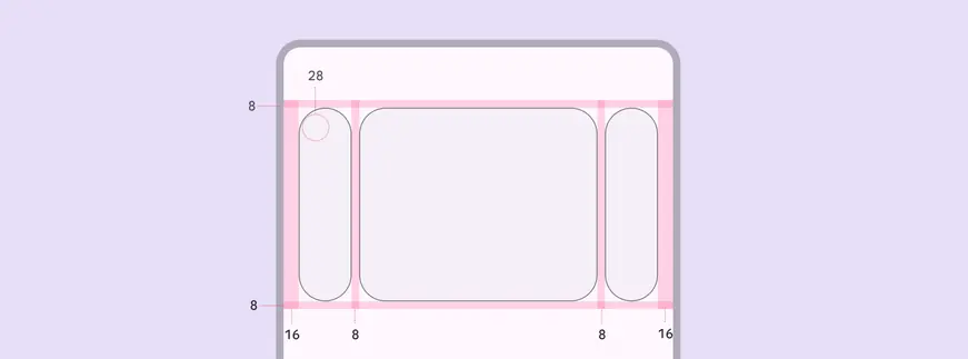
Center-aligned hero carousels have padding on both sides of the container
| Attribute | Value |
| :----------------------: | :-----------------: |
| Alignment | Vertically centered |
| Leading/Trailing padding | 16dp |
| Top/bottom padding | 8dp |
| Padding between elements | 8dp |
| Large item width | Dynamic |
| Small item width | 40-56dp, dynamic |
| Item corner radius | 28dp |
## Full-screen
The full-screen layout shows one edge-to-edge large item.
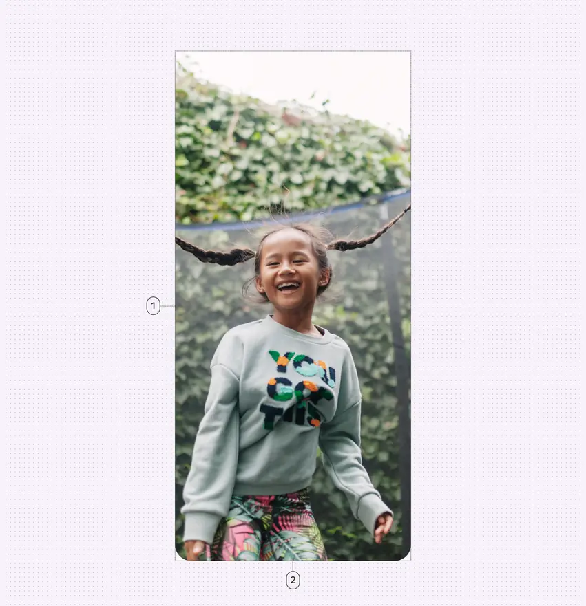
1. Container
2. Large carousel item
### Measurements
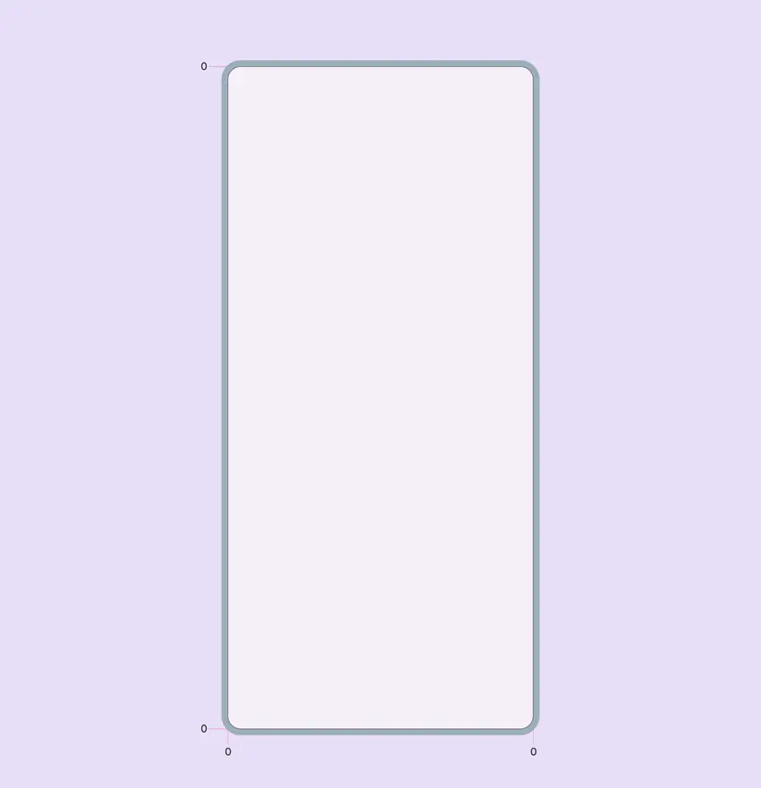
Full-screen carousels fill the window edge-to-edge
| Attribute | Value |
| :----------------------: | :------: |
| Alignment | Centered |
| Leading/Trailing padding | 0dp |
| Top/bottom padding | 0dp |
| Padding between elements | 16dp |