---
url: /components/button-groups/specs.md
description: Button groups organize buttons and add interactions between them
---
# Button groups
Button groups organize buttons and add interactions between them
[Overview](overview.md) · **Specs** · [Guidelines](guidelines.md) · [Accessibility](accessibility.md)
## Variants
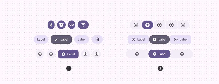
1. Standard button group
2. Connected button group
| Variant | M3 | M3 Expressive |
| ---------------------- | :--------------------------------------------------------------------------------------------------------------------------------------------------------------------------------------------------------------------------: | :-----------: |
| Standard button group | -- | Available |
| Connected button group | Available as [segmented button](../segmented-buttons/overview.md "Segmented buttons help people select options, switch views, or sort elements. Note: They're deprecated in the expressive update. Use a nav rail instead.") | Available |
## Configurations
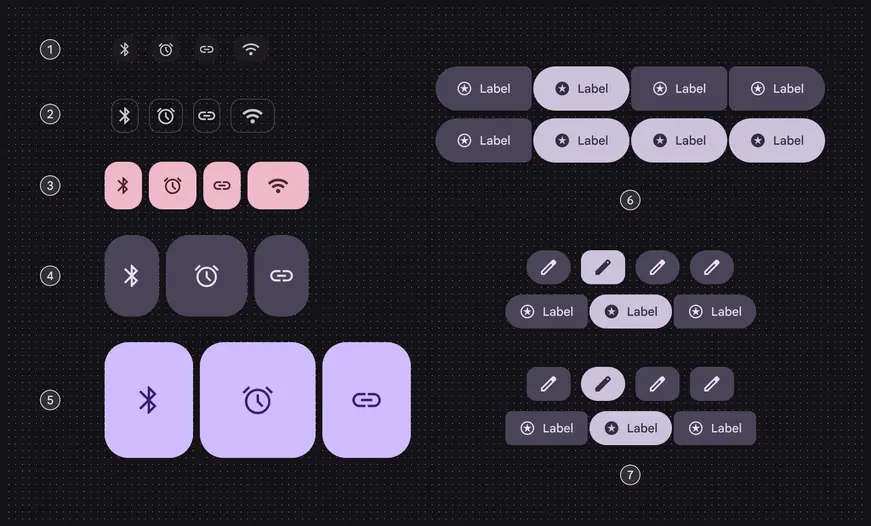
Configurations for both variants of button groups:
1. Extra small
2. Small
3. Medium
4. Large
5. Extra large
6. Single-select and multi-select
7. Round and square
| Category | Configuration | M3 | M3 Expressive |
| ------------- | ----------------------------------------------- | ---------------------------------------------------------------------------------------------------------------------------------------------------------------------------------------------------------------------------- | ------------- |
| Size | XS, S, M, L, XL | -- | Available |
| Default shape | Round, square | -- | Available |
| Selection | Single-select, multi-select, selection-required | Available as [segmented button](../segmented-buttons/overview.md "Segmented buttons help people select options, switch views, or sort elements. Note: They're deprecated in the expressive update. Use a nav rail instead.") | Available |
## Tokens & specs
Standard and connected button group tokens are organized by size. Select the variant and size from the token set menu. Go to the [button](../buttons/specs.md) and [icon button](../icon-buttons/specs.md) pages to view their tokens. [Learn about design tokens](../../foundations/design-tokens/overview.md)
::: token-table token-table-082d7fd6e058b011-9ecd1779
**Button groups tokens** · 10 token sets · 55 tokens · [live token table](https://m3.material.io/components/button-groups/specs) · DSDB `TOKEN_TABLE.082d7fd6e058b011`
* Default context: none
* Not configurable here (group default used): Theme: Light · Platform: Android · Audience: 1P Baseline · Motion scheme: Standard · Font: Static · Contrast: Default · iOS dark theme elevation: None · iOS weight setting: Default · Language height: Small
* Reference chain: aliases from the token to its source value (`token → alias → … → value`). "—" means the token holds a literal value.
**Button group standard - Size - Xsmall** · `md.comp.button-group.standard.xsmall` · 5 tokens
For XS standard button groups.
| Group | Token | Type | Reference chain | Resolved value |
| --- | --- | --- | --- | --- |
| Pressed | `md.comp.button-group.standard.xsmall.pressed.item.width.motion.spring.dampening` | Duration | `md.sys.motion.spring.fast.spatial.damping` | `0.9` |
| Pressed | `md.comp.button-group.standard.xsmall.pressed.item.width.motion.spring.stiffness` | Duration | `md.sys.motion.spring.fast.spatial.stiffness` | `1400` |
| Pressed | `md.comp.button-group.standard.xsmall.pressed.item.width.multiplier` | Length | — | `15%` |
| Other | `md.comp.button-group.standard.xsmall.container.height` | Length | — | `32dp` |
| Other | `md.comp.button-group.standard.xsmall.between-space` | Length | — | `18dp` |
**Button group standard - Size - Small** · `md.comp.button-group.standard.small` · 5 tokens
For small standard button groups.
| Group | Token | Type | Reference chain | Resolved value |
| --- | --- | --- | --- | --- |
| Pressed | `md.comp.button-group.standard.small.pressed.item.width.motion.spring.stiffness` | Duration | `md.sys.motion.spring.fast.spatial.stiffness` | `1400` |
| Pressed | `md.comp.button-group.standard.small.pressed.item.width.multiplier` | Length | — | `15%` |
| Pressed | `md.comp.button-group.standard.small.pressed.item.width.motion.spring.dampening` | Duration | `md.sys.motion.spring.fast.spatial.damping` | `0.9` |
| Other | `md.comp.button-group.standard.small.container.height` | Length | — | `40dp` |
| Other | `md.comp.button-group.standard.small.between-space` | Length | `md.sys.measurement.space150` | `12dp` |
**Button group standard - Size - Medium** · `md.comp.button-group.standard.medium` · 5 tokens
For medium standard button groups.
| Group | Token | Type | Reference chain | Resolved value |
| --- | --- | --- | --- | --- |
| Pressed | `md.comp.button-group.standard.medium.pressed.item.width.motion.spring.stiffness` | Duration | `md.sys.motion.spring.fast.spatial.stiffness` | `1400` |
| Pressed | `md.comp.button-group.standard.medium.pressed.item.width.multiplier` | Length | — | `15%` |
| Pressed | `md.comp.button-group.standard.medium.pressed.item.width.motion.spring.dampening` | Duration | `md.sys.motion.spring.fast.spatial.damping` | `0.9` |
| Other | `md.comp.button-group.standard.medium.container.height` | Length | — | `56dp` |
| Other | `md.comp.button-group.standard.medium.between-space` | Length | `md.sys.measurement.space100` | `8dp` |
**Button group standard - Size - Large** · `md.comp.button-group.standard.large` · 5 tokens
For large standard button groups.
| Group | Token | Type | Reference chain | Resolved value |
| --- | --- | --- | --- | --- |
| Pressed | `md.comp.button-group.standard.large.pressed.item.width.motion.spring.stiffness` | Duration | `md.sys.motion.spring.fast.spatial.stiffness` | `1400` |
| Pressed | `md.comp.button-group.standard.large.pressed.item.width.multiplier` | Length | — | `15%` |
| Pressed | `md.comp.button-group.standard.large.pressed.item.width.motion.spring.dampening` | Duration | `md.sys.motion.spring.fast.spatial.damping` | `0.9` |
| Other | `md.comp.button-group.standard.large.container.height` | Length | — | `96dp` |
| Other | `md.comp.button-group.standard.large.between-space` | Length | `md.sys.measurement.space100` | `8dp` |
**Button group standard - Size - Xlarge** · `md.comp.button-group.standard.xlarge` · 5 tokens
For XL standard button groups.
| Group | Token | Type | Reference chain | Resolved value |
| --- | --- | --- | --- | --- |
| Pressed | `md.comp.button-group.standard.xlarge.pressed.item.width.motion.spring.stiffness` | Duration | `md.sys.motion.spring.fast.spatial.stiffness` | `1400` |
| Pressed | `md.comp.button-group.standard.xlarge.pressed.item.width.multiplier` | Length | — | `15%` |
| Pressed | `md.comp.button-group.standard.xlarge.pressed.item.width.motion.spring.dampening` | Duration | `md.sys.motion.spring.fast.spatial.damping` | `0.9` |
| Other | `md.comp.button-group.standard.xlarge.container.height` | Length | — | `136dp` |
| Other | `md.comp.button-group.standard.xlarge.between-space` | Length | `md.sys.measurement.space100` | `8dp` |
**Button group connected - Size - Xsmall** · `md.comp.button-group.connected.xsmall` · 6 tokens
For XS connected button groups.
| Group | Token | Type | Reference chain | Resolved value |
| --- | --- | --- | --- | --- |
| All tokens | `md.comp.button-group.connected.xsmall.container.height` | Length | — | `32dp` |
| All tokens | `md.comp.button-group.connected.xsmall.between-space` | Length | `md.sys.measurement.space25` | `2dp` |
| All tokens | `md.comp.button-group.connected.xsmall.container.shape` | Shape | `md.sys.shape.corner.full` | `Circular (fully rounded)` |
| All tokens | `md.comp.button-group.connected.xsmall.inner-corner.corner-size` | Shape | `md.sys.shape.corner-value.small` | `8dp` |
| All tokens | `md.comp.button-group.connected.xsmall.pressed.inner-corner.corner-size` | Shape | `md.sys.shape.corner-value.extra-small` | `4dp` |
| All tokens | `md.comp.button-group.connected.xsmall.selected.inner-corner.corner-size` | Length | — | `50%` |
**Button group connected - Size - Small** · `md.comp.button-group.connected.small` · 6 tokens
For small connected button groups.
| Group | Token | Type | Reference chain | Resolved value |
| --- | --- | --- | --- | --- |
| All tokens | `md.comp.button-group.connected.small.container.height` | Length | — | `40dp` |
| All tokens | `md.comp.button-group.connected.small.between-space` | Length | `md.sys.measurement.space25` | `2dp` |
| All tokens | `md.comp.button-group.connected.small.container.shape` | Shape | `md.sys.shape.corner.full` | `Circular (fully rounded)` |
| All tokens | `md.comp.button-group.connected.small.inner-corner.corner-size` | Shape | `md.sys.shape.corner-value.small` | `8dp` |
| All tokens | `md.comp.button-group.connected.small.pressed.inner-corner.corner-size` | Shape | `md.sys.shape.corner-value.extra-small` | `4dp` |
| All tokens | `md.comp.button-group.connected.small.selected.inner-corner.corner-size` | Length | — | `50%` |
**Button group connected - Size - Medium** · `md.comp.button-group.connected.medium` · 6 tokens
For medium connected button groups.
| Group | Token | Type | Reference chain | Resolved value |
| --- | --- | --- | --- | --- |
| All tokens | `md.comp.button-group.connected.medium.container.height` | Length | — | `56dp` |
| All tokens | `md.comp.button-group.connected.medium.between-space` | Length | `md.sys.measurement.space25` | `2dp` |
| All tokens | `md.comp.button-group.connected.medium.container.shape` | Shape | `md.sys.shape.corner.full` | `Circular (fully rounded)` |
| All tokens | `md.comp.button-group.connected.medium.inner-corner.corner-size` | Shape | `md.sys.shape.corner-value.small` | `8dp` |
| All tokens | `md.comp.button-group.connected.medium.pressed.inner-corner.corner-size` | Shape | `md.sys.shape.corner-value.extra-small` | `4dp` |
| All tokens | `md.comp.button-group.connected.medium.selected.inner-corner.corner-size` | Length | — | `50%` |
**Button group connected - Size - Large** · `md.comp.button-group.connected.large` · 6 tokens
For large connected button groups.
| Group | Token | Type | Reference chain | Resolved value |
| --- | --- | --- | --- | --- |
| All tokens | `md.comp.button-group.connected.large.container.height` | Length | — | `96dp` |
| All tokens | `md.comp.button-group.connected.large.between-space` | Length | `md.sys.measurement.space25` | `2dp` |
| All tokens | `md.comp.button-group.connected.large.container.shape` | Shape | `md.sys.shape.corner.full` | `Circular (fully rounded)` |
| All tokens | `md.comp.button-group.connected.large.inner-corner.corner-size` | Shape | `md.sys.shape.corner-value.large` | `16dp` |
| All tokens | `md.comp.button-group.connected.large.pressed.inner-corner.corner-size` | Shape | `md.sys.shape.corner-value.medium` | `12dp` |
| All tokens | `md.comp.button-group.connected.large.selected.inner-corner.corner-size` | Length | — | `50%` |
**Button group connected - Size - Xlarge** · `md.comp.button-group.connected.xlarge` · 6 tokens
For XL connected button groups.
| Group | Token | Type | Reference chain | Resolved value |
| --- | --- | --- | --- | --- |
| All tokens | `md.comp.button-group.connected.xlarge.container.height` | Length | — | `136dp` |
| All tokens | `md.comp.button-group.connected.xlarge.between-space` | Length | `md.sys.measurement.space25` | `2dp` |
| All tokens | `md.comp.button-group.connected.xlarge.container.shape` | Shape | `md.sys.shape.corner.full` | `Circular (fully rounded)` |
| All tokens | `md.comp.button-group.connected.xlarge.inner-corner.corner-size` | Shape | `md.sys.shape.corner-value.large-increased` | `20dp` |
| All tokens | `md.comp.button-group.connected.xlarge.pressed.inner-corner.corner-size` | Shape | `md.sys.shape.corner-value.large` | `16dp` |
| All tokens | `md.comp.button-group.connected.xlarge.selected.inner-corner.corner-size` | Length | — | `50%` |
:::
## Anatomy
Button groups are invisible containers that add padding between buttons and modify button shape. They don’t contain any buttons by default.
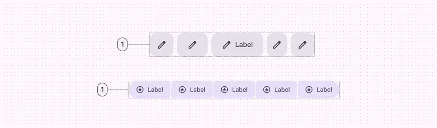
1. Container
### Common layouts
Mix and match buttons and icon buttons for different scenarios.
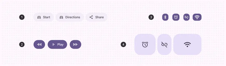
1. Label buttons
2. Label buttons and icon buttons
3. Extra small icon buttons
4. Large icon buttons
### Color
Button groups have no color properties. They can use the default button or toggle button color styles, like filled, tonal, and outlined. Avoid using standard icon buttons or text buttons, as they have no container treatment.
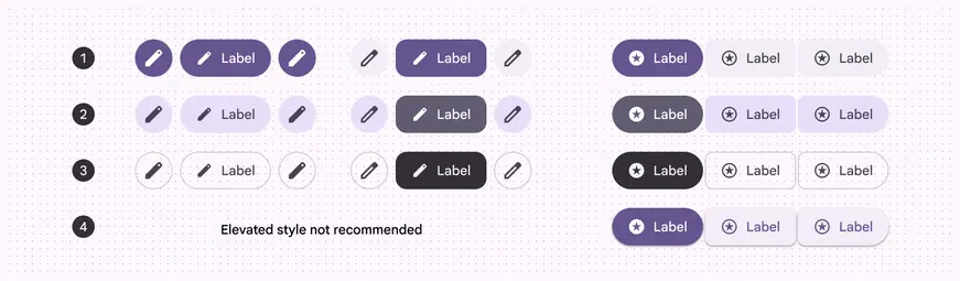
1. Filled
2. Tonal
3. Outlined
4. Elevated
## Selection & activation
**Standard button groups** add interaction between adjacent buttons when a button is selected or activated.
This interaction changes the width, shape, and padding of the selected or activated button, which adjusts the width of buttons directly next to it.
A selected button changes shape, and briefly changes the width of itself and adjacent buttons
**Connected button groups** don’t add any interaction between buttons when selected or activated.
They only affect the shape of the button being selected or activated.
A selected button changes shape without affecting adjacent buttons
## States
### Standard button group
When a button is pressed, standard button groups modify the width and shape of that button and adjacent buttons.
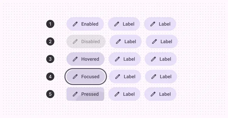
1. Enabled
2. Disabled
3. Hovered
4. Focused
5. Pressed
When a toggle button is selected in a standard button group, its shape should change between square and round. The color should change according to the [button specs](../buttons/specs.md).
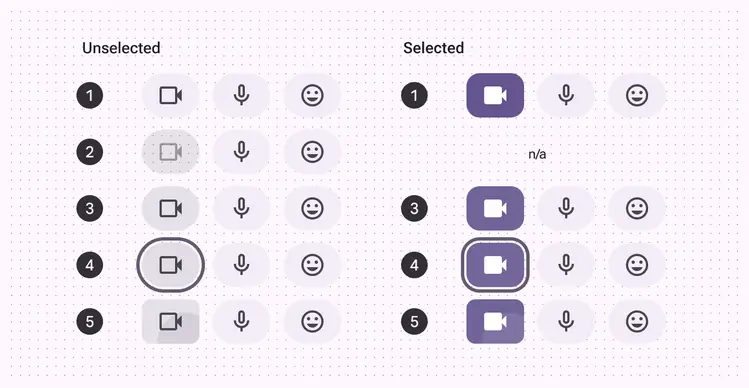
1. Enabled
2. Disabled
3. Hovered
4. Focused
5. Pressed
### Connected button group
Connected button groups have different shape changes than standard button groups. Selecting a button does not affect adjacent buttons.
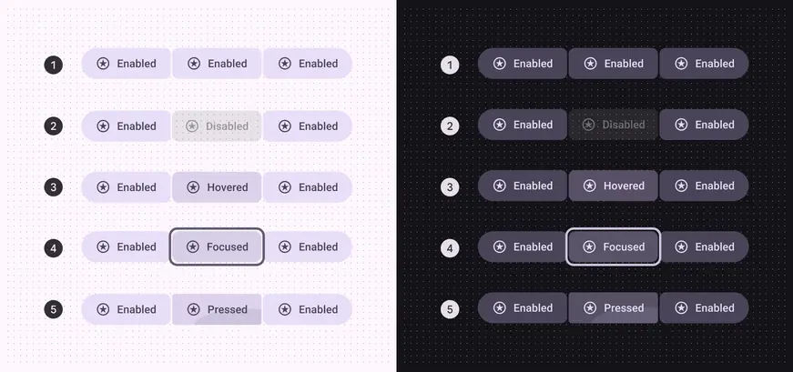
Connected button group unselected states:
1. Enabled
2. Disabled
3. Hovered
4. Focused
5. Pressed
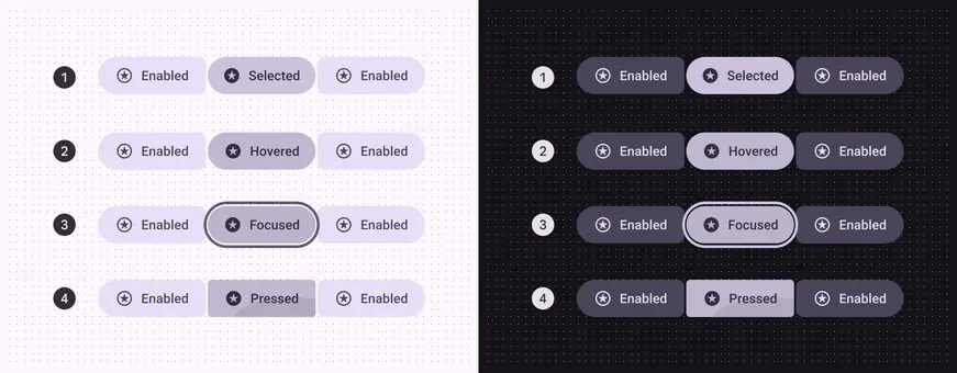
Connected button group selected states:
1. Enabled
2. Hovered
3. Focused
4. Pressed
## Measurements
### Standard button group
Standard groups apply padding between all buttons. The amount of padding changes based on button size to ensure a minimum accessible target size of 48dp. More details on padding: [Button specs](../buttons/specs.md), [icon button specs](../icon-buttons/specs.md)
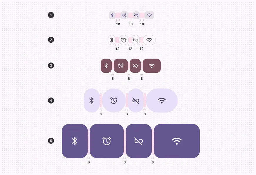
Standard button group inner padding:
1. XS: 18dp
2. S: 12dp
3. M: 8dp
4. L: 8dp
5. XL: 8dp
### Connected button group
For all connected button groups, use 2dp padding. This provides visual consistency at scale.
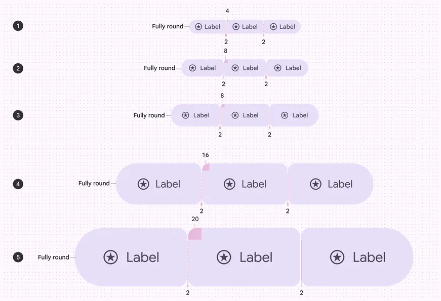
Round connected button group inner padding is 2dp at every size. The outer shape is fully round, and the inner shape remains square with the following corner sizes:
1. XS: 4dp
2. S: 8dp
3. M: 8dp
4. L: 16dp
5. XL: 20dp
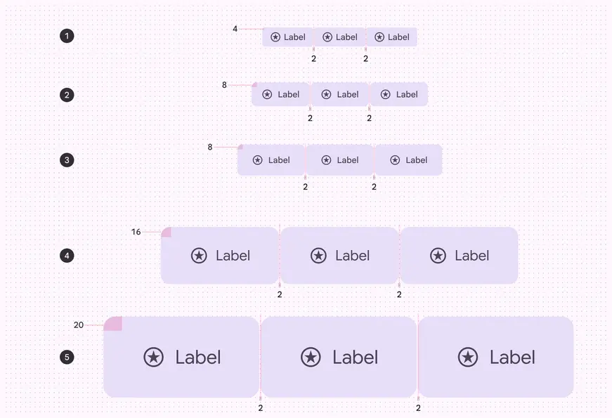
Square connected button group inner padding is 2dp at every size. The outer shape has the following corner sizes:
1. XS: 4dp
2. S: 8dp
3. M: 8dp
4. L: 16dp
5. XL: 20dp
### Minimum widths
Extra small and small connected button groups have 48dp target areas and a minimum width of 48dp.
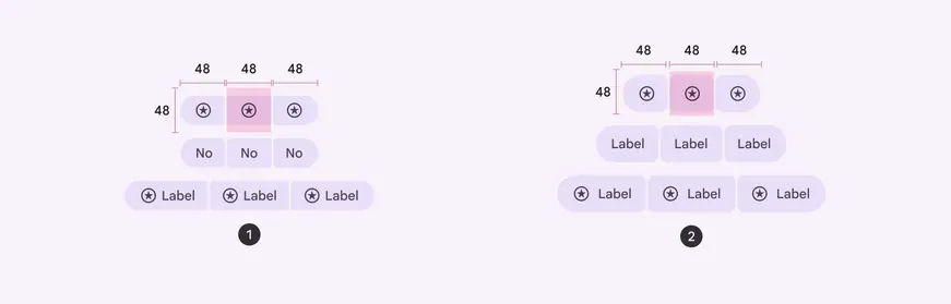
1. Extra small
2. Small
## Density
Button groups adapt to density of the buttons inside. [More on density](../../foundations/layout/grids-spacing/density.md)
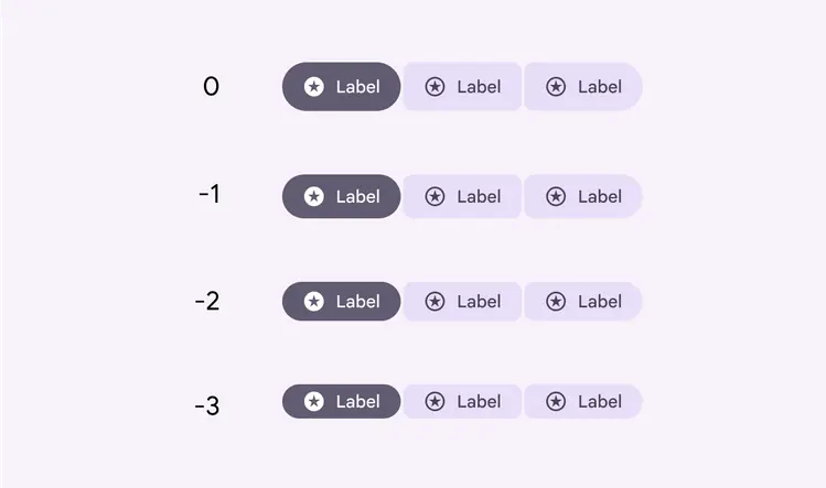
Button groups adapt to the height of the buttons inside, including when density is applied