---
url: /components/button-groups/overview.md
description: Button groups organize buttons and add interactions between them
---
# Button groups
Button groups organize buttons and add interactions between them
**Overview** · [Specs](specs.md) · [Guidelines](guidelines.md) · [Accessibility](accessibility.md)

* Two variants: **standard** and **connected**
* Applies shape morph when pressed and selected
* Connected button groups replace the [segmented button](../segmented-buttons/overview.md "Segmented buttons help people select options, switch views, or sort elements. Note: They're deprecated in the expressive update. Use a nav rail instead.")
* Works with all button sizes: XS, S, M, L, and XL
* Support for single-select, multi-select, and selection-required
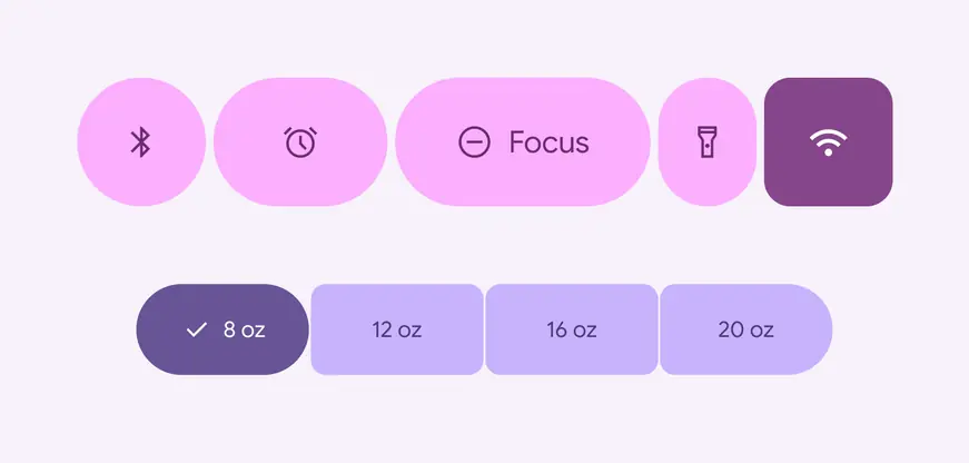
Button groups can contain buttons and icon buttons
## Availability & resources
| Type | Resource | Status |
| --- | --- | --- |
| Design | [Design Kit (Figma)](https://www.figma.com/community/file/1035203688168086460) | Available |
| Implementation | [Jetpack Compose: Expressive](https://developer.android.com/reference/kotlin/androidx/compose/material3/package-summary#ButtonGroup\(androidx.compose.ui.Modifier,kotlin.Float,androidx.compose.foundation.layout.Arrangement.Horizontal,kotlin.Function1\)) | Available |
| Implementation | [Android Views (MDC-Android): Expressive](https://github.com/material-components/material-components-android/blob/master/docs/components/Button.md#button-groups) | Available |
| Implementation | Web: Expressive | Unavailable |
## M3 Expressive update
Button groups apply shape, motion, and width changes to [buttons](../buttons/overview.md "Buttons let people take action and make choices with one tap.") and [icon buttons](../icon-buttons/overview.md "Icon buttons help people take minor actions with one tap.") to make them more interactive. [More on M3 Expressive](https://m3.material.io/blog/building-with-m3-expressive)
**May 2025**
New component added to catalog.
Variants and naming:
* Added standard button group
* Added connected button group
* Use instead of [segmented button](../segmented-buttons/overview.md "Segmented buttons help people select options, switch views, or sort elements. Note: They're deprecated in the expressive update. Use a nav rail instead."), which is no longer recommended
Configurations:
* Works with all button sizes: XS, S, M, L, and XL
* Applies default shape to all buttons: round or square
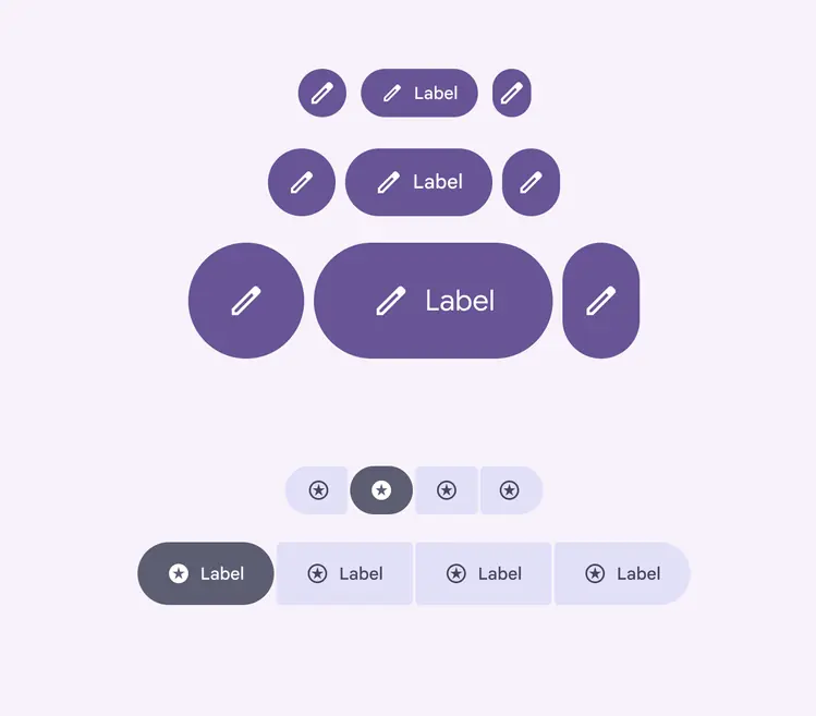
Button groups are containers that hold buttons of many shapes and sizes