---
url: /components/badges/accessibility.md
description: >-
Badges are used as indicators to convey dynamic information, such as counts or
status. A badge can include labels or numbers.
---
# Badges
Badges are used as indicators to convey dynamic information, such as counts or status. A badge can include labels or numbers.
[Overview](overview.md) · [Specs](specs.md) · [Guidelines](guidelines.md) · **Accessibility**
## Use cases
People should be able to use assistive technology to:
* Understand the dynamic information conveyed in badges, such as counts or labels
* Address badge announcements by selecting corresponding navigation destinations
## Interaction & style
Badges are most commonly used within other components, such as [navigation bar](../navigation-bar/overview.md "Navigation bars let people switch between UI views on smaller devices."), [navigation rail](../navigation-rail/overview.md "Navigation rails let people switch between UI views on mid-sized devices."), [app bars](../app-bars/overview.md "App bars display navigation, actions, and text at the top of a screen."), and [tabs](../tabs/overview.md "Tabs organize content across different screens and views.").
When a badge is used to indicate an unread notification, the badge gets hidden once it's selected.
## Visual indicators
Badges use a color intended to stand out against labels, icons, and navigation elements. Use the default color mapping to avoid color conflict issues.
::: tip Do
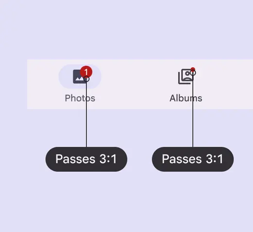
Badges must use default color with at least 3:1 contrast
:::
::: danger Don't
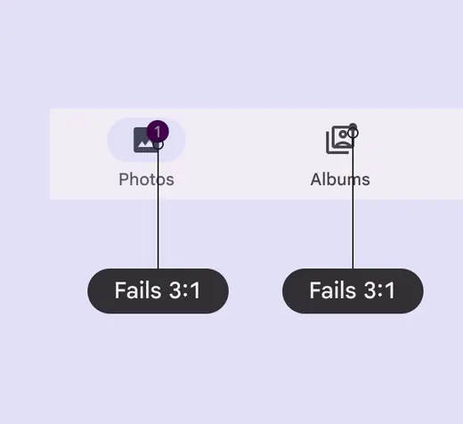
Avoid using custom color roles for the badge container and label text. If custom roles are necessary, make sure they have contrast of at least 3:1.
:::
## Labeling elements
The [accessibility](../../foundations/overview/principles.md "Accessible design makes products usable for people with all kinds of abilities.") label for a badge item will be read after its navigation destination. Any numerical badges will have their number read, while non-counting badges will simply announce **New notification**.
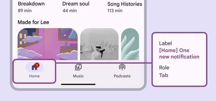
Numerical badges will have their number read
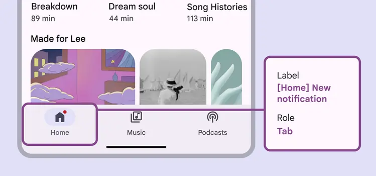
Non-counting badges will simply announce **New notification**